Pen Review: Kaweco AL Sport Stonewashed (Black)

stonewashed-header

Kaweco AL Sport Stonewashed (Black)
Length Capped: 106mm
Length Posted: 131mm
Length Uncapped: 100mm
Section at Thinnest Point: 9mm
Section at Widest Point: 9.5mm
Weight with Cartridge: 21.2g
Fast Writing: Keeps up decently, couple of skips
Line Variation: Not much at all; not practical.
Upside Down Writing: Very scratchy, but doable. Hard to read.
Wetness: Fairly dry, but not bad.
Pros: Nib writes well, very cool "distressed" body, decent nib
Cons: Converter options

Kaweco continues to do an incredible job of doing unique things with their fountain pen designs.  The "stonewashed" version of their AL Sport is something I've not seen other companies do.  Though Kaweco is a German company, this stonewashed pen reminds me of the Japanese concept of "wabi-sabi," in which the aesthetic value of an object increases with wear and tear from use.  Nakaya uses this idea in the design of some of their pens  by introducing cracks to the finish; in my opinion it really adds to their appeal.

Parts of the Pen

Like all Kaweco Sport models, the pen features a fairly long cap with an octagonal facets.  The body is cylindrical with a step down at the end leading to an end cap with a rounded top and a dimple in the middle.  The section is tapered and flared, and has a small grouping of threads at the top where the cap screws on - the threads with this specific pen I've noticed have not squeaked when unscrewing the cap .  I suspect this is due to the process of distressing the pen, but can't say for certain.  Finally, the finial is very slightly conical and features the 3-syllable Kaweco logo.

Review

Kaweco likens this design as a "used look that perfectly matches your favorite pair of jeans."  According to their site, they treat the pens with a very similar procedure to that used in jeans manufacturing.  The result is an amazingly deceiving design which would have you believe this pen has been around for years and has produced many a page of written thought.

I've seen some people say that they don't like how even and uniform the wear marks on the pen are; I can understand that, as a pen that's been around for years may not wear as evenly.  I still like the design of the pen, because they've not worn the entire finish off, but instead have focused on the high edges, which would be the first to wear on an old pen.  Their idea is to mimic a worn pair of jeans, and to that end, I think they've done it perfectly.

The AL Sport Stonewashed edition is obviously the same pen as its non-distressed AL Sport counterpart, so the basic usability and functionality remains the same.  The pen is well balanced, both posted and unposted.  Due to its fairly short length, I prefer to write posted - the balance is unaffected by this as the cap adds negligible back weight. 

The Kaweco steel nib is a fairly smooth writer with a touch of feedback.  Being a steel nib, you get minimal line variation, though you can squeeze out the tiniest bit if you're determined to do so.  Just be sure not to overdo it, because you'll probably spring the nib.  Upside down writing is possible but I noticed the nib tends to catch on the paper and you'll have a hard time reading it.  I've found the Kawecos tend to run a little on the dry side and this one was no exception - that could also be attributed to the finer nib size as well.

One thing that will always be an issue with the Kaweco Sport pens is the converter options.  Since the pen is aluminum, eyedropper conversion isn't an option sadly.  The pen takes Standard International short cartridges, and most full sized converters will not fit in the body of the pen.  That leaves you with a few options: use only prefilled Standard International Cartridges, refill a used cartridge with a bottled ink and a syringe, or pick up one of the few converter options.  The Monteverde Mini Converter, which is a plunger style, will fit in the sport pen but I believe that the plunger cannot be pulled out all the way.  I've also heard that people have had issues with it not fitting the back of the feed properly, so there is the potential for leakage.  Your second option is the Kaweco squeeze converter which is made specifically for the Kaweco Sport pens.  It was recently redesigned to fit better in the new Sports, but a lot of people have issues getting a full fill with the squeeze mechanism.  Another option is to fill the Squeeze Converter with a syringe, saving you the hassle of buying cartridges to refill, and avoiding the issue of getting a full fill.  Finally, you may remember me mentioning the Templar Mini Converter when I reviewed the regular Kaweco AL Sport - I have since purchased one, and sadly discovered that they do no fit properly on the Kaweco feed.  I spoke to Richard Croft about it, and he said that even though the Kaweco pens take a Standard International cartridge, the nipple on the back of the feed is skinnier and therefore the SI converters will not fit snugly. This likely explains why the Monteverde Mini Converter doesn't fit well either.  Richard is developing a new style of converter just for the Sport pens, and is going to send me one of those to try.  Until then, I'm still refilling my old cartridges.

All in all, I really dig this pen.  Despite the converter issues, the unique distressed design keeps me coming back to it.  It's a pen you'll never have to worry about scratching, as that has already been done for you!  Of course the extra effort in manufacturing is going to add a little to the price, so the AL Sport Stonewashed sells for $90 from most of the US vendors.  The pen comes in both a black and blue option currently, though I'd really love to see them add more color options down the road - a Stonewashed anthracite or silver would be awesome!

Thanks for reading!
Lori

(Kaweco has provided this product at no charge to The Desk for the purpose of review - I have since chosen to purchase the pen from them.  My opinions are honest and without bias - visit the About Me page for more details).

Ink Review: Kobe #3 Sepia

sepia-header

Sailor Kobe #3 Sepia
Pen: Kaweco AL-Sport (F)
Paper: Rhodia Dotpad 80gsm
Shading: low to moderate
Saturation: high
Flow: wet
Dry Time: 11 seconds

I've not had the privilege of using any Sailor inks up to this point.  When I discovered Ink by the Ml, that opened up an easy avenue to try some without spending on a full bottle that I wasn't sure I would like.  I was drawn to the Kobe line from Sailor in all honesty by the name.  Kobe, Japan is a place I've always wanted to visit, so the Kobe inks were the first ones I checked out.

Kobe #3 Sepia is a nice reddish-brown ink that flows exceptionally well.  When I first inked it up and wrote with it, I had a tiny bit of water in my feed from a cleaning, and the ink came out a tad bit diluted.  The diluted color matched my Anthracite AL-Sport perfectly, so I was a little sad when I realized that the ink was actually a much darker chocolate brown.  I still love the color, but I think I might mess around with diluting it just to see if I can reproduce a shade that matches my pen.

#3 Sepia is a highly saturated ink, so there's not much in the way of shading, but it makes up for it in its smoothness and wet flow.  Dry time isn't bad at around 11 seconds for a fairly wet-writing F nib.  I didn't see any feathering or bleedthrough, though there was a little bit of spread.

Chromatography shows the ink to have some black, pink yellow and red in it.  Very neat combo.  The color is unlike any other I have currently, but it's lighter than El Lawrence, and browner than Green Gold.  It shows up as a chocolate-brown in swab form.

I'm very impressed with Kobe so far.  I can't wait to try more colors.  I think I might go ahead and pick up a bottle of #3 Sepia just so I can play around with diluting.  If you're interested in a bottle for yourself, Vanness Pens sells Kobe, or you can get a sample from Ink by the Ml.

Thanks for reading!
Lori

Ink Review: KWZI Iron Gall Green Gold

IG-green-gold-header

KWZI Iron Gall Green Gold
Pen: Kaweco BRASS Sport (F)
Paper: Rhodia Dotpad 80gsm
Shading: low to moderate
Saturation: high
Flow: medium wet
Dry Time: 11 seconds

(*edit* I originally assumed Dav was a man but she very sweetly pointed out her gender to me when we spoke today.  Thankfully she was more than forgiving of my mistake!)

KWZI was an ink brand that I'd not heard of yet until a friend told me about the website Ink by the Ml.  If you've not heard of this site, please, take a moment and go check it out, I'll wait.  Done? Awesome (you're welcome)!  Dav is the woman behind the amazing site that offers samples from not-so-common (at least if you're in the US like myself) inks from around the world, and is a pleasure to deal with.  Highly recommended!  I immediately found several samples that I wanted to try, a few of which were from the KWZI brand.

KWZI is developed in Poland by a fellow named Konrad.  He is a chemistry graduate and fountain pen user who'd been making inks for himself since 2012 - he wanted to increase the saturation of one of the inks, and his research eventually led to him developing his own line of inks for the public.  His line features some of the most amazing colors I've seen.  KWZI features colors that you just can't find elsewhere, some of which are Iron Gall that stray from the typical blue-black or Diamine Registrar's, or the blue or purple of Rohrer & Klingner.

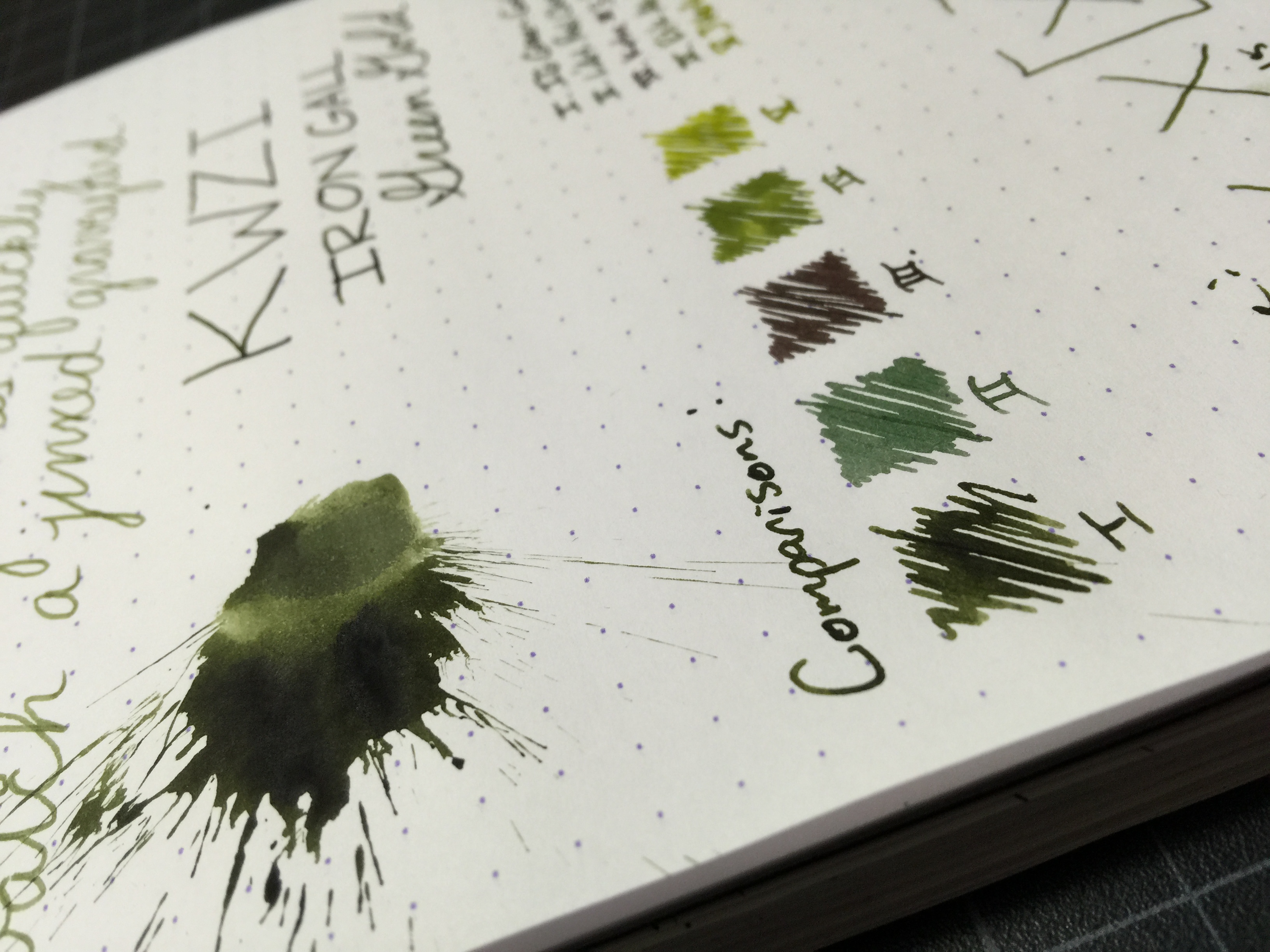
I love the color green, and have found that I have a fascination with iron gall inks.  Not because of the permanent properties, but because of the roots of iron gall ink and its history in our country and the world as the ink that many historical documents were written on.  KWZI IG Green Gold is quite unique.  The first thing you'll notice is that the ink is a very bright green when first laid down on the page - I liken it to Iroshizuku Chiku-rin.  Immediately after you start writing, though, it will begin to oxidize before your eyes and turn a deep golden green color.  It's amazing how fast the color changes.  Before you can write out an entire sentence, the first words are starting to darken.  This is starkly different than other iron galls I've used, (Registrar's & the R&Ks) as those don't darken nearly as much and do so over a much longer period of time.

IG Green Gold immediately after swabbing

Aside from the things that make it unique, IG Green Gold is a very nice, well-behaved ink.  I find it to flow very nicely, and it doesn't feather at all on typical fountain-pen paper.  It is highly saturated, so shading is only moderate at best, depending on how wet your pen writes.  If you notice on my written review, my pen (a Kaweco with a less than desirable feed) was writing very dry until I did the ink splatter, so you can see a difference in the way a pen will write being dry vs. wet with this ink.  Unintended, but it worked out!  The ink has a fairly lengthy dry time at 18 seconds, though it was with a wetter writing nib that had been recently "primed."

The ink doesn't really compare to anything I've seen yet - hence why KWZI is such a draw to folks; but here are a few that are somewhat close.  I find Diamine Safari is decently close, though not really comparable.  KWZI's Green Gold (non-iron gall) is close, but still quite different.

Notice how much darker the swab is now

Chromatography shows only greenish-blue, yellow and the faintest hint of grey.  I'm curious as to whether that grey is due to the iron gall property, though I can't be certain.  I let this one soak a bit too long so the greenish-blue is almost gone, but hopefully you'll get the gist.

Being an iron gall, I know you'll be wondering about ease of cleaning.  I've had the ink in my pen for a little over a week now, and just flushed it with no issues.  I'm not one to keep an ink in my pen for months, so I caution you to practice good pen maintenance with any iron gall ink that you use.  I find them to be stubborn but not impossible even when I've left it in for a few weeks.

I highly recommend you check out KWZI if you can.  The line has some great variety of color, with lots of uniqueness.  Also check out Ink by the Ml - not affiliated with either, just a happy customer.

Thanks for reading!
Lori

Ink Review: Iroshizuku Ina-ho

ina-ho-header

Iroshizuku Ina-ho (Rice ear) 
Pen: Lamy Safari (F)
Paper: Rhodia Dotpad 80gsm
Shading: high
Saturation: low to medium
Flow: wet
Dry Time: 9 seconds

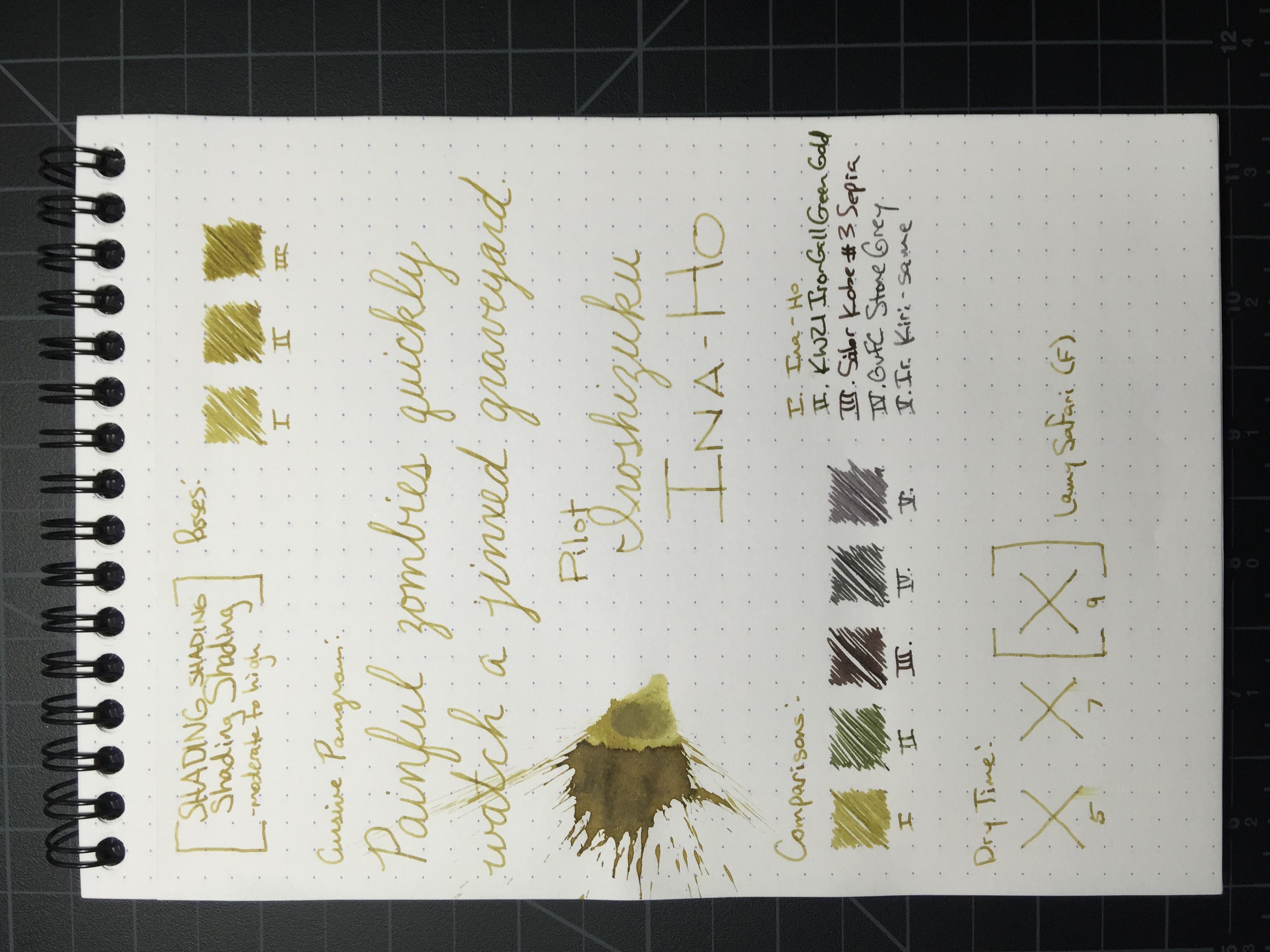
I've had my eye on Iroshizuku Ina-ho for quite some time now.  I always looked at it whenever I placed an order, but never got a sample.  For some reason the color was different enough to draw my attention, and eventually I did break down and get a sample.  I am very glad that I did.

Ina-ho or "rice ear" is a very unique ink.  Its a pale brown color with some distinct gold tones and is an AMAZING shader.  I would never have thought that I'd fall for a brown ink, but I really love this one.  I love it so much that I may end up getting a full bottle.

ina-ho-review

Aside from it's awesome shading characteristics, Ina-ho has a great dry time at around 9 seconds from my Lamy F nib.  Being an Iroshizuku ink, it flows very nicely and doesn't feather or bleed in the slightest.  The ink really glides across the paper, which is a big draw for me.

Chromatography was very interesting for this ink.  It has some blue, pink and yellow - if you're into easter colors, you'll love the chroma sheet!

ina-ho-chroma

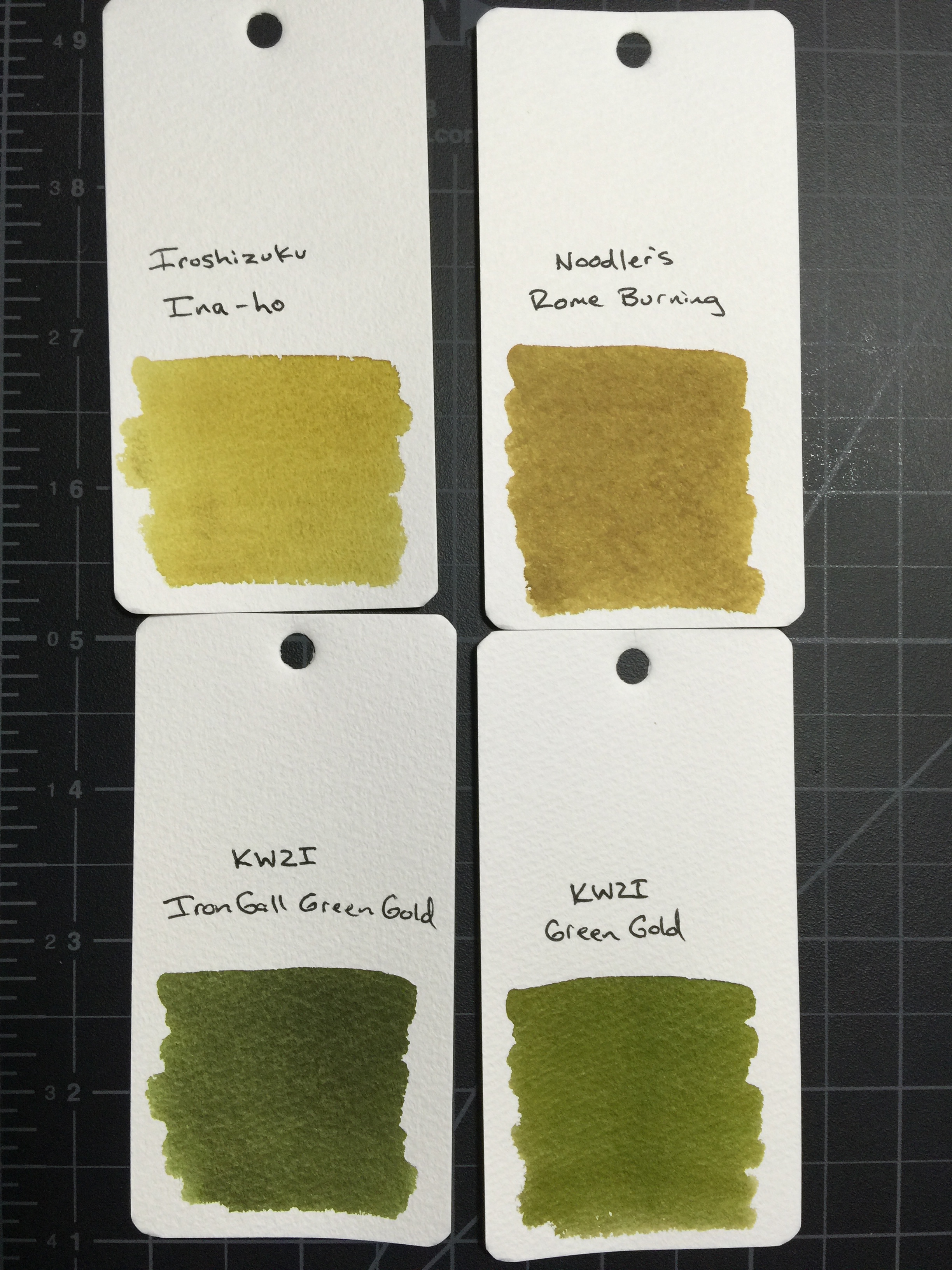
You're getting some sneak previews of inks I haven't reviewed yet here, but Ina-ho compares closest to Noodler's Rome Burning as far as the inks I currently have.  I haven't decided yet which one I like better, but I'm thinking Ina-ho will win out.

ina-ho-swabs

All in all, Ina-ho turned out to be a very pleasant surprise for me.  I think I'll look into checking out more gold & brown ink colors.  If you're interested in a bottle for yourself, you can get the full size bottle for $28, or a mini bottle (15mL) for between $10.50 or $14 at Vanness Pens or JetPens respectively.