Review: Cain Cigar Box Pen Case from BamaPens
You may remember a little over a month ago when I reviewed my OSOK and Hoyo de Monterrey boxes from BamaPens. Shortly afterwards John reached out to me when he read on my review that he'd forgotten to put the rubber feet on my OSOK box. He immediately made it right and sent me some rubber feet in the mail to apply to my box. I was very pleased that he would go to the trouble of doing that, completely unsolicited by me.
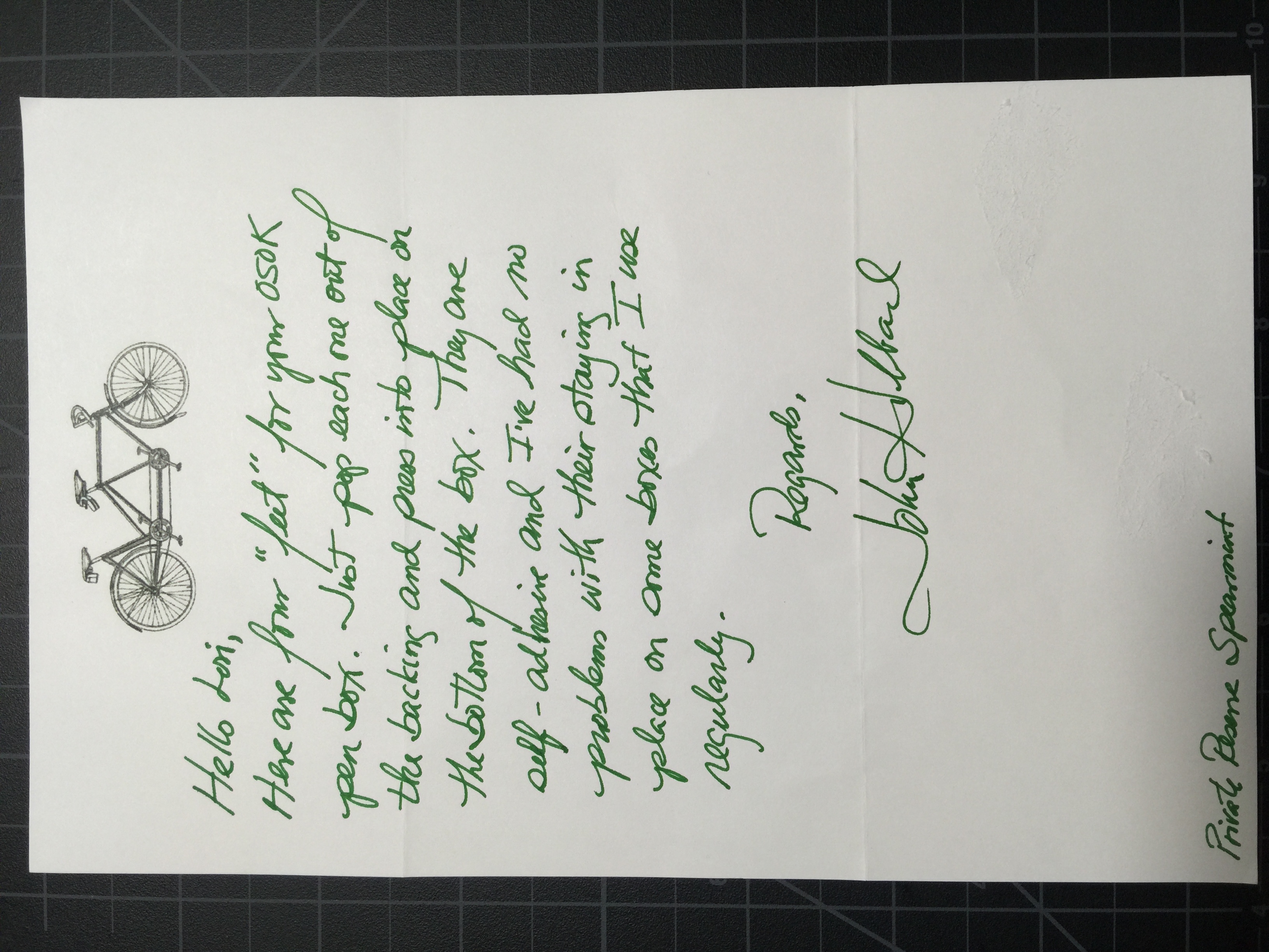
I love John's stationery
In speaking to John at that time, I asked him if he happened to have any boxes like the ones he's sold Brad Dowdy with the glass top. A glass top box was what I'd really wanted as a nice display for my pens. He said he had exactly one left, and offered it to me with whatever color lining I'd like. He was also nice enough to offer a small discount as a returning customer, which I thought was an awesome gesture.
After about a week or so John emailed that he had completed my new box and sent it on its way to me. Just like last time, the packing was impeccable - it would have taken a small explosion for this thing to get damaged in transit. He also sent along another nice note with my purchase.
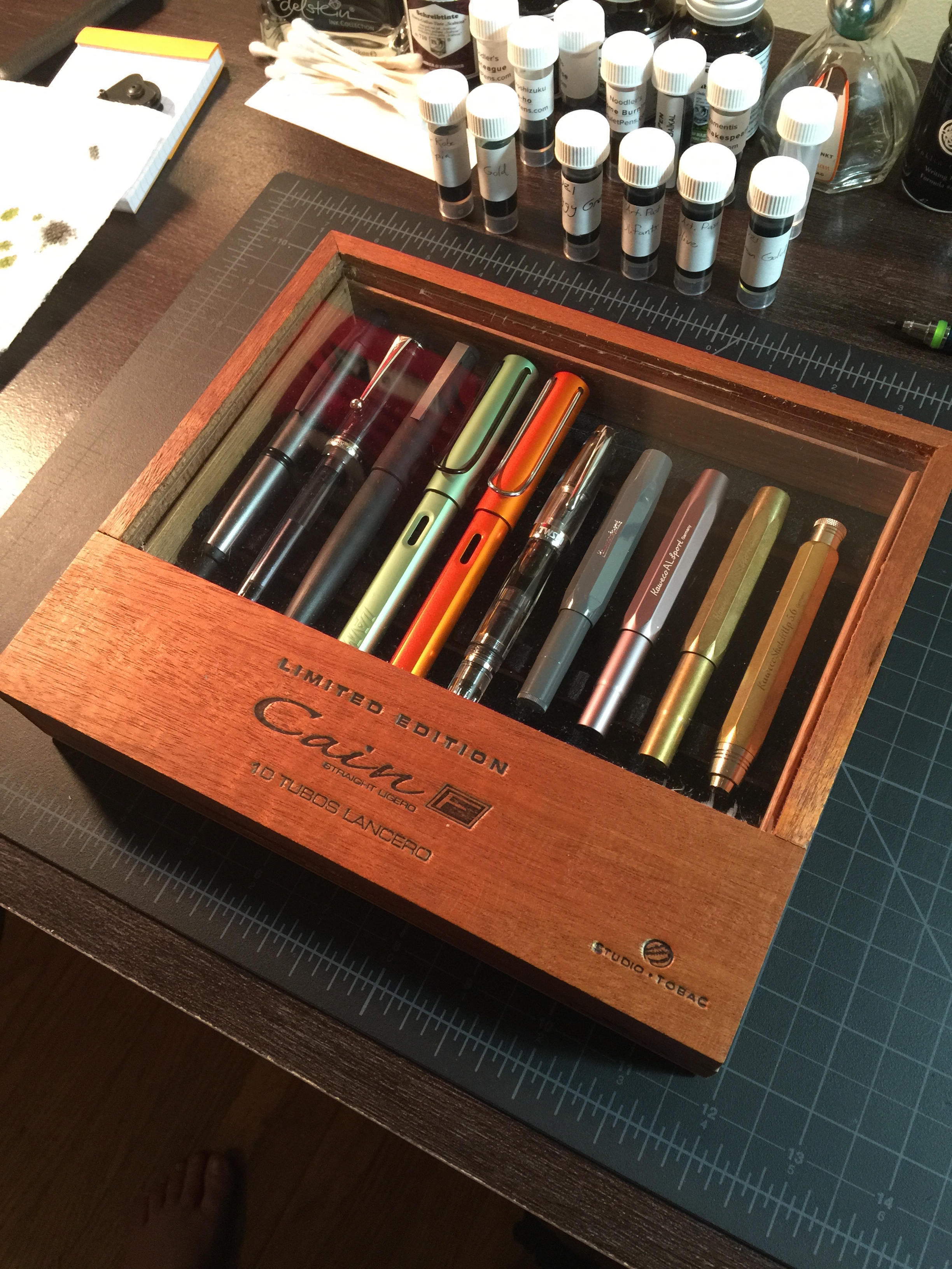
As much as I loved the OSOK box that I purchased from John, this is the one that I fell in love with. For the price, you can't beat this as a pen display box and it's got a bit of a rustic feel to it.
I noticed that the glass on the box was a bit scratched up, but I kind of expected that given that it's intended purpose was to house cigars. I'm sure the manufacturing tolerances on these things aren't the tightest when it comes to things like scratches and scuffs. The box has some nice stamped logos on the top and sides, which I really liked. The "Cain" logo itself kind of appeals to me.
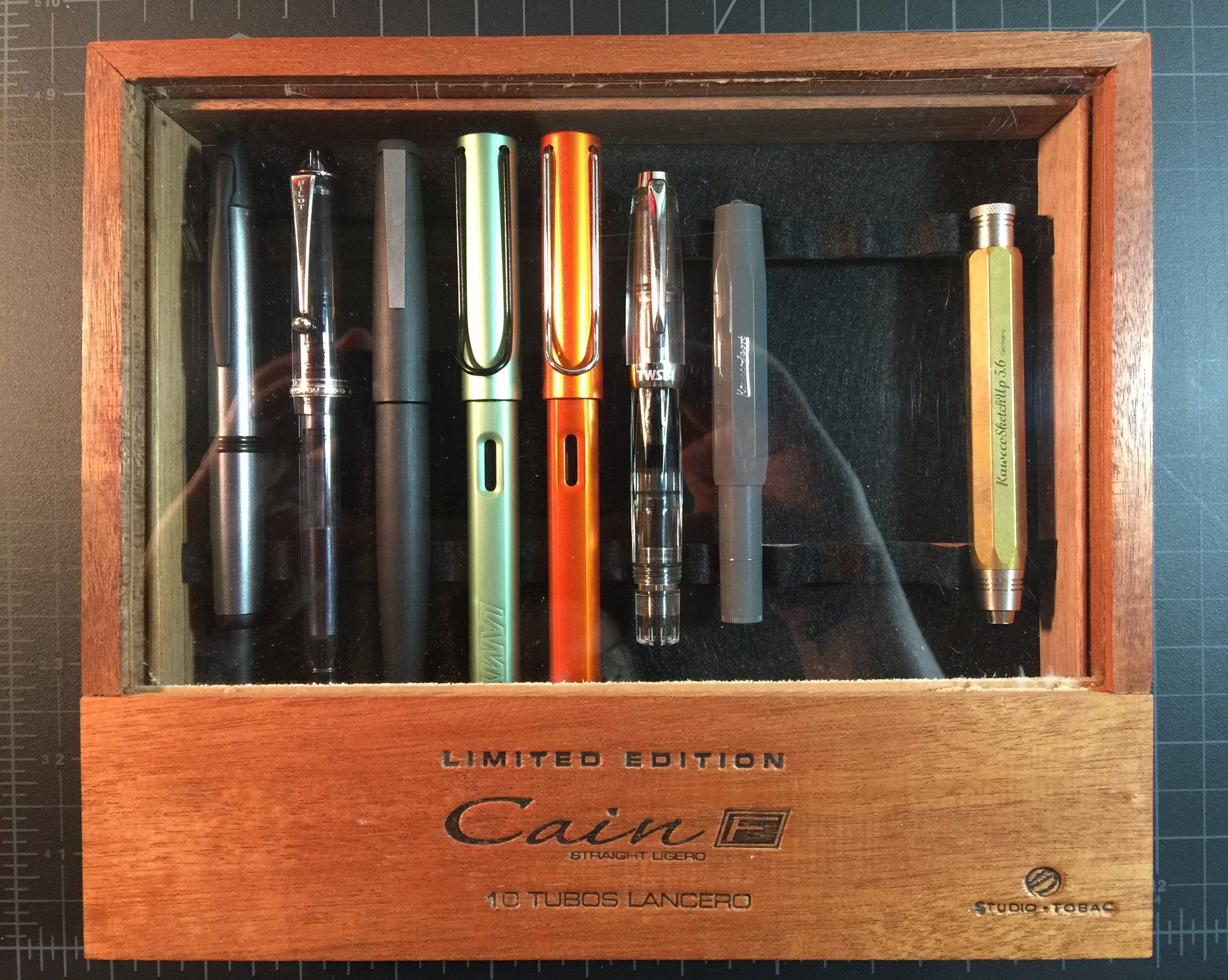
The front of the box has a nice indention so that you can easily open the lid. The inside has 10 pen slots that John has covered in a nice black felt that I chose. He offers both felt lining and suede in various colors on his website. I really love the black lining in this box as it allows the pens to stand out. John also applies a foamy rubber sheet to the bottom to prevent the box from sliding around. I found it to work really well.
Once again I was very pleased with my purchase from John. If you're looking for storage and/or display boxes for your pens, I highly recommend you check out his website. If you're looking for something that's not on his site, be sure to shoot him an email because I've found that he has more in stock or readily available than he has time to list on his site.
Thanks for reading!
Lori