Ink Review: J. Herbin 1798 Amethyste de l'Oural

amethyste-de-loural-header

J. Herbin nearly broke the fountain pen & ink internet when they released their first "shimmering" ink, Rouge Hematite.  To my knowledge, this was the first fountain pen ink that contained glittering flakes, giving the ink a sheening quality beyond that provided by the ink characteristics alone.  Since the release of Rouge Hematite, they added 3 more beautiful shimmering inks to the 1670 Collection, all of which were highly anticipated and sought after.

The company is now releasing a new line of shimmering inks, the 1798 Collection.  These two dates are significant markers in the company's history.  1670 marked the year that J. Herbin, who was then a sailor, traveled through India to gather ingredients which he brought back to Paris for manufacturing sealing wax and inks.  It was in this year that he established his trading and shipping business "Herbin."  In 1798 as steel nib dip pens began to replace quill pens for writing, Herbin relocated and expanded the business into production & influence.

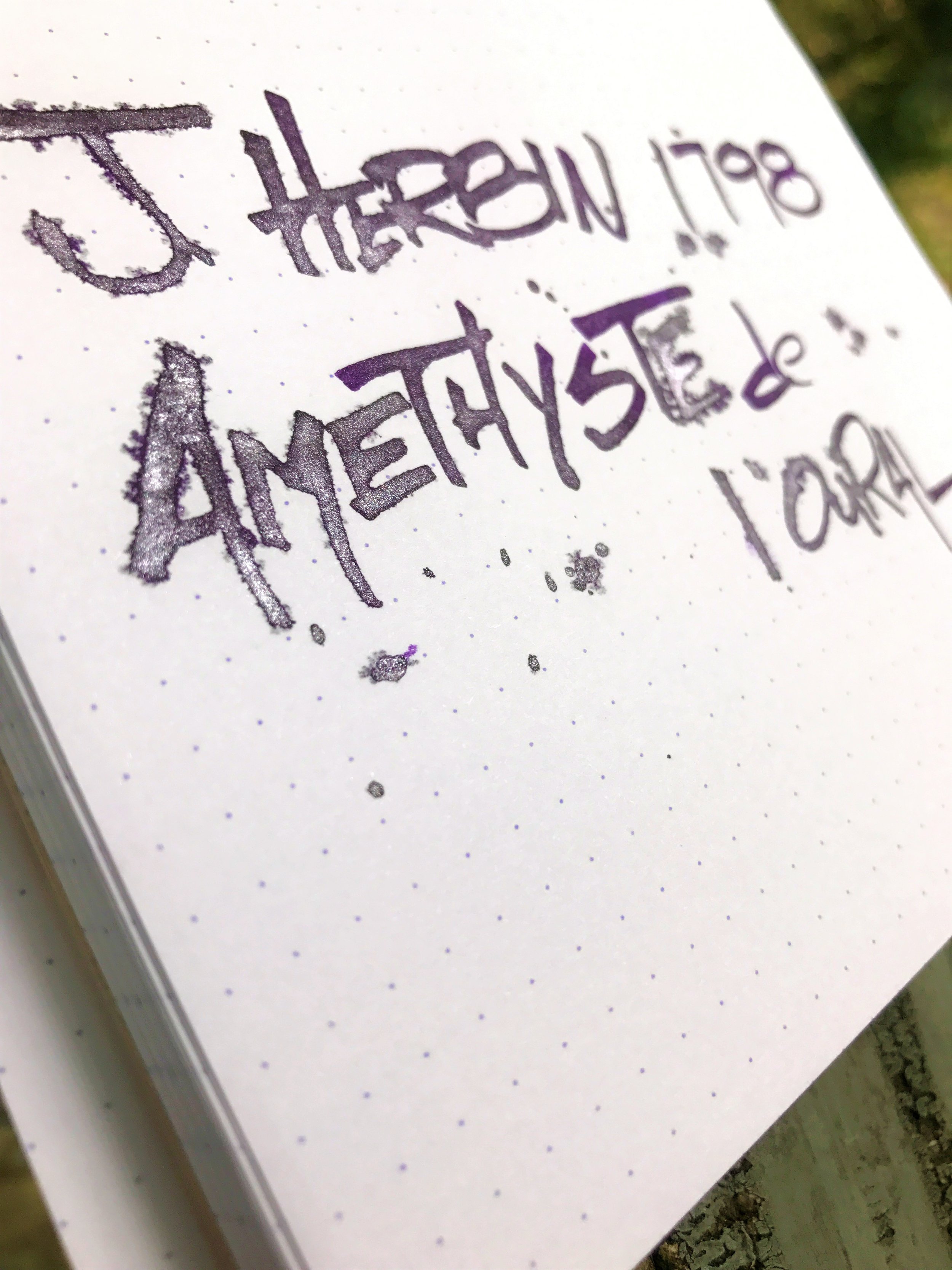
Lovely silver shimmer!

The first ink in this new 1798 line is called Amethyste de l'Oural, which translates to "Amethyst of the Ural Mountains."  The name is inspired by the trading of gemstones in the 16th and 17th centuries.  The ink is a nice mid-to-dark purple with a beautiful silver shimmer.  Though I'm not a huge fan of shimmering inks from a practical everyday-use standpoint, I do appreciate their beauty, especially for artistic applications.  They're fantastic for writing invites, or just a nice letter to a friend who you want to impress.  I've seen some amazing calligraphy work on Instagram using these inks - admittedly something I could never pull off myself!  I've always been a sucker for purple inks, so of all the shimmering inks that J. Herbin have released, I think this one may be my favorite.

The packaging on the 1798 Collection is similar to that of the 1670 Collection, though a few notable improvements have been made.  Most notably, the opening of the bottle is much wider, making it easier to fill your pen when the bottle gets low.  The cap also has a thicker wax coating on it which gives a nice grip when opening the bottle.  The bottle shape is the same, but they've added a small label to the front to indicate the ink's name, which is a nice touch.  They've also changed the ribbon that wraps around the mouth of the bottle to a nice silky silver string versus the somewhat cheap-looking gold string that was on the 1670 bottles.  A nice hidden touch is the J. Herbin logo that's been embossed or stamped into the glass.

J. Herbin logo

The ink itself is very well behaved, even in my heaviest of pens I got almost no feathering or bleed.  There is a bit of show-through on my Rhodia pad with heavier nibs like a Broad or a 1.1 stub.  Unfortunately, the ink does feather quite a bit if you drip or pour it on the page, which made my folded nib work a little difficult.  If you're doing flex nib or folded nib lettering, you may want to use Tomoe River or a heavily ink-resistant paper.  I don't have any BB or BBB nibs in my collection, but I'd venture to guess that those might cause a bit of feathering as well, depending on the paper.  The silver shimmer comes through nicely on the page and it provides a nice contrast against the purple.  The two colors go well together - I'm so glad they didn't choose a gold shimmer for this ink, the silver just looks really nice.

Heavy drops caused some feathering.  Fortunately, only with the folded nib, and not with the actual fountain pen.

The ink is fairly saturated, so you don't get a ton of shading, but I think there's enough going on with this ink that shading would just distract from the color and shimmer.  One thing that struck me as I was writing, is that the ink almost feels lubricated - similar to the Noodler's eel series of inks.  My pen isn't particularly silky smooth, but the ink seems to smooth out the friction between the nib and the page, more so than other inks I've used.  J. Herbin doesn't advertise the ink to be lubricated, but it does feel very nice.

Dry time was respectable, at between 18 and 20 seconds depending on how heavy you write and what nib you're using.  My tests were done with a Lamy M nib.  I had no trouble cleaning it out of my pen after about a week and a half of having it in there.  In my experience, the Diamine Shimmertastic inks are tougher to clean out of pens than the J. Herbin 1670 Collection inks.  That seems to hold true with the 1798 Collection as well.

Chromatography was very interesting - all of the silver shimmer stayed at the bottom with the tiniest bit of brown, and the ink itself shows a light pink tone throughout which ends in a tiny bit of medium purple.  The ink's shade of purple sits somewhere in between Diamine Bilberry and Noodler's Purple Martin.

amethyste-swabs

Overall I was very pleased with this ink.  I think J. Herbin are doing awesome things with their special edition collections, and I'm very excited to see what the next color will be in the 1798 line.  Amethyste de l'Oural will go on sale September 1st, and the recommended retail will be around $26 - check your favorite retailer on that date as I'm sure these will go fast!

Let me know in the comments what you think about the new 1798 Collection and Amethyste de l'Oural!  If you have any questions, feel free to post them below as well.  If you'd like to stay up to date on the latest reviews at The Desk of Lori, feel free to join my mailing list!  Thanks for reading!
-Lori

(The lovely folks at Exaclair have provided this product at no charge to The Desk for the purpose of review.  My opinions are honest and without bias - visit the About Me page for more details).

Pencil Review: Caran d'Ache Swiss Wood

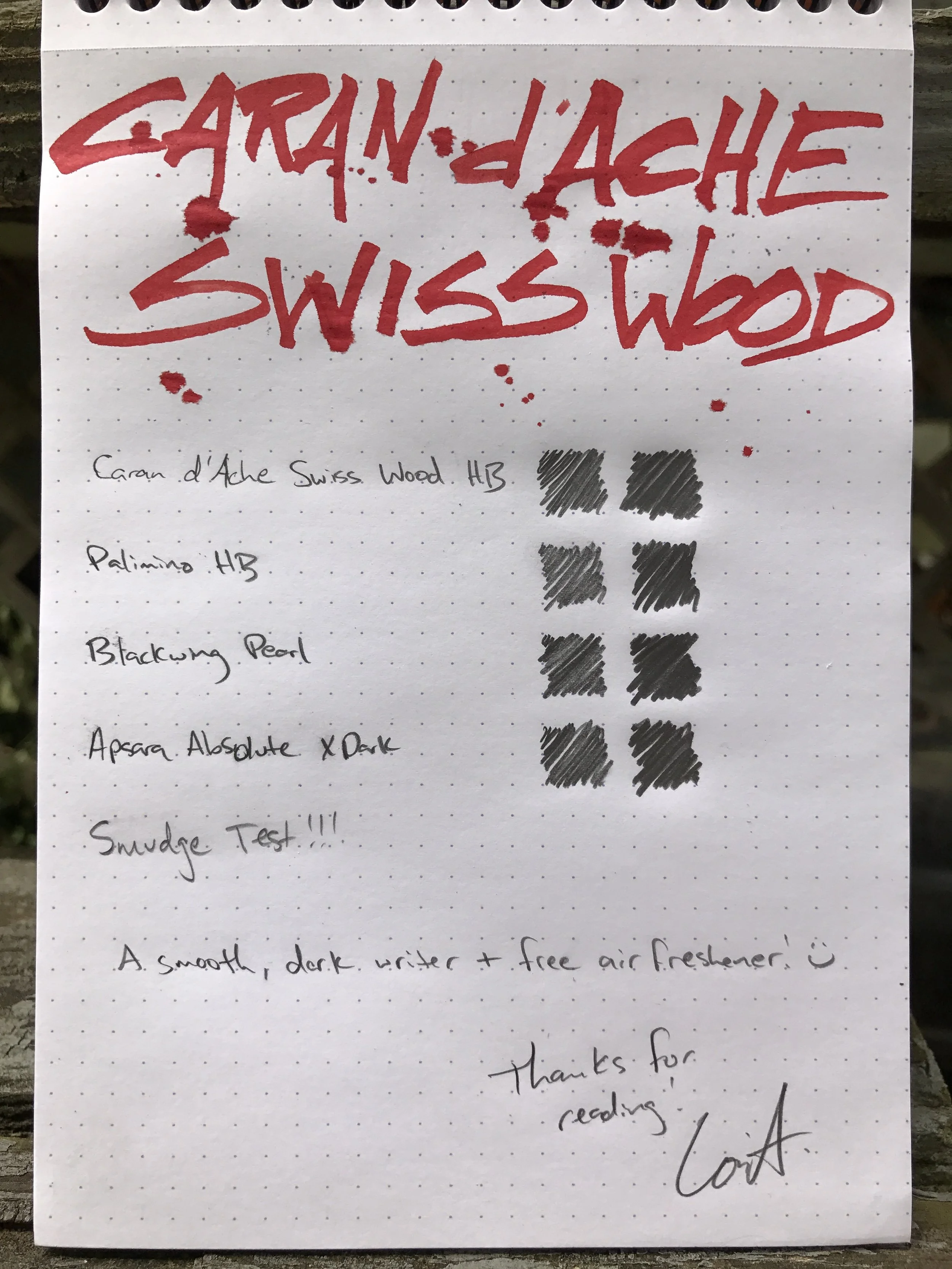
swiss-wood-header

Hey guys! Long time no talk!  I've admittedly neglected the blog recently, and to be perfectly honest...lots of cool video games came out, life got busy, and I'm planning my wedding that's coming up this October!  So, things have been a little hectic, but I'm kicking myself in gear and getting back to business here at The Desk of Lori!

I decided that to get back into the swing of things, I'd do my first PENCIL review!  During my hiatus, I started listening to the Erasable Podcast, and though I have never been a fan of wood-cased pencils, they ignited the stationery nut in me and I gave it a shot.  I now have some favies and a decent collection that I definitely want to share with you guys.  I wanted to start out with a pencil that has quite a reputation in the community, and (spoiler) is one of my absolute favorites: the Caran d'Ache Swiss Wood.

One of the first things you'll notice about this pencil is that it has a very unique fragrance.  From what I've seen on the Erasable Facebook group (check it out if you're not a member!), is that about 50% of people love it, and the other 50% of people absolutely hate it.  I'm part of the former group, and LOVE the smell of this pencil!  Most people that don't like it so much think it smells like soy sauce.  I think it has a very unique smell, kind of spicy/earthy and hard to describe.  I also don't eat Chinese food, so maybe that's why I just don't get the soy sauce fragrance.  I love having it in my Nock Co. Chimneytop because it makes it smell amazing!

Another thing you'll notice immediately is that the wood is very dark, unlike most pencils you see.  The Swiss Wood is made from Beech Wood from the Jura Rainforest, which is absolutely gorgeous.  The pencil appears to be a raw wood finish, but it does have a slight lacquer on it.  It's nice and subtle, though, so when I use it I feel like I'm using an non-lacquered pencil.  The pencil features a red dipped end with the Swiss cross on it, and I've found that I much prefer pencils with no ferrule and eraser on them.  The pencil is ever-so-slightly fatter than your standard pencils that you'll find at the store, so be cautioned that this one may not fit in all pencil sharpeners.  I use a Mobius & Ruppert Grenade sharpener and it works perfectly.

I may have borrowed Mr. Dudek's idea of putting shavings into a metal ashtray :)

The "lead" in this pencil is graded as HB, which is the same as #2 for the Americanized grading system.  An HB sits at the insection of darkness and hardness for pencils, so it's a perfect daily use grade.  What I will say about this pencil in particular, is that I find the HB for this one to be just *slighly* lighter than most other HBs that I have used.  As such, it also holds a point forever, which is another one of my favorite features of this pencil.  The graphite is nice and buttery smooth, and a pleasure to write with for long writing sessions.  The Swiss Wood is slightly heavier than most pencils, so you may notice more fatigue with this one than you do with some others.

As amazing as this pencil is, it does come at a steep price tag.  C.W. Pencils sells it for $4.50, and I've seen it other places online for up to $5.  I personally think it's completely worth it, but it may not be for everyone.  There are plenty of other pencils out there that write just as well for significantly less money, but if you like fancy & unique pencils, I urge you to give this one a try.  If you're anything like me, you'll be totally hooked!

The Swiss Wood holds up well in comparison with some of the darker pencils I have.

Thanks for stopping by! Keep an eye out on the blog - I plan on releasing some other pencil reviews, some more pen & paper reviews, and eventually some ink reviews as well.  If there's anything in particular you'd like to see, do let me know.  I love hearing from you guys!  If you'd like to be notified via email when I post, hit the Subscribe button and sign up.

Review: Kaweco Leather Traveler's Case

kaweco-leather-case-header

Kaweco Leather Traveler's Case
Size: 5.75" x 4.5"
Capacity: 6 pens + a few accessories
Material: Tan leather (outside) & tan suede leather (inside)

Most of you that have followed me probably know that I have a loyalty to Nock Co. and their awesome pen cases.  It would really take quite a bit for another case to pull me away from those, unless it fit a pretty specific use-case that Nock doesn't cover.  Still, I was eager to give this Kaweco case a try, because I love the products that Kaweco produces.  Unfortunately, this case isn't going to be replacing anything in my rotation any time soon.  Let's talk specifics...

The Kaweco Leather Traveler's Case is nice and portable in it's 5.75" x 4.5" stature, and features a slightly toothy camel-colored outer leather cover.  It feels like there is sturdy cardboard or maybe even some sturdy plastic inner liner for stability.  On the inside it features a nice suede tan leather inner liner, as well as a protective flap of the same material and a net holder for accessories.  You'll only be able to fit small things in the net like ink cartridge boxes, converters, etc.  Not a ton of room there, but those are the typical things you'd probably be carrying in there anyways.

A tight fit.

This case isn't a terrible case at all.  On the contrary, it's fairly well built, and protects pens quite nicely.  I did, however, find the pen slots to be fairly narrow and tight, which made it a little bit frustrating to use.  There's something to be said for a balance between being snug enough to hold the pens securely, and being just loose enough to be able to move them in and out without much fuss; this case kinda fails in that way.  I used this case for about 2 months, and the elastic of the pen slots loosened only ever-so-slightly - which isn't necessarily a bad thing.  If your pens fit perfectly, you really don't want them to loosen up, but I found it really difficult to get them in and out.  The slots are also pretty close together so once you get your pens in there, they're practically touching.  I can't help but think they intended this to be used with their line of pens only, which as you know are quite a bit smaller than most - Liliputs, Sports, etc. - even though the Sport even struggles to fit in there.

The flap lays off-center, to the left, even when pulled tight without pens in the case.

Another thing that bugged me a bit about the case was the protective flap on the inside.  It wasn't the flap itself, I actually find that to be a nice addition for extra protection.  The issue is that when the flap was sewn into to case, it was sewn just a tad off center.  So even when the case is empty, the flap lays off to the left slightly.  It may just be my OCD, but it does bug me.  With pens in the case, it can exaggerate the issue, and it can sometimes put the off-center flap in the way of the zipper.

Speaking of the zipper, the case does have a very nice leather pull on the zipper, making it easy to find when you're ready to zip/unzip the case.  I did find the zipper to be fairly stiff.  An (almost) square case like this doesn't lend to a very responsive or smooth zipper, because it tends to stop or "hang" at the corners; but I do think this one is especially stiff when compared to something like a YKK zipper that I've seen on other products.  This one doesn't have any markings on it, so unfortunately I don't what brand it is.

I hated giving this case a somewhat negative review, because when I first saw it I thought it was beautiful and I couldn't wait to try it out.  In use, it just didn't push my buttons like I thought it would.  The case wasn't a failure on the whole - it was just a number of small issues that bothered me enough that I just can't use this in my daily carry.  Along those lines, we should talk about the price.  This case retails for between $107 to $118 depending on where you purchase it.  I honestly do not believe for a second that this case is worth that kind of money.  As a rule, leather cases are quite a bit more expensive than most, but this case only holds 6 pens and has a couple fit and finish issues - I just don't see the value there.  If you like leather, you can pick up an Aston 10 pen case for $64 and an Aston 20 pen case for $90 from Goulet.  If you prefer no leather and some added color, go for a Nock Co. case - you can get the Lookout 3 pen case for $25, the Brasstown 6 pen case (plus extra storage) for $40, and others - all made in the US.  Both the Nock and Aston cases have more comfortably sized pen slots and are quite a bit less expensive.  I would really only recommend the Kaweco case if you love the look of it, and have some money to burn.  

(Kaweco has provided this product at a discounted cost to The Desk for the purpose of review.  My opinions are honest and without bias - visit the About Me page for more details).
Wanna be notified when new posts hit the blog? Head over to the Subscribe page and sign up for email notifications!

Pen Review: Kaweco Ice Sport (Black)

kaweco-ice-sport-header

Kaweco ICE Sport (Black) [M]
Paper:
Rhodia 80gsm #16 blank (top staple)
Ink: Kaweco Sunrise Orange
Length Capped: 105mm
Length Posted: 132mm
Length Uncapped: 100mm
Section at Thinnest Point: 9mm
Section at Widest Point: 10mm
Weight w/quarter barrel of Ink & cap: 10.5g
Weight w/quarter barrel of Ink & no cap: 6.3g
Fast writing: Keeps up fairly well; couple of skips
Upside down writing: Pretty dry.
Wetness: Dry.
Pros: Can be eyedroppered, lightweight, lots of color options & nib sizes
Cons: Nibs can be finicky, may be too light for some, no really *good* converter options (see below)

Kaweco's ICE Sport is a demonstrator version of their flagship Kaweco Sport.  The pen has the classic octagonal cap design, with the finial sporting the 3-syllable Kaweco logo.  The body is a clear plastic with a section matching the color of the cap, which holds a standard a steel Bock nib.  The pen is pocked-sized, which nice for portability, and it posts to a comfortable size for regular writing.  This version is one of the new colors that Kaweco has introduced to this line, and is my personal favorite.  They also have some other really neat colors like a florescent yellow, florescent orange, red, pink and many others. 

What distinguishes the plastic Kaweco Sport pens from their aluminum and brass counterparts is the fact that they can be eyedroppered.  If you're unfamiliar with that term, converting a pen to an "eyedropper" allows you to fill the barrel with ink instead of installing a cartridge or a converter (after adding a little silicone grease to the threads).  Many people buy the Sports just for this reason, and with the ICE sport being clear, you get the added effect of being able to see your ink sloshing around in the barrel - which also lets you know how low your level is!  The Kaweco pens are too short for a standard international converter, and unfortunately most of the Kaweco squeeze or plunge-type converters have been less than desirable to the masses, so eyedroppering is really the best option in my opinion.  I've used the Templar Skinny Mini converter in my Brass and AL versions, but for the plastic I much prefer to eyedropper for both the ink capacity, and the look.  Some folks have reported having burping issues with eyedropper pens; I've been fortunate not to experience that.  I use my pens more for burst writing sessions instead of longer ones, and usually the cause is when the air in the pen is heated up by the hands.

Like a lot of Kaweco pens I've used, the nib suffered from a case of baby's bottom.  It's a medium nib, but much to my liking, it wrote on the finer side of the spectrum.  I don't care for super wide nibs anyways, so it was a pleasant surprise.  I've heard a lot of people say that even Kaweco's broad nibs write closer to a western medium.  I'm not sure if this is the case for all Bock nibs, or if Kaweco's are slightly different.  Either way, I had to do some tuning on this one, and I still don't think I quite have it where I want it yet.  Because this is a medium I think the issue is a little bit worse than it has been on some of my fine nibs.  I will say that once they're tuned, they're really a pleasure to write with, just don't be surprised if you have to work on them a little bit.

The pen itself is very comfortable to hold and use.  It is very light, though - between 6 and 10 grams depending on whether you use the cap, and slightly more if you have more ink in it.  It may be a little too light for some folks, but I find it very comfortable.  It's a little too short for me to use comfortably without posting, but it certainly can be done depending on your hand size.

So far, I've found the pen to be easy to clean, even when eyedroppered.  I've had this ink in here for quite a while and it washed out just fine; I recommend using a q-tip to dry the barrel once you're done rinsing it, and at worst you can fill the barrel with some pen flush and let it soak a bit to get a more stubborn ink out. 

I really enjoyed this pen, aside from the nib troubles.  It's a beautiful design, and I'm a sucker for demonstrators.  Kaweco have a great selection of colors with the ICE Sport, so you're likely to find something that'll suit almost anyone's taste.  If you're interested in eyedroppering your Sport, I recommend Goulet Pens' silicone grease, but you can use just about any 100% pure silicone grease.  The Kaweco ICE Sport sells at most US retailers for around $25; if you love a good demonstrator and want a good pocket/purse pen with a high ink capacity, you can't go wrong at that price!

(Kaweco has provided this product at no charge to The Desk for the purpose of review.  My opinions are honest and without bias - visit the About Me page for more details).

Wanna be notified when new posts hit the blog? Head over to the Subscribe page and sign up for email notifications!