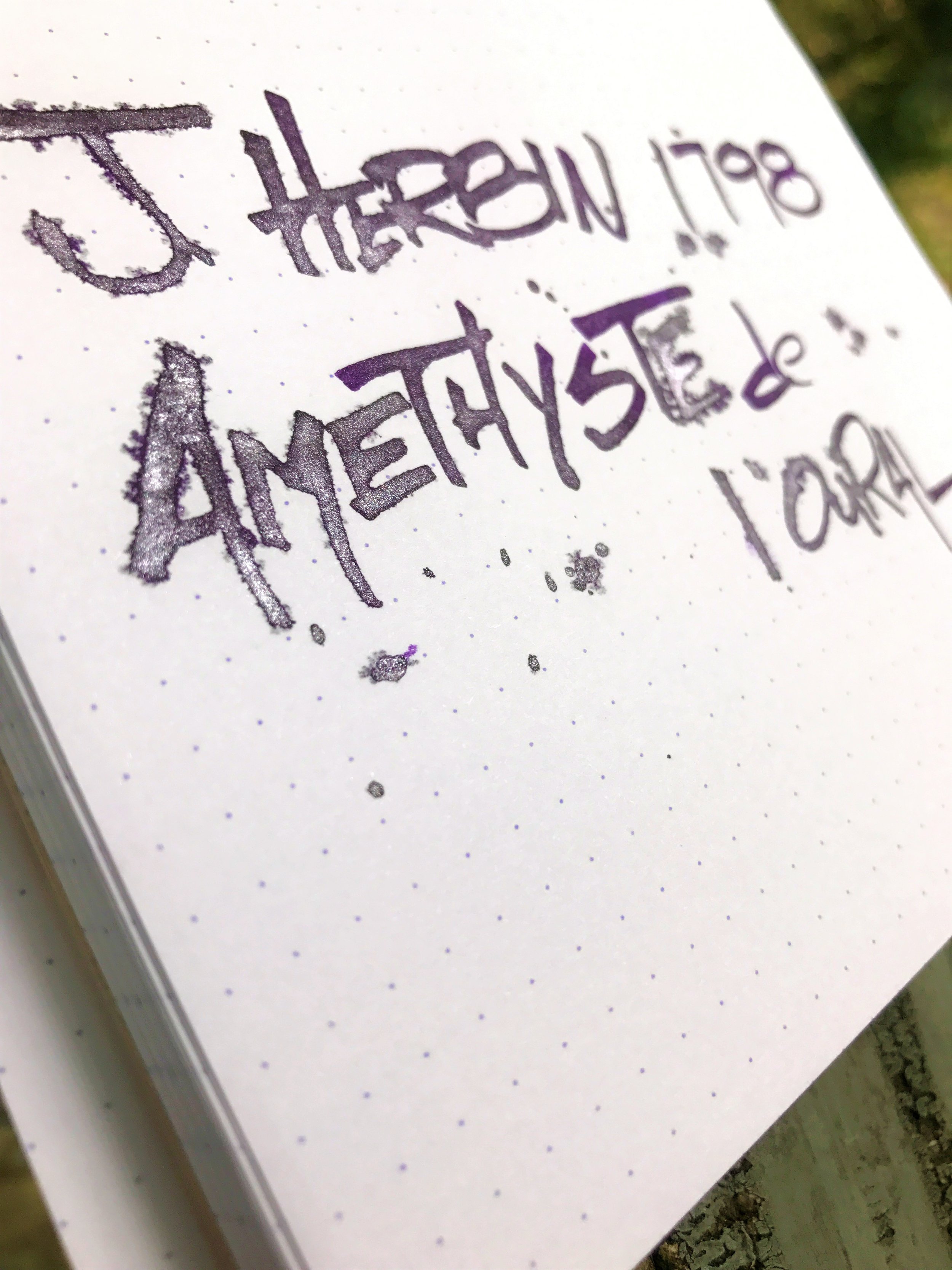
Ink Review: J. Herbin 1798 Amethyste de l'Oural

amethyste-de-loural-header

J. Herbin nearly broke the fountain pen & ink internet when they released their first "shimmering" ink, Rouge Hematite.  To my knowledge, this was the first fountain pen ink that contained glittering flakes, giving the ink a sheening quality beyond that provided by the ink characteristics alone.  Since the release of Rouge Hematite, they added 3 more beautiful shimmering inks to the 1670 Collection, all of which were highly anticipated and sought after.

The company is now releasing a new line of shimmering inks, the 1798 Collection.  These two dates are significant markers in the company's history.  1670 marked the year that J. Herbin, who was then a sailor, traveled through India to gather ingredients which he brought back to Paris for manufacturing sealing wax and inks.  It was in this year that he established his trading and shipping business "Herbin."  In 1798 as steel nib dip pens began to replace quill pens for writing, Herbin relocated and expanded the business into production & influence.

Lovely silver shimmer!

The first ink in this new 1798 line is called Amethyste de l'Oural, which translates to "Amethyst of the Ural Mountains."  The name is inspired by the trading of gemstones in the 16th and 17th centuries.  The ink is a nice mid-to-dark purple with a beautiful silver shimmer.  Though I'm not a huge fan of shimmering inks from a practical everyday-use standpoint, I do appreciate their beauty, especially for artistic applications.  They're fantastic for writing invites, or just a nice letter to a friend who you want to impress.  I've seen some amazing calligraphy work on Instagram using these inks - admittedly something I could never pull off myself!  I've always been a sucker for purple inks, so of all the shimmering inks that J. Herbin have released, I think this one may be my favorite.

The packaging on the 1798 Collection is similar to that of the 1670 Collection, though a few notable improvements have been made.  Most notably, the opening of the bottle is much wider, making it easier to fill your pen when the bottle gets low.  The cap also has a thicker wax coating on it which gives a nice grip when opening the bottle.  The bottle shape is the same, but they've added a small label to the front to indicate the ink's name, which is a nice touch.  They've also changed the ribbon that wraps around the mouth of the bottle to a nice silky silver string versus the somewhat cheap-looking gold string that was on the 1670 bottles.  A nice hidden touch is the J. Herbin logo that's been embossed or stamped into the glass.

J. Herbin logo

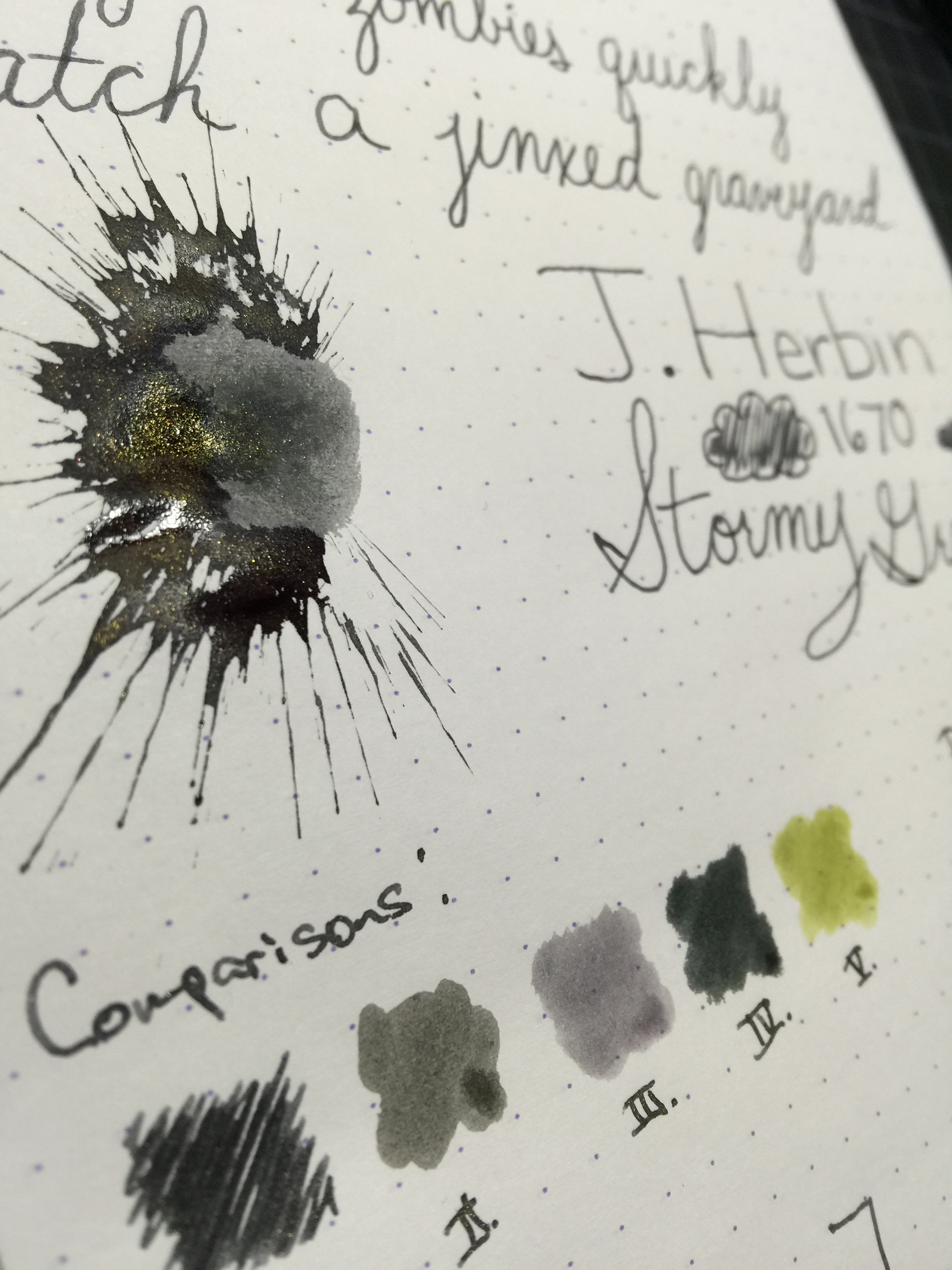
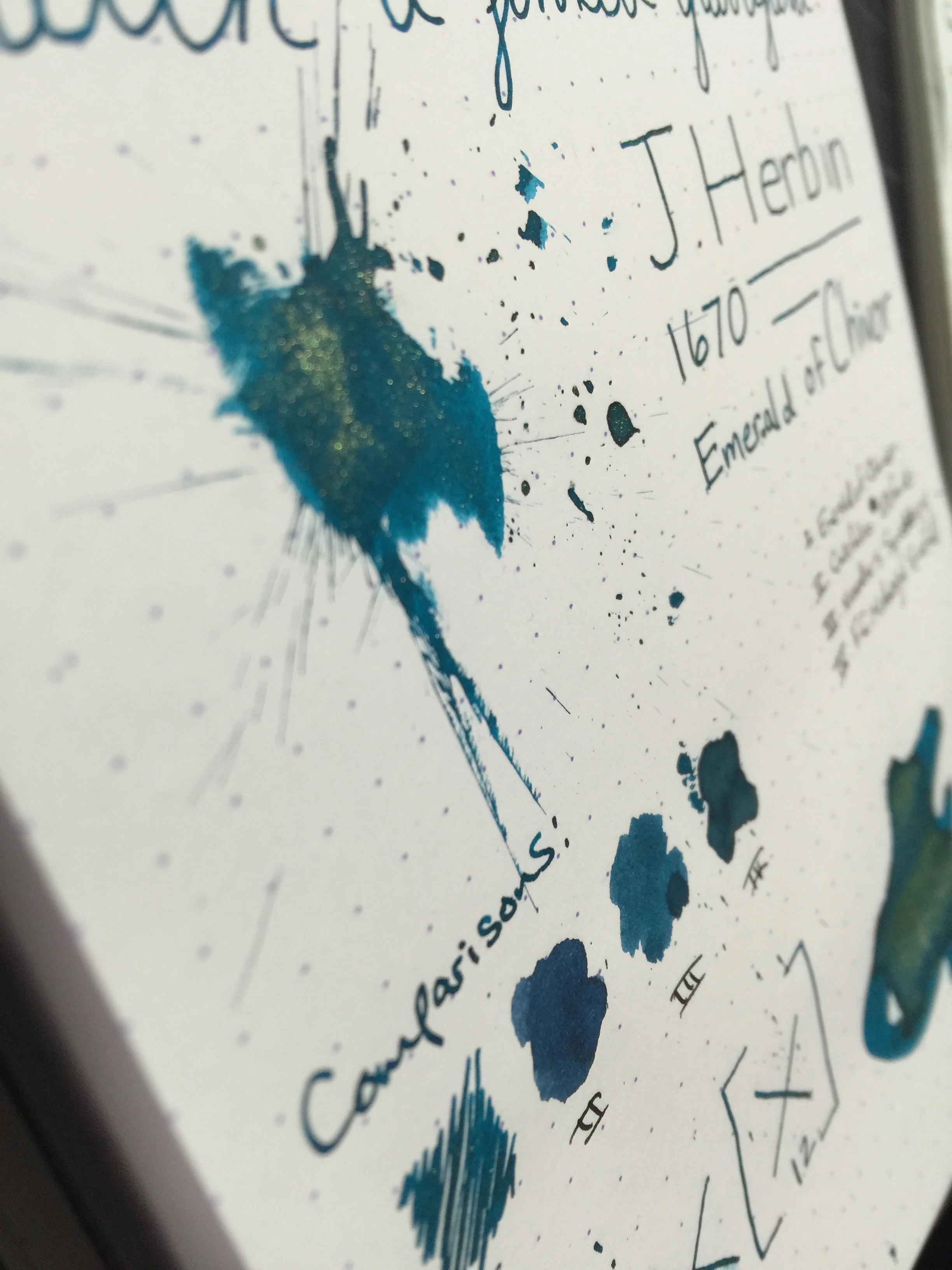
The ink itself is very well behaved, even in my heaviest of pens I got almost no feathering or bleed.  There is a bit of show-through on my Rhodia pad with heavier nibs like a Broad or a 1.1 stub.  Unfortunately, the ink does feather quite a bit if you drip or pour it on the page, which made my folded nib work a little difficult.  If you're doing flex nib or folded nib lettering, you may want to use Tomoe River or a heavily ink-resistant paper.  I don't have any BB or BBB nibs in my collection, but I'd venture to guess that those might cause a bit of feathering as well, depending on the paper.  The silver shimmer comes through nicely on the page and it provides a nice contrast against the purple.  The two colors go well together - I'm so glad they didn't choose a gold shimmer for this ink, the silver just looks really nice.

Heavy drops caused some feathering.  Fortunately, only with the folded nib, and not with the actual fountain pen.

The ink is fairly saturated, so you don't get a ton of shading, but I think there's enough going on with this ink that shading would just distract from the color and shimmer.  One thing that struck me as I was writing, is that the ink almost feels lubricated - similar to the Noodler's eel series of inks.  My pen isn't particularly silky smooth, but the ink seems to smooth out the friction between the nib and the page, more so than other inks I've used.  J. Herbin doesn't advertise the ink to be lubricated, but it does feel very nice.

Dry time was respectable, at between 18 and 20 seconds depending on how heavy you write and what nib you're using.  My tests were done with a Lamy M nib.  I had no trouble cleaning it out of my pen after about a week and a half of having it in there.  In my experience, the Diamine Shimmertastic inks are tougher to clean out of pens than the J. Herbin 1670 Collection inks.  That seems to hold true with the 1798 Collection as well.

Chromatography was very interesting - all of the silver shimmer stayed at the bottom with the tiniest bit of brown, and the ink itself shows a light pink tone throughout which ends in a tiny bit of medium purple.  The ink's shade of purple sits somewhere in between Diamine Bilberry and Noodler's Purple Martin.

amethyste-swabs

Overall I was very pleased with this ink.  I think J. Herbin are doing awesome things with their special edition collections, and I'm very excited to see what the next color will be in the 1798 line.  Amethyste de l'Oural will go on sale September 1st, and the recommended retail will be around $26 - check your favorite retailer on that date as I'm sure these will go fast!

Let me know in the comments what you think about the new 1798 Collection and Amethyste de l'Oural!  If you have any questions, feel free to post them below as well.  If you'd like to stay up to date on the latest reviews at The Desk of Lori, feel free to join my mailing list!  Thanks for reading!
-Lori

(The lovely folks at Exaclair have provided this product at no charge to The Desk for the purpose of review.  My opinions are honest and without bias - visit the About Me page for more details).

Fountain Pen Day Giveaway - Winner!

fpd-giveaway-2016

I am once again humbled for the turnout for this giveaway - almost 300 entries!  Thank you all so much for your readership, and I hope you had an awesome Fountain Pen Day!

The winner is.......

UPDATE:  Mary did not claim her prize, so I've drawn a new winner - Brian S!  Brian, keep an eye on your email - I'll be reaching out to you to notify you that you've won!

Congratulations Mary!  Mary spent Fountain Pen Day inking up her new Lamy 2000 (love that pen).  Keep an eye on your email for a message from me - get your address to me by next Friday!  Thanks so much to everyone else for participating - I'll do another giveaway soon!

Ink Review: J. Herbin 1670 Stormy Grey

stormy-grey-header

J. Herbin 1670 Storm Grey
Pen: Pilot Metropolitan (M)
Paper: Rhodia 80gsm Dotpad
Shading: Moderate
Saturation: low
Flow: medium wet
Dry Time: 9 seconds

I picked up a sample of this ink a month or so ago, and have been using it in my Metropolitan for a while.  I've gotten a few requests for a review on it, and I was very happy to oblige.  Grey being my favorite ink color, I have thoroughly enjoyed using it.

The shade of grey that this ink exhibits is a mid-range grey, leaning more dark than light.  If I were to imagine what "stormy grey" would be, this would be it.  It is reminiscent of the dark storm clouds, with just a tiny hint of blue underneath.

Of course one of the biggest draws to this ink is the gold fleck that gives your written word a brilliant glittery sheen.  On my Rhodia pad, the sheen stands out very well, but not so much as to drown out the color of the ink itself. Its sister ink, Emerald of Chivor, has a bit more gold sheen in my experience, though with the lighter color, it works very well.

Stormy Grey has a moderate amount of shading, and gives a good balance between shading and saturation.  Dry time is rather exceptional at 9 seconds for my Pilot medium nib.  I kept the ink in the pen for roughly a week, and did not have any trouble cleaning it out - much like Emerald of Chivor.

In comparison to other greys I've used, Stormy Grey is closest to Graf von Faber Castell Stone Grey, leaning just a bit cooler on the color scale.  Noodler's Lexington Grey is a close second, and matches better on paper than it does on the swab.

Overall, I really enjoyed using Stormy Grey.  I still am not really on the glitter/gold fleck ink bandwagon, but for those that are I think this is a great choice.  Being a huge grey ink fan, I loved the color more than anything else.  If you're interested in a bottle for yourself, you can pick up a 50mL bottle for $26.00.

Thanks for reading!

Ink Review: J. Herbin 1670 Emerald of Chivor

chivor-header

J. Herbin 1670 Emerald of Chivor
Pen: Pilot Metropolitan (M)
Paper: Rhodia 80gsm & Tomoe River
Shading: moderate to high
Saturation: moderate to high
Flow: wet
Dry Time: 12 seconds or higher

The much anticipated and latest 1670 Anniversary ink from J. Herbin, Emerald of Chivor, has finally been released.  This ink had an incredible build up in the fountain pen media channels, and I was incredibly excited to see if it lived up to the hype.

Being that this ink has solid objects in it (the gold flecks), I didn't want to risk putting it in an expensive pen and potentially have clogging issues, or trouble cleaning the gold flecks out.  I chose my trusty $15 Pilot Metropolitan for the occasion because it's inexpensive, and it has a medium nib that puts down a heavy line.  In choosing a heavier-writing pen, I'd hoped to bring out both the gold flecks as well as the signature red sheen that this ink is known to have.

After inking up and writing on my Rhodia pad, I was immediately impressed with how prominent the gold flecks were in the ink.  They showed up beautifully, and the ink produced an incredibly gorgeous color with nice shading.  One thing that was missing was the red sheen - even on my Rhodia pad I could not reproduce that sheen that takes this ink from awesome to incredible.  After talking to some folks on Twitter, it hit me that I needed to try it on some Tomoe River paper - that was the ticket!

Of the "emerald" inks that I've used, Emerald of Chivor compares well to Noodler's Squeteague and Franklin Christoph Midnight Emerald.  Color-wise, I like Midnight Emerald a lot better than Emerald of Chivor, mainly because it's darker and tends to shade more.  Of course, a lot of people will buy this ink regardless of whether they absolutely love the color; it's the characteristics that is the main draw.

As far as dry time, the ink does fairly well on my Rhodia pad at about 12 seconds, but with Tomoe River it's quite a bit more.  That's to be expected of course, but something to be aware of.  A huge bit of disappointment for me was the fact that the red sheen does not present itself on anything less ink resistant than Tomoe River.  For me, that sheen is a huge factor in my enjoyment of this ink, and Tomoe River isn't always the most accessible or feasible paper choice.  Being as this ink is a bit of a novelty, you may really only use it for special correspondence, in which case Tomoe River would be a great choice.  So it really depends on how you plan to use the ink, and whether that is a deal breaker for you.

All in all, I really enjoyed my first experience with the 1670 ink series.  I have a sample of Stormy Grey that I'm very excited to try out - love grey inks!  If you wanna play around with a unique ink, pick up a bottle or sample of Emerald of Chivor - you won't be disappointed.  Just beware that you'll probably have gold flecks on your hands for a few days!

Thanks for reading!
​Lori