Ink Review: J. Herbin 1670 Emerald of Chivor
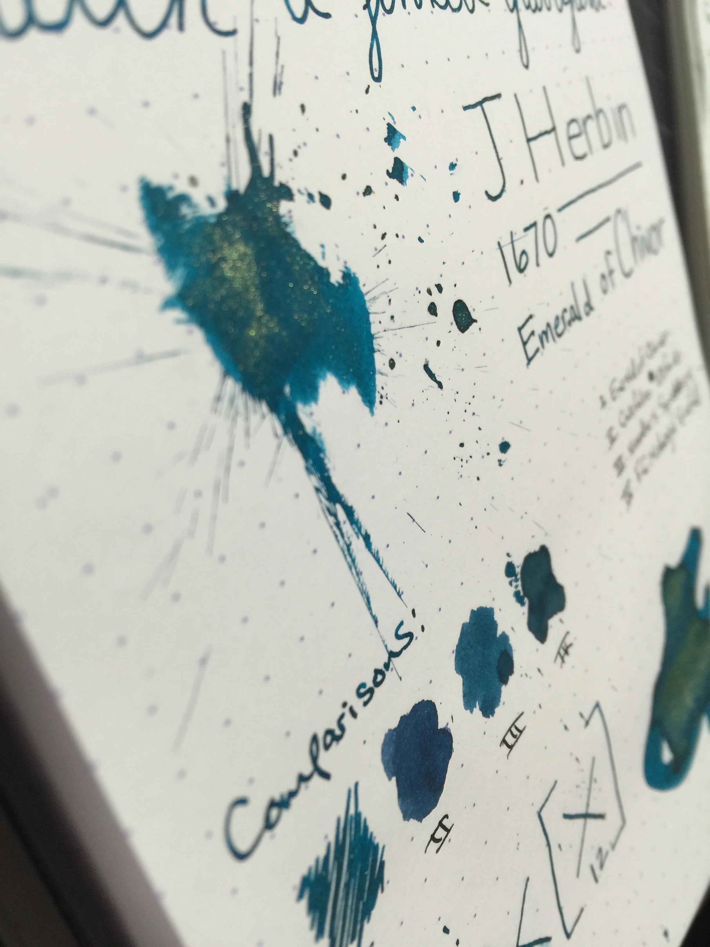
J. Herbin 1670 Emerald of Chivor
Pen: Pilot Metropolitan (M)
Paper: Rhodia 80gsm & Tomoe River
Shading: moderate to high
Saturation: moderate to high
Flow: wet
Dry Time: 12 seconds or higher
The much anticipated and latest 1670 Anniversary ink from J. Herbin, Emerald of Chivor, has finally been released. This ink had an incredible build up in the fountain pen media channels, and I was incredibly excited to see if it lived up to the hype.
Being that this ink has solid objects in it (the gold flecks), I didn't want to risk putting it in an expensive pen and potentially have clogging issues, or trouble cleaning the gold flecks out. I chose my trusty $15 Pilot Metropolitan for the occasion because it's inexpensive, and it has a medium nib that puts down a heavy line. In choosing a heavier-writing pen, I'd hoped to bring out both the gold flecks as well as the signature red sheen that this ink is known to have.
After inking up and writing on my Rhodia pad, I was immediately impressed with how prominent the gold flecks were in the ink. They showed up beautifully, and the ink produced an incredibly gorgeous color with nice shading. One thing that was missing was the red sheen - even on my Rhodia pad I could not reproduce that sheen that takes this ink from awesome to incredible. After talking to some folks on Twitter, it hit me that I needed to try it on some Tomoe River paper - that was the ticket!
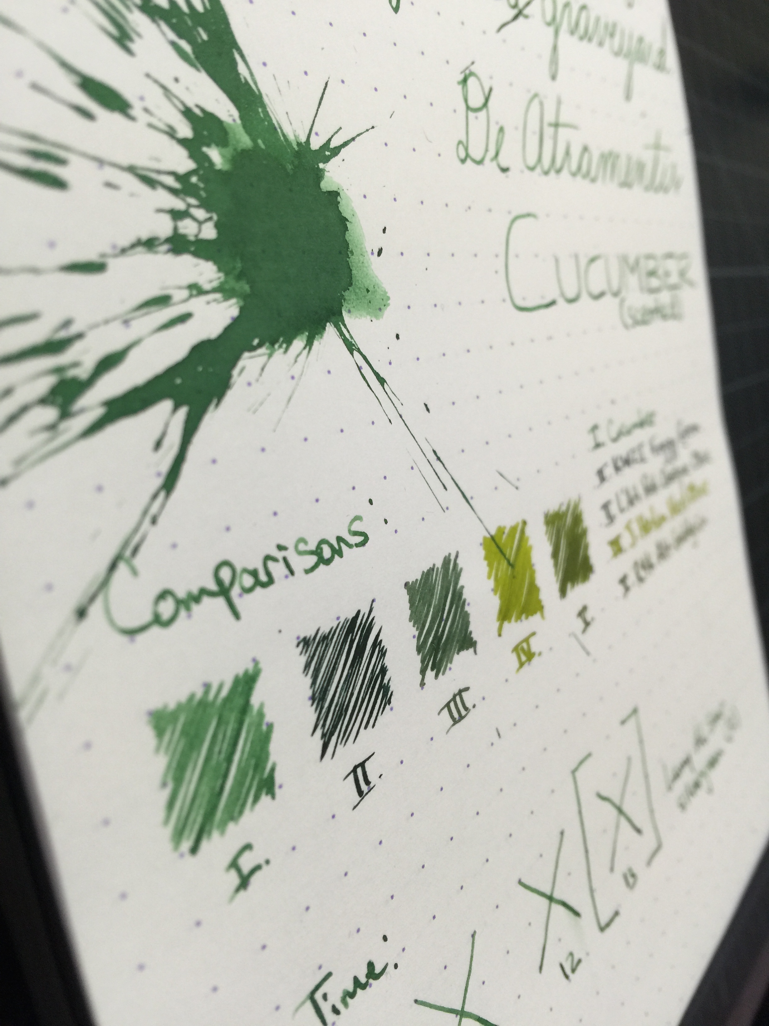
Of the "emerald" inks that I've used, Emerald of Chivor compares well to Noodler's Squeteague and Franklin Christoph Midnight Emerald. Color-wise, I like Midnight Emerald a lot better than Emerald of Chivor, mainly because it's darker and tends to shade more. Of course, a lot of people will buy this ink regardless of whether they absolutely love the color; it's the characteristics that is the main draw.
As far as dry time, the ink does fairly well on my Rhodia pad at about 12 seconds, but with Tomoe River it's quite a bit more. That's to be expected of course, but something to be aware of. A huge bit of disappointment for me was the fact that the red sheen does not present itself on anything less ink resistant than Tomoe River. For me, that sheen is a huge factor in my enjoyment of this ink, and Tomoe River isn't always the most accessible or feasible paper choice. Being as this ink is a bit of a novelty, you may really only use it for special correspondence, in which case Tomoe River would be a great choice. So it really depends on how you plan to use the ink, and whether that is a deal breaker for you.
All in all, I really enjoyed my first experience with the 1670 ink series. I have a sample of Stormy Grey that I'm very excited to try out - love grey inks! If you wanna play around with a unique ink, pick up a bottle or sample of Emerald of Chivor - you won't be disappointed. Just beware that you'll probably have gold flecks on your hands for a few days!
Thanks for reading!
Lori