Ink Review: Diamine Bilberry

bilberry-header

Diamine Bilberry - June 2015 Ink Drop
Pen: Lamy Al-Star Silvergreen (F)
Paper: Rhodia Dotpad 80gsm
Shading: low
Saturation: high
Flow: wet
Dry Time: 19 seconds

Next up for this month's Goulet Ink Drop is Diamine Bilberry.  With this month's theme being "Farmers' Market," Bilberry must have been an easy choice.  I honestly wasn't sure what a Bilberry was, so Wikipedia came to the rescue!  On first glance you might thing that a bilberry is the same thing as a blueberry, but it is actually distinct from the blueberry, but in a similar family.  It is native to Europe & the British Isles, so naturally with Diamine being a European brand they chose the name Bilberry for this deep, rich blueish purple ink. (As a side note, I think Goulet's swab of this is a little deceiving - I found it to have a little more blue tone than what their swab (or even my swab) shows).

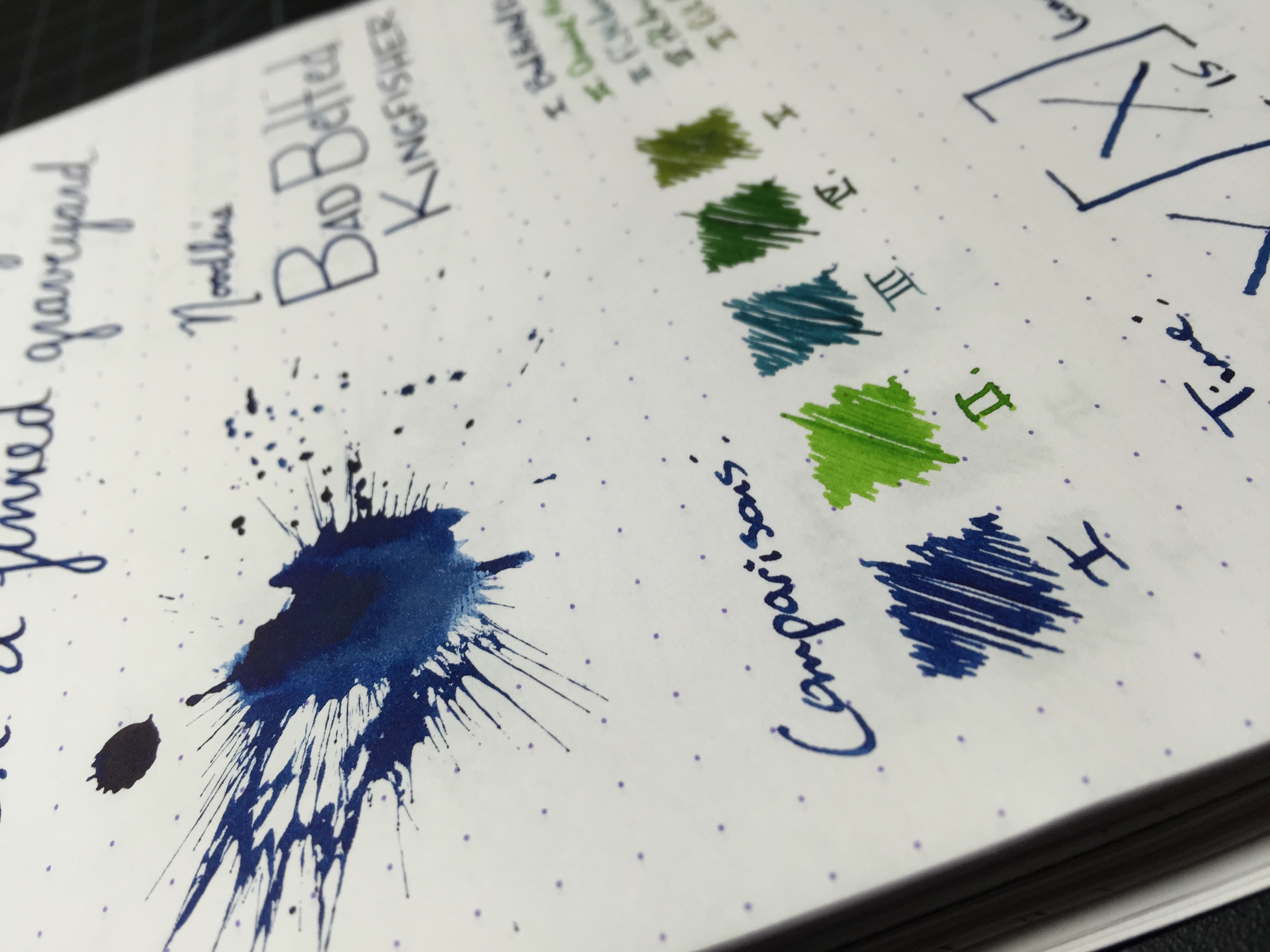
One of the coolest things about this ink is its amazing gold sheen.  If you lay it on thick you will notice right away that there is a nice halo effect that shimmers like gold flakes that you'd see in a J. Herbin 1670 ink.  Don't get me wrong, it's not nearly that pronounced, but it's definitely there.

Bilberry is a heavily saturated ink, so you don't get a ton of shading, but the heavy saturation seems to make the ink flow nicely.  It runs smooth as silk out of my Lamy F nib, and produces no feathering, bleedthrough or ghosting on typical fountain pen paper.  Dry time is a bit on the high side at 19 seconds - left handers beware.

Chromatography is just blue with the faintest hint of purple.

bilberry-swabs

Depending on your light source, this ink in swab form can look both blue and purple.  It honestly looks like you'd taken De Atramentis Hyacinth, or a similar royal blue that really pops, and mixed it with a color like Noodler's Purple Martin.

All ink all, if you love blues and purples you'll love this ink.  As an added bonus you get an incredible sheen as long as you're using a heavier writing pen.  If you're interested in a bottle for yourself, you can grab 80ml for $14.95 or 30ml for $7.50.

Thanks for reading!
​Lori

Ink Review: Noodler's Bad Belted Kingfisher

badbeltedkingfisher-header

Noodler's Bad Belted Kingfisher
Pen: Lamy AL-Star 1.1 stub
Paper: Rhodia Dotpad 80gsm
Shading: low to moderate
Saturation: high
Flow: wet
Dry Time: 15 seconds

I recently tried another one of Noodler's warden series of inks - Bad Belted Kingfisher - when a family member visited who had it inked up in his pen.  One of the more surprising things about this ink is how similar it looks to Bad Blue Heron, which is also part of the warden series.  In fact when I used it I asked him, "Is this Bad Blue Heron?"  That's one thing that's puzzled me about those two colors - why have a couple inks that are so similar to one another in the same line?  They have black, green and blue covered, so I would have liked to see a red in the mix instead of a second blue - just my opinion though.

Nathan Tardiff created the Warden Series of inks to combat both currently existing forgery techniques, as well as ones that haven't actually been observed by law enforcement as of yet.  The inks are what he calls "combination lock" inks, that have a set aging and component variable that are different on a per-bottle basis.  Essentially they each have a unique fingerprint; this makes it impossible for a forger to have an ink exactly identical to your bottle, making the forgery process nearly impossible.  In addition to the standard Bulletproof and washing-resistent properties that a lot of the Noodler's inks have, the Warden Series inks are also laser proof - pretty cool!

Bad Belted Kingfisher is a nice deep blue with a very high saturation level.  It does a great job of not feathering on good paper, though if you lay it on thick like I did with my 1.1 stub, you'll get some ghosting on the back side of the page; no bleedthrough though.  Compared to Bad Blue Heron, Kingfisher is a tad bit darker and more saturated, so there's less shading.  Heron maintains a very similar color, but has more shading and overall variation depending on how your writing.

Bad Belted Kingfisher is a great forgery-resistant ink.  If you already have Bad Blue Heron, I wouldn't bother picking up Kingfisher unless you're a completionist and want the whole warden set (trust me, I totally understand!).  You can pick up a bottle from Goulet or a similar retailer for $12.50/3oz.

Thanks for reading!
​Lori

Ink Review: Franklin-Christoph Midnight Emerald

midnightemerald-header

Franklin-Christoph Midnight Emerald
Pen: Franklin-Christoph Model 40 Pocket - Masuyama Medium Cursive Italic
Paper: Rhodia Dotpad 80gsm
Shading: high
Saturation: medium
Flow: medium
Dry Time: 13 seconds

After seeing all of the amazing photos online of Franklin-Christoph's pens, especially the "ice" models, I knew I had to have one.  Never has a company impressed me as much with their unique designs as Franklin-Christoph has.  Of course this review isn't about the pen itself, (that will come soon!) but about the ink that I bought along with the pen.

Midnight Emerald is a fairly new ink to the Franklin-Christoph line, and is one that I'm convinced will be one of their best sellers in due time.  I likely wouldn't have given an ink of this shade a second glance if it hadn't been for seeing Jeff Abbot's post on The Pen Addict.  He'd bought the same pen I was interested in, and when I saw the way this ink looked in the barrel of an eyedropper-converted Model 40 Pocket, I knew I had to have it.

Arguably the best thing about Midnight Emerald is its incredible shading properties.  With my medium cursive italic nib, it lays down enough ink to give quite a nice variation in color.  Depending on the speed at which you write, the ink will go from a deep blueish-green to a lighter medium teal.  It isn't overly saturated, and flows wet, but not so wet as to drown out the variations in color.  It doesn't feather at all on your standard fountain pen friendly papers, and there's no ghosting or bleed to speak of.

Shortly after picking up a bottle of Midnight Emerald, I grabbed a sample of Noodler's Squeteague to see how it compared.  It's actually very close in comparison, but leans more green than blue, unlike Midnight Emerald which exhibits more blue than green.  A lot of folks also compare Midnight Emerald to Sailor Yama-dori, though I've not had the opportunity to do the comparison myself yet.  From the pictures in Jeff's post, I'd say they're very close.

Chromatography shows the ink to be comprised of a royal blue, brown-ish red, and yellow tones.  I was surprised to see very little green in the mix!

If you've not tried Midnight Emerald yet, you definitely should! Unfortunately, Franklin-Christoph doesn't do ink sampling, but if you're a fan of Yama-dori or Squeteague and want an ink with incredible shading, then it's worth picking up a bottle.  You can pick it up at franklin-christoph.com for $12.50/2oz.

Thanks for reading!
Lori

Ink Review: De Atramentis Hyacinth (Scented)

hyacinth-header

De Atramentis Hyacinth (scented) - May 2015 Ink Drop
Pen: Lamy Al-Star 1.1 stub
Paper: Rhodia Dotpad 80gsm
Shading: low to moderate
Saturation: high
Flow: wet
Dry Time: 30 seconds w/1.1 stub; about 15 for a F

Once again, De Atramentis has wowed me with another one of their inks.  This time, it is 'Hyacinth,' which is from their line of scented fountain pen inks.  It was included in the May 2015 Goulet Ink Drop, which was themed "Wake Up and Smell the Roses."  An apt theme for this pollen-filled time of year.

Hyacinth is an amazingly bright and brilliant royal blue, that smells as if you've been walking through a flower shop filled with fresh flowers of the same name.  The color is such a brilliant blue, that I believe it would be a very suitable replacement for the ever-controversial Noodler's Baystate Blue.  The scent is very noticeable when writing and makes for a really pleasant experience.  Unfortunately, once the ink has been on the paper for a short while, the scent slowly fades; so it's meant mainly for the enjoyment of the writer and not the recipient of the letter.

The ink behaves quite well, as I've seen with most all of the De Atramentis inks I've used thus far.  This royal blue really pops off the page at you and even gives a bit of a red halo with heavier writing pens.  It doesn't have a ton of shading, but there is some.  Saturation is nice and high, which I really like, and the ink flows wet.  Dry time with my Lamy 1.1 stub was fairly high at 30 seconds, though not terrible for a stub.  For a regular F nib, it's about 15 seconds.

In comparison to other blue inks I have used (which are few currently), the closest in color is Lamy blue.  Keep in mind though, that this ink is worlds over more saturated and bright than Lamy blue, but the shade is fairly close.

This ink has inspired me to try more of the De Atramentis scented inks - if you have any suggestions please hit me up via Twitter, the comments below or the contact form.  I honestly just don't use a lot of blue inks, but if I were to use a blue that wasn't a blue-black, it would be something like Hyacinth.  The ink just pops out at you which is nice to see, and De Atramentis' standard line of inks are very easily maintained.  If you're interested in a bottle for yourself you can pick it up from Goulet or a similar retailer for $12.95.

Thanks for reading!
Lori