Ink Review: Diamine Terracotta

diamine-terracotta-header

Diamine Terracotta
Pen: Lamy Safari (M)
Paper: Rhodia 80gsm #16 blank
Shading: high
Saturation: moderate
Flow: wet
Dry Time: 20s in Lamy M

Spoiler alert: I LOVE this ink.  I had been wanting to try my sample of Diamine Ancient Copper for a long time now, but then I saw Goulet Pens' swab of this ink and I had to try it first.  The colors are very similar, so I may do a shootout of these two at some point.  Diamine have been producing some of the most unique fountain pen inks on the market, and have been around since 1864.  They very recently celebrated their 150th anniversary.  To commemorate, they produced the 150th anniversary ink set, which Terracotta is a part of.  Other popular inks in the set include Silver Fox, Regency Blue and the much loved 1864 Blue Black.

My ink was from a sample, but if you've not seen the 150th Anniversary Diamine bottles, you should definitely take a look.  Each bottle is a triangular wedge, and when you own the entire set the bottles fit together to make a nice circle for your desk.  Terracotta is a warm reddish-brown with an intense amount of shading.  The color variation is wide, and ranges from a dark red-brown, to a lighter brownish-orange.  The ink flows wet and lends to a smooth writing experience.  The dry time in my medium Lamy Safari was about 20 seconds on Rhodia; so not terrible, but not fast either.

Chromatography was very neat looking; it goes from a orange-red and leads up to a medium brown.  For comparisons, honestly, there aren't a ton of inks out there that match this perfectly.  Diamine Burnt Sienna is the closest I could find. Diamine Ancient Copper and Diamine Autumn Oak are darker and lighter inks respectively that are both very nice as well.

I have to say, I'm not typically a fan of brown inks, especially reddish browns.  Terracotta really changed my mind on that.  The ink just has so much character and I have already put my email on the notification list for when this comes back in stock at Goulet Pens.  I highly recommend you give this one a try!  You can snag a 40mL bottle for $15.95 at most retailers.

Leave a comment and let me know what your favorite brown ink is!
Thanks for reading!
- Lori

Ink Review: L'Artisan Pastellier Brun Ours

Brun-Ours-header

L'Artisan Pastellier Brun Ours (Brown Bear)
Pen: Jinhao x450 (M)
Paper: Rhodia #16 Blank - 80gsm
Shading: moderate to high
Saturation: medium
Flow: moderate
Dry Time: 13 seconds in fairly wet M nib

L'Artisan Pastellier Classique inks are still fairly new on my radar, but so far I'm really liking them a lot. They're made in France, and are hailed for their ability to be freely mixed to form new colors. The first one that I tried was Olive, which has become one of my favorite inks.  When I was going through my sample vials and saw Brun Ours, the color caught my attention and I had to try it.

I'm usually not a fan of browns, especially warmer browns, but Brun Ours has more of a greyish tone, which I like a lot.  It's not a heavily saturated ink, so it has a fair amount of shading.  The ink goes onto the page a warmer, medium-dark brown, and dries a cooler brown with a nice neutral grey tint.  The dry time is a tad high at around 13 seconds, but aside from that it behaves quite well with no feathering or bleedthrough on typical fountain pen paper.

One of the best parts of the L'Artisan Pastellier inks is their ease of cleaning.  They're not heavily saturated with strong dyes, and in my experience even when having them in my pen for a few weeks they clean out very easily.

The ink compares very closely to De Atramentis Maron.  Maron is a tad bit cooler and darker, but they're very close.  The chromatography shows mostly black with a tiny bit of pinkish-brown.

L'Artisan Pastellier inks are certainly becoming more and more popular, and rightly so.  Their lightly saturated colors, high shading and ability to mix make them unique and fun inks.  If you're interested in checking out their other colors or ordering a bottle for yourself, check out Vanness Pens page.  You can get a 30mL bottle for $7.  What is your favorite L'Artisan Pastellier color?

Thanks for reading!
- Lori

Ink Review: KWZI Iron Gall Gold

KWZI-IG-Gold

KWZI Iron Gall Gold
Pen: Lamy Safari, Charcoal - F
Paper: Rhodia 80gsm dotpad
Shading: moderate
Saturation: medium
Flow: medium-dry
Dry Time: 17 seconds

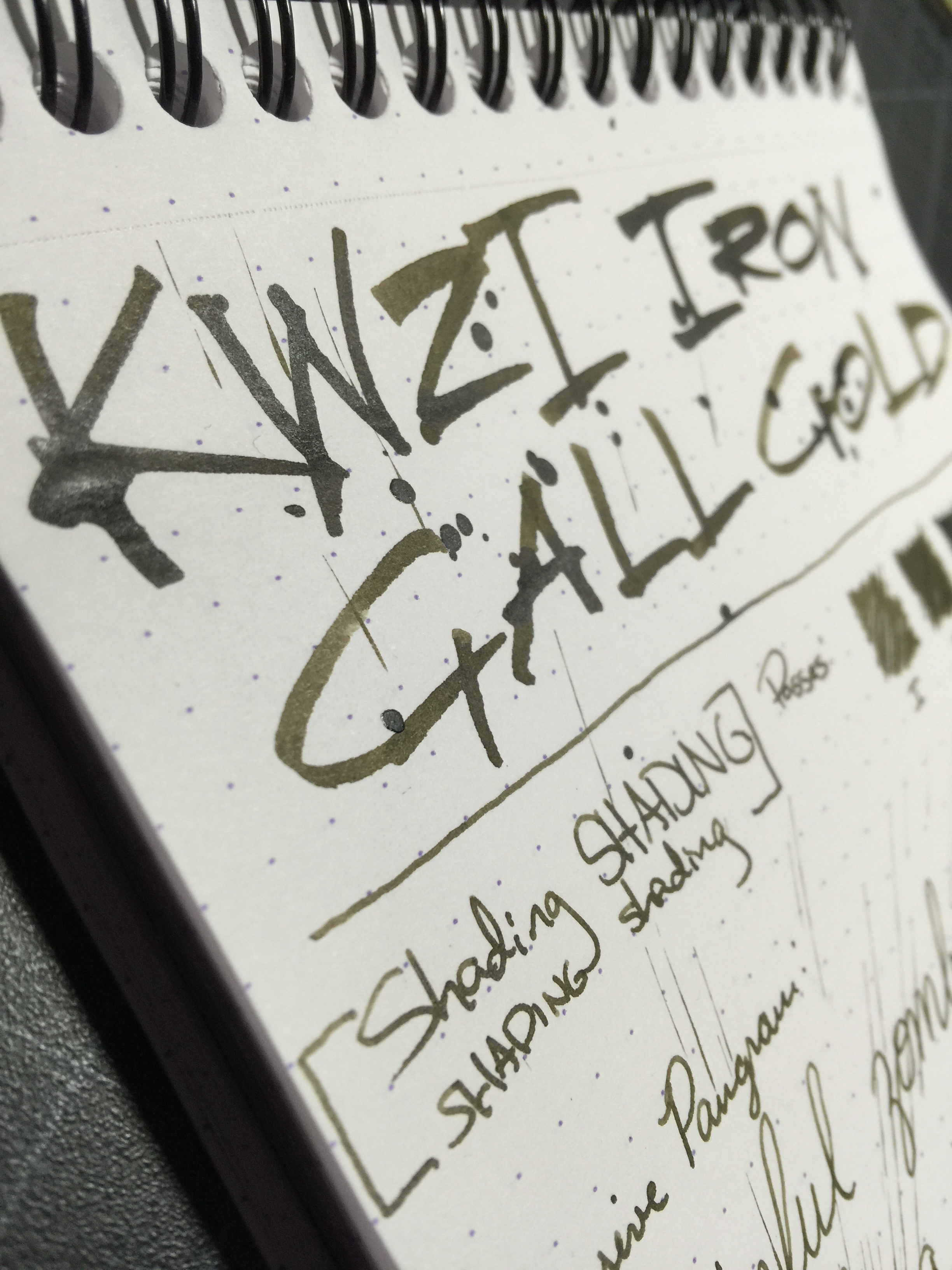
KWZI is developed in Poland by a fellow named Konrad.  He is a chemistry graduate and fountain pen user who'd been making inks for himself since 2012 - he wanted to increase the saturation of one of the inks, and his research eventually led to him developing his own line of inks for the public.  The KWZI line features colors that you just can't find elsewhere, some of which are iron gall inks that have a much wider range of colors than the few iron gall inks from the mainstream manufacturers such as Diamine or Rohrer & Klingner.

As I mentioned in a previous review of an iron gall ink from the KWZI line, I do have a fascination with iron gall inks.  Besides the benefit of their permanent qualities, they have some very cool properties that you just don't get with other inks.  KWZI's line seems to parallel much more closely with traditional old school iron gall inks, where the ink oxidizes rather quickly as you write on the page.  I did find this to be less pronounced with KWZI Iron Gall Gold than I did with their other ink Iron Gall Green Gold; but the effect is still there.  It goes on as a light golden brown and after several seconds begins darkening to a deep brown.  This effect can also mean that you may or may not have the same color that you expect once the ink is fully dried and oxidized (which can be a fun thing).  Iron gall inks do tend to have a funkier smell, so be warned.

30 seconds

4 hours

Iron Gall Gold is a well behaved ink, though I did find it to feel a tad dry coming out of the pen. The dry time was surprisingly longer than I expected given that the ink feels dry - right at about 17 seconds, with a fine nib on a Rhodia pad.  The ink wasn't at all unpleasant to use, but if you enjoy buttery smooth writing, you may want to use this ink with a bit broader nib to put more ink on the page.  It has some decent shading as you're writing, though it does become a bit less pronounced as the ink darkens from a medium golden brown to a muddy brown.  

I tried to let this swab sit for a bit before doing any color comparisons, to give the most accurate representation of final color.  It seems to sit somewhere in between Iroshizuku Yama-guri and Ina-ho.  I liken it to a more diluted version of Noodler's El Lawrence, because it has that motor oil look to it.

Chromatography of iron gall inks typically leaves a trail of dark grey/brown as it goes through the paper, and this one was no exception.  The two main colors that makeup this ink are black and yellow.

I'm often asked about whether it's harmful for pens to use iron gall inks in them.  For inks like Rohrer & Klingner Salix and Scabiosa - those seem to be more mild versions of the iron gall inks out there, so in my experience they behave close to traditional inks.  For the KWZI inks, they seem to sit somewhere between the R&Ks, and something like Diamine Registrar's (which I've heard folks have issues with from time to time).  I didn't have any cleaning issues with IG Gold, though I didn't leave the ink in my pen longer than a couple of weeks, and with regular use - which is about what I'd recommend with these iron gall inks before cleaning and refilling.  If you're using vintage pens, especially with any kind of sac filling mechanism, I wouldn't recommend using iron gall in them. Vintage pens are much harder to replace, so maybe stick to traditional inks for those pens.  I'm more of a modern pen user anyway, and in my experience as long as you practice regular pen maintenance, you shouldn't have any problems.  If you're curious, Vanness Pens has great information on their KWZI page talking about the properties and warnings about iron gall use.

I enjoyed the color of this ink more than anything.  It has a very retro feel to me, and is just different enough than a plain black ink to give your writing some character.  I could have stood for it to write a tad wetter, but I don't think I'd give up on it just for that reason.  Aside from buying straight from Konrad, you can also get the KWZI line from Vanness Pens here in the U.S. (60 ml for $14).  I can't recommend KWZI enough - they have such an amazing variety of colors to choose from and from the ones I've tried so far, they perform very well.

Thanks so much for reading!
- Lori

Ink Review: Iroshizuku Yama-guri (Wild Chestnut)

yama-guri-header

Pilot Iroshizuku Yama-guri - June 2015 Ink Drop
Pen: Lamy Al Star (F)
Paper: Rhodia Dotpad 80gsm
Shading: low
Saturation: high
Flow: wet
Dry Time: 14 seconds
Waterproofness: only the black undertone

The fourth ink in this month's Ink Drop is Iroshizuku Yama-guri.  Yama-guri, or Wild Chestnut, is an apt name for this ink, which fits right in with the Farmer's Market theme.  A warm, dark brown, the ink reminds me of milk chocolate.

Yama-guri is a very well behaved ink, as is typical of the Iroshizuku inks.  No feathering or bleed occurred in my Rhodia pad, even with the flex nib.  The ink is pretty highly saturated, so there was minimal shading, though I've found that to be the case with a lot of the darker brown inks.  Dry time was a tiny bit high at 14 seconds, and water test shows the only portion of the ink that stays behind is a dark grey or black color.

Chromatography had quite a few colors in the mix - the greyish-black base stayed put, which makes sense based on my water tests.  then there is a dusty purple,, followed by a bit of orange, yellow and pink.  The chroma sheet was nearly identical to the Kobe #3 Sepia I did a few days ago.

Speaking of #3 Sepia, this ink definitely resembles that ink on the page.  In swab form, Sepia is a little more reddish than Yama-guri, but on the page the resemblence is closer.  Yama-guri is a tiny bit lighter with certain nibs.  KWZI Green Gold has some similar brown tones, but is quite different on the page.

I am actually really warming up to some of the brown inks out there.  Yama-guri is definitely one to check into if you're looking for a good brown ink to add to your collection.  You can get a full size bottle for $28 at most US retailers, or you can get the smaller 15mL bottle for $10.50 from Vanness Pens.

Thanks for reading!
ori