Ink Review: Diamine Shimmertastic Magical Forest

magical-forest

Diamine Shimmertastic Magical Forest
Pen: Pilot Metropolitan (M)
Paper: Rhodia 80gsm
Shading: moderate
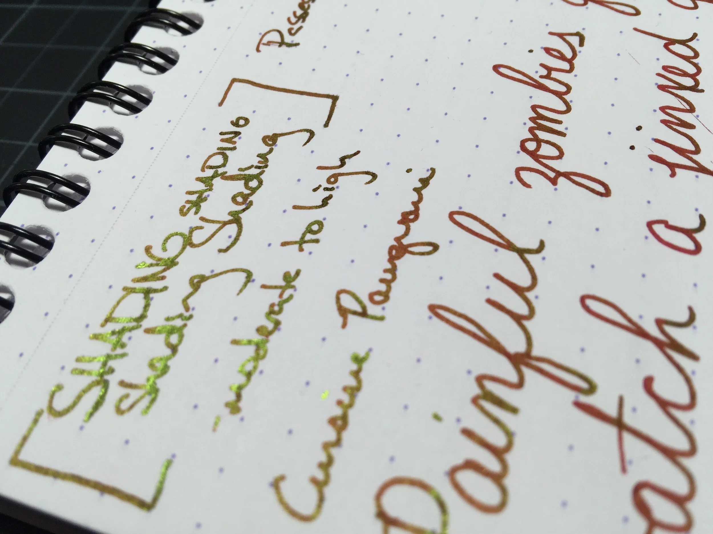
Saturation: low to moderate
Flow: medium wet
Dry Time: short; 13-15 seconds with a Pilot medium

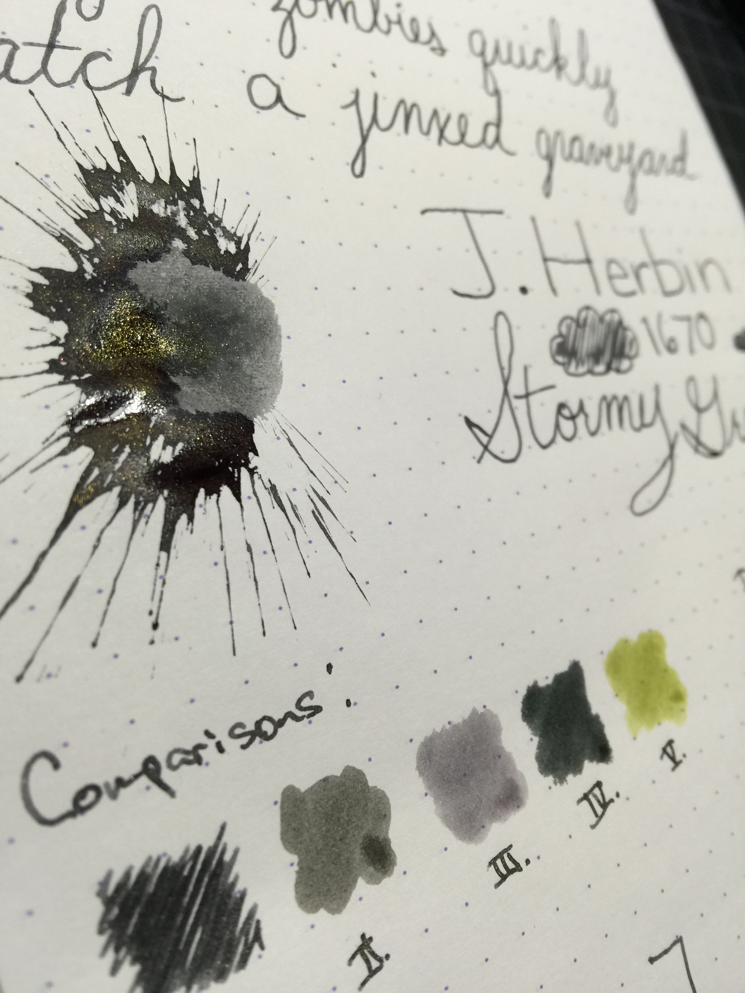
The sheening and shimmering inks craze has been in full force since J. Herbin debuted their 1670 line of inks with gold flecks in them.  Since that time, Diamine took shimmering inks to a whole different level and released their "Shimmertastic" line.  The Shimmertastic line currently consists of 10 different colors, most of which were new colors that haven't seen a simmering version before from other brands.  Magical Forest was my first test of these new inks, and I have to say I am very impressed with its balance of subtlety and uniqueness.

One of my favorite things about this ink that is different than some of the J. Herbin inks, is that is has a silver sheen, or flecks, whereas the J. Herbins had a gold sheen.  I feel like silver goes well with almost any color, and pairing it with this green was a great choice.  As far as the ink properties themselves, the ink writes moderately wet, but not too wet.  I got no feathering or bleeding on my Rhodia pad or any other typical fountain pen papers.  The dry time was good at around 14 to 15 seconds with a medium Pilot nib.  The sheen itself shows up pretty well in good lighting, but it also doesn't overwhelm the color of the ink.  This might be good and bad depending on the person - myself, I like the balance a lot.

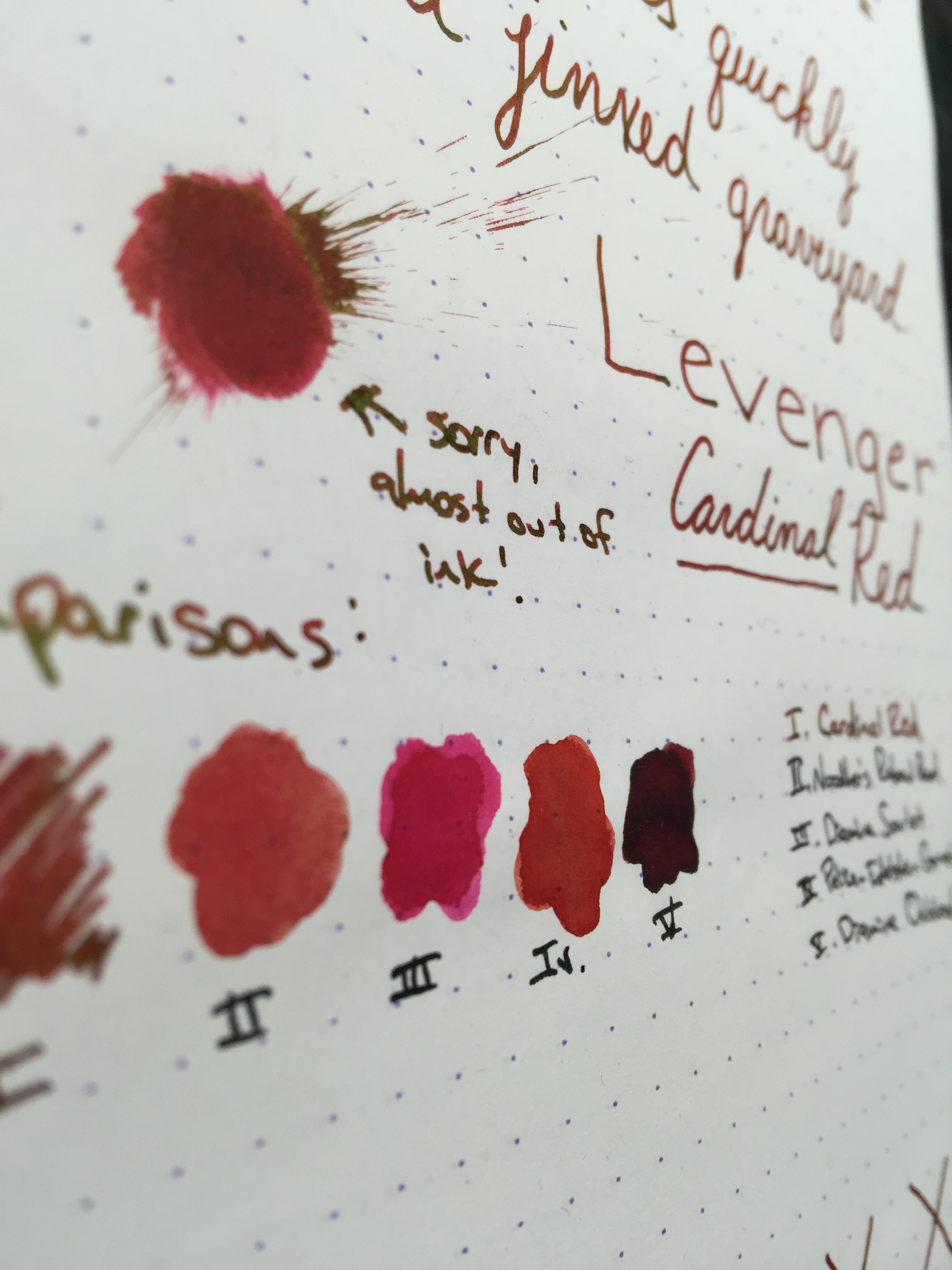
Chromatography of the ink reminds me a lot of the tie dye t-shirts we wore in middle school - very bright blue and yellow.  The ink compares closely with Diamine Woodland Green or Noodlers Gruene Cactus (it sits right in the middle).  

I really enjoyed my time with this ink.  If you're a fan of a heavy sheen or fleck in your ink, this one may not be heavy enough for you, but I feel it has a very nice balance.  Its a mid-range green, so you could easily use it in your day to day without a lot of distraction from the work you're doing.  It behaves wonderfully on most papers, and had a quick to moderate dry time.  One downside is the price - it runs $20 for a 50mL bottle at most ink vendors, whereas other Diamine inks are around $15 for 80mL.  It is a couple bucks cheaper than the J. Herbin 1670 inks, though, and you get a much bigger variety of colors that sheen.

Thanks for reading! Drop a comment and let me know what other inks you'd like to see a review of!
Lori

Pen Review: Kaweco AC Sport Carbon

AC-Sport-header

Kaweco AC Sport Carbon - Steel Nib (F)
Length Capped: 107mm
Length Posted: 131mm
Length Uncapped: 100mm
Section at Thinnest Point: 9mm
Section at Widest Point: 10mm
Weight w/Ink & Cap: 22.2g
Weight w/Ink & No Cap: 13.4g
Fast Writing: Keeps up fine.
Line Variation: Very little line variation, but you can squeeze out a tiny bit.
Upside Down Writing: Very scratchy, but it can be done if needed.
Wetness: Fairly wet writer.  This ink did contribute to that some.
Pros: Lightweight, portable, Kaweco style & dependability
Cons: May be too light for some; cannot be used long without posting; nib can be a tad scratchy.

Parts of the Pen:

Like all Kaweco Sport models, the pen features a fairly long cap with an octagonal facets.  The body is cylindrical with a step down at the end leading to an end cap with a rounded top and a dimple in the middle.  The section is tapered and flared, and has a small grouping of threads at the top where the cap screws on.  Finally, the finial is very slightly conical and features the 3-syllable Kaweco logo.  The carbon parts on the cap appear to be applied as stickers, so you do have a bit of a gap between the carbon and the aluminum edge.

Review:

Kaweco is always coming up with new creative spins on their classic style fountain pen, and the AC Sport Carbon is a good example of that.  This pen features a nice matte aluminum finish and is embellished with a nice genuine carbon wrap around the barrel, and on every other panel of the unique octagonal cap.  The pen comes in 4 different colors - Red, Champagne, Silver and Black.  

As far as how the pen writes, if you've used any other Kaweco sport pen, it functions pretty much the exact same in my experience.  This pen uses the same steel nib that comes standard on all of the other Kaweco Sports/Skylines, so the added price doesn't add anything to the writing experience itself.  I admittedly have had my hits and misses with Kaweco nibs, but this one performed fairly well.  I had a bit of an issue with scratchiness, but discovered the nib tines were misaligned out of the box.  Once that was corrected, it performed well with no hard starts and only a slight "toothiness."

One issue that kind of bugged me about this pen was that lint and dust seems to settle in the small gap between where the carbon ends and the aluminum edge begins on the cap.  It's not noticeable at a distance, but up close it's pretty easy to see.  That is one small improvement Kaweco could make to this pen to bring it up a notch.

Final Thoughts:

Overall I really enjoyed using this pen, much like all my Kaweco pens.  The style is something that very few other companies have mimicked successfully, and it is another great spin on a classic design.  Whether the extra cost is worth it is really up to what added style is worth to you.  The Kaweco AL Sport, which is just the standard aluminum body Sport, retails for $80, and the AC Sport Carbon retails for around $128 - so close to an extra $50.  I think if you really like the carbon look, it's worth it to go ahead and pick it up.  If the cost isn't worth it to you, try the AL Sport, or even the classic Sport which has a plastic body.  All are great pens for on-the-go. 

Thank you so much for reading, and thank you to Kaweco for sending this pen for review!
- Lori

(Kaweco has provided this product at no charge to The Desk for the purpose of review - I have since chosen to purchase the pen from them.  My opinions are honest and without bias - visit the About Me page for more details).

Ink Review: J. Herbin 1670 Stormy Grey

stormy-grey-header

J. Herbin 1670 Storm Grey
Pen: Pilot Metropolitan (M)
Paper: Rhodia 80gsm Dotpad
Shading: Moderate
Saturation: low
Flow: medium wet
Dry Time: 9 seconds

I picked up a sample of this ink a month or so ago, and have been using it in my Metropolitan for a while.  I've gotten a few requests for a review on it, and I was very happy to oblige.  Grey being my favorite ink color, I have thoroughly enjoyed using it.

The shade of grey that this ink exhibits is a mid-range grey, leaning more dark than light.  If I were to imagine what "stormy grey" would be, this would be it.  It is reminiscent of the dark storm clouds, with just a tiny hint of blue underneath.

Of course one of the biggest draws to this ink is the gold fleck that gives your written word a brilliant glittery sheen.  On my Rhodia pad, the sheen stands out very well, but not so much as to drown out the color of the ink itself. Its sister ink, Emerald of Chivor, has a bit more gold sheen in my experience, though with the lighter color, it works very well.

Stormy Grey has a moderate amount of shading, and gives a good balance between shading and saturation.  Dry time is rather exceptional at 9 seconds for my Pilot medium nib.  I kept the ink in the pen for roughly a week, and did not have any trouble cleaning it out - much like Emerald of Chivor.

In comparison to other greys I've used, Stormy Grey is closest to Graf von Faber Castell Stone Grey, leaning just a bit cooler on the color scale.  Noodler's Lexington Grey is a close second, and matches better on paper than it does on the swab.

Overall, I really enjoyed using Stormy Grey.  I still am not really on the glitter/gold fleck ink bandwagon, but for those that are I think this is a great choice.  Being a huge grey ink fan, I loved the color more than anything else.  If you're interested in a bottle for yourself, you can pick up a 50mL bottle for $26.00.

Thanks for reading!

Ink Review: Levenger Cardinal Red

cardinalred-header

Levenger Cardinal Red
Pen: Levenger True Writer
Paper: Rhodia 80gsm
Shading: moderate to high
Saturation: moderate to high
Flow: wet
Dry Time: LONG - 45+ seconds depending on the nib

It's been a while since I've used a red ink, so when I was loaned the Levenger Truewriter with a converter full of Levenger Cardinal Red, I was anxious to give it a go.  The ink behaved well on all of the usual ink-resistant papers I typically use, and has a nice balance of high shading and good saturation.  My page was never starved for ink, as this one flows quite well, even in drier pens.

The one problem I experienced with Cardinal Red is that it takes forever to dry.  I had to sit my page aside after finishing, as the ink took anywhere between 45 to 60 seconds to completely dry, making it bad choice for hook-handed lefties.

Despite the dry time issue, I wouldn't count this ink out just yet.  It had one feature that I absolutely love: it sheens like crazy.  In researching the ink, I didn't find any official statements about its sheen, so it would seem it's just a happy side effect.  In even the faintest light, the ink has a bright greenish-gold sheen.  It rivals that of J. Herbin's 1670 Rouge Hematite, without that actual gold fleck.

cardinalred-sheen2

Of course if you're not a fan of sheen, this ink may not be for you as the sheen tends to drown out the actual red color; especially if you're in a setting with a light overhead.

Chromatography shows a bright red with a hint of magenta at the top.  The ink compares well to Pelikan Edelstein Garnet and Diamine Scarlet.

All in all, I really enjoyed using this ink.  I still tend to lean more towards darker reds, such as Diamine Oxblood; but for a mid-range red with an insane amount of sheen, Levenger Cardinal Red is just the ticket.

You can pick up a bottle for around $12 on Amazon.  I had trouble finding it on some of the usual pen vendors, but it still seems to be easily obtainable.

Thanks for reading!
Lori