Pen Review: Levenger True Writer

truewriter-leader

Hi everyone! I want to give my apologies for the lack of blog content of late.  I was in a pretty good groove as far as posting, and then life kinda happened.  I have had a lot of family events going on - my brother and cousin got married, bachelorette parties, an unexpected family death, and a whole lot of work stress with my day job.  For those of you that don't know, I suffer from chronic pain due to a condition called Spasmodic Torticollis in my neck, as well as fibromyalgia.  With the increased work stress I've had recently, my pain has been a lot worse so it had/has hindered my ability to sit down in the evenings to write from time to time.  That said, I am VERY happy to be back, and I hope to keep the content rolling.  Thanks for stopping by and I hope you enjoy the review!

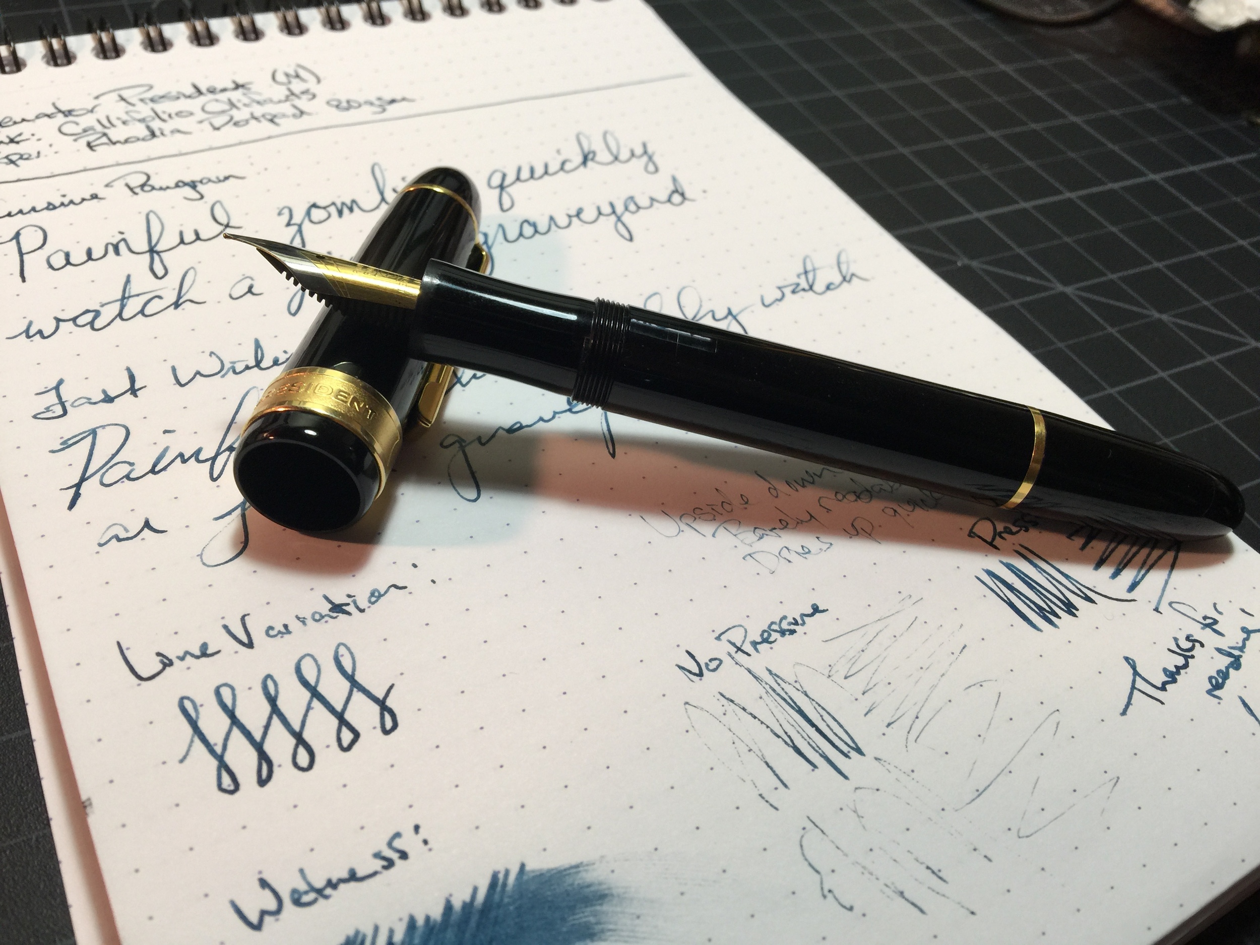
Levenger True Writer - Steel Nib (M)
Length Capped: 138mm
Length Posted: 155mm
Length Uncapped: 124mm
Section at Thinnest Point: 14mm
Section at Widest Point: 16mm
Weight w/Ink & Cap: 36.6g
Weight w/Ink & No Cap: 21.5g
Fast Writing: Keeps up very well.
Line Variation: Lots of spring for a steel nib.
Upside Down Writing: Writes well; keeps up, and is only a tiny bit scratchy.
Wetness: Very.
Pros: Nice weight, wet writer, smooth nib, springy nib
Cons: Price, hard starts, section is a little slick

Thanks so much to Clay P. for sending me his Levenger True Writer to review.  I really enjoyed using this pen.

*EDIT* Clay was kind enough to clarify for me that this particular True Writer was part of the Metalist line of pens which are no longer produced.  The normal line of True Writers which I mention are on sale for $59 right now, are acrylic.

Levenger made its debut in 1987 in Massachusetts.  The name Levenger was derived from the combination of the founders (husband and wife) combining their last names.  They specialized in creating many proprietary products for the home and office, and eventually made their way into writing instruments.

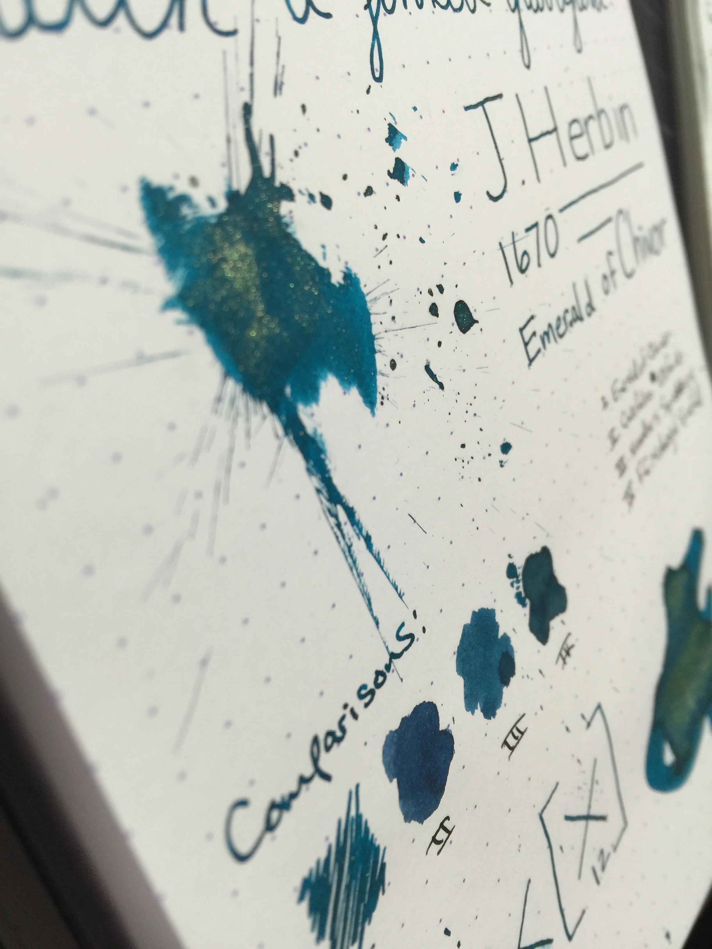
The True Writer is probably their most well known pen, and features a nice hefty metal body (with a plastic-esque coating) and a German steel nib.  I was impressed with how smooth the steel nib performed.  It writes nice and wet and I had no issues with skipping or dryness.  I did, however, have issues with hard starting - that, coupled with the smoothness leads me to believe that it may be suffering from a bit of "baby's bottom."  The pen is a cartridge converter pen, so you can use any bottled ink of your choosing.  I used Levenger Cardinal Red for this review - keep an eye out for a review on that ink soon!

The pen itself is very smooth and sleek, and has a very professional/business-like appearance.  I've heard these are popular in the corporate realm, and I can certainly see why.  The weight and balance are very nice - I didn't experience any fatigue with extended use.  The section is a little on the slick side, so that could potentially cause some slipping when writing.

The trim on the pen is minimalistic, which I like.  The center band is a chrome-colored metal with the word "Levenger."  The finials are just a smooth rounded black "button."

The color itself is a metallic grey with a slick clear coat.  I love the color of this pen!

Overall, I really enjoyed writing with this pen.  A few rounds on some micromesh to fix the hard starting and it would be even better.  For a steel nib, the smoothness is rivaled by very few, and the weight and balance make it a pleasure to hold.  The True Writer retails for around $79 normally, but at the time of writing, Levenger has it on sale for $59.  If you're looking for a comfortable, smooth, durable writer, I highly recommend you pick one up.

Ink Review: J. Herbin 1670 Emerald of Chivor

chivor-header

J. Herbin 1670 Emerald of Chivor
Pen: Pilot Metropolitan (M)
Paper: Rhodia 80gsm & Tomoe River
Shading: moderate to high
Saturation: moderate to high
Flow: wet
Dry Time: 12 seconds or higher

The much anticipated and latest 1670 Anniversary ink from J. Herbin, Emerald of Chivor, has finally been released.  This ink had an incredible build up in the fountain pen media channels, and I was incredibly excited to see if it lived up to the hype.

Being that this ink has solid objects in it (the gold flecks), I didn't want to risk putting it in an expensive pen and potentially have clogging issues, or trouble cleaning the gold flecks out.  I chose my trusty $15 Pilot Metropolitan for the occasion because it's inexpensive, and it has a medium nib that puts down a heavy line.  In choosing a heavier-writing pen, I'd hoped to bring out both the gold flecks as well as the signature red sheen that this ink is known to have.

After inking up and writing on my Rhodia pad, I was immediately impressed with how prominent the gold flecks were in the ink.  They showed up beautifully, and the ink produced an incredibly gorgeous color with nice shading.  One thing that was missing was the red sheen - even on my Rhodia pad I could not reproduce that sheen that takes this ink from awesome to incredible.  After talking to some folks on Twitter, it hit me that I needed to try it on some Tomoe River paper - that was the ticket!

Of the "emerald" inks that I've used, Emerald of Chivor compares well to Noodler's Squeteague and Franklin Christoph Midnight Emerald.  Color-wise, I like Midnight Emerald a lot better than Emerald of Chivor, mainly because it's darker and tends to shade more.  Of course, a lot of people will buy this ink regardless of whether they absolutely love the color; it's the characteristics that is the main draw.

As far as dry time, the ink does fairly well on my Rhodia pad at about 12 seconds, but with Tomoe River it's quite a bit more.  That's to be expected of course, but something to be aware of.  A huge bit of disappointment for me was the fact that the red sheen does not present itself on anything less ink resistant than Tomoe River.  For me, that sheen is a huge factor in my enjoyment of this ink, and Tomoe River isn't always the most accessible or feasible paper choice.  Being as this ink is a bit of a novelty, you may really only use it for special correspondence, in which case Tomoe River would be a great choice.  So it really depends on how you plan to use the ink, and whether that is a deal breaker for you.

All in all, I really enjoyed my first experience with the 1670 ink series.  I have a sample of Stormy Grey that I'm very excited to try out - love grey inks!  If you wanna play around with a unique ink, pick up a bottle or sample of Emerald of Chivor - you won't be disappointed.  Just beware that you'll probably have gold flecks on your hands for a few days!

Thanks for reading!
​Lori

Pen Review: Senator President

senator-header

Senator President - Steel Nib
Length Capped: 146mm
Length Posted: 175mm
Length Uncapped: 136mm
Section at Thinnest Point: 11mm
Section at Widest Point: 12mm
Weight w/Ink & Cap: 25.4g
Weight w/Ink & No Cap: 15.9g
Fast Writing: Keeps up fairly well; few skips.
Line Variation: Decent.
Upside Down Writing: Barely readable, dries up quickly.
Wetness: With pressure, very wet.
Pros: Inexpensive alternative to MB149, looks professional, ink capacity, ebonite feed
Cons: Lightweight, "cheap" feel, nib performance/flow issues

First off, special thanks to Clay P. for sending this pen to me to review.  The Senator President is an interesting pen and I was very excited to try it out.  The pen is sadly no longer made, but they make their rounds on eBay and FPN from time to time, so if you are interested you should be able to get ahold of one fairly easily.

The Senator President is a German-made fountain pen that by no coincidence very closely resembles the Montblanc 149.  It's definitely the largest pen I've used, but the first thing that you'll notice when you pick it up for the first time is how light it is.  At a mere 25.4g filled, it's lack of heft definitely doesn't match its appearance.  The pen was made available in both a steel nib option and a 18k gold nib option.  The pen I'm using is the steel version, and the nib is rather large - I would guess it is probably a #9 or so. 

The pen writes fairly well, but I had quite a lot of issues with skipping.  The nib is of the "Iridium Point Germany" variety, which in my experience tend to be less than stellar.  I wouldn't say it's horrible, but it definitely has its share of skips and hard starts.  You can squeeze a bit of line variation out of it if you try, but be careful not to spring the nib.  One think I've noticed with this pen is it does take a bit of pressure to get consistent writing and flow from it.  If you are light handed, you would have a lot more issues with skipping.  I've seen great reviews of the gold nib version of the pen, so if you're wanting one of these, I'd recommend trying to find a gold version.

The trim on the pen is a thin metal - likely aluminum or stainless steel - and is plated to have a gold appearance.  The pen does pick up micro-scratches over time, both on the body and on the trim, so something to keep in mind.  The back of the pen unscrews to reveal the piston knob, and the pen has vertical stripes for ink windows just above the section.  The section itself has a nice taper and flare to it, though because the pen is fairly fat, it took some getting used to for the wider grip.  Once you're acclimated to it, it feels great.

All in all, the Senator President isn't a bad pen, but it's just not for me.  I'm not a huge fan of black with gold trim, though I know a lot of folks are.  If you do want to pick one of these up online or at a pen show, I highly recommend that you go for the gold nib and not the steel.  The cheap iridium point Germany nib really ruined this pen for me.  As far as pricing - based on what I've found on FPN, at the time when these pens were still available they sold for around $113 for the steel nib and $290 for the 18K gold nib.  I cannot imagine paying $113 for the steel nib version - the body of the pen feels a bit cheap and for the nib performance, I'd much rather buy a couple of TWSBIs  for that price.  The gold nib is likely a lot better and may be worth it for the look and feel of a Montblanc at a fraction of the cost.

Thanks again to Clay for sending this to me for review, and thanks for reading! 


Ink Review: Noodler's Blue Upon the Plains of Abraham

plainsofabraham-header

Noodler's Blue Upon the Plains of Abraham
Pen: Kaweco AL-Sport F
Paper: Rhodia Dotpad 80gsm
Shading: low to moderate
Saturation: high
Flow: wet
Dry Time: 18 seconds

Just when I thought I'd heard about all of the Noodler's inks, I found out they had a Canadian line! I heard about Blue Upon the Plains of Abraham by listening to Brian Goulet's Q&A a few weeks ago.  He was asked what his favorite ink was that nobody has heard of, and his reply was Noodler's Blue Upon the Plains of Abraham.  As soon as he mentioned it, I knew I had to find some to try.  I went over to Wonder Pens' website and noticed they didn't do shipping to the US (to their credit, they attempted to reach out to me afterwards but I already had some by that point), so an awesome reader of the blog Brad T. ordered some for me and sent it over - thanks so much Brad!

Plains of Abraham is a very unique and interesting ink.  It's a deep blue with a hint of purple tones; definitely very unique.  Despite its high saturation, it has some decent shading which is awesome.  One thing Brian noted was that it is super thick and it flows like tar - he's absolutely right.  It's definitely got a thicker consistency than a lot of inks I've used.  It's not syrup-y or anything like that, but it definitely flows thick.  I've had it in my Kaweco for a couple of weeks and I've not had any issues with flow or clogging, so it doesn't appear to have an effect on ease of use.  The ink was actually formulated and released a few years back and had been discontinued; but it has since made its return and for good reason.  In addition to it being a great color, it has the Noodler's signature bulletproof and eternal qualities for those folks who want their writing to stick around for a while.

The name for this ink is inspired by the Seven Years War and the battle of The Plains of Abraham where the British and French battled for control of the land, which ultimately prompted the "British North America" affecting what Canada is today.  In addition to his usual politically driven name and label, he added the saying "American Canadian Ink for Canada" to the label.

The chromatography of this ink was a bit stubborn.  Not sure if it was the bulletproof properties or the thicker consistency, but the ink just would NOT move any further up onto my sheet than it did.  It did still give a pretty good idea of the colors in this ink - the burgundy/maroon color definitely gives this ink it's purple hue, and it's got some black undertones as well as the royal blue.

The ink is in a league of its own, but the closest comparisons I had were Diamine Registrar's and Bad Belted Kingfisher.  The color sits somewhere between those two.

I really love the blueish-purple tone of this ink.  It's definitely very different than all the other standard blue-black inks that are out there.  I'm kind of disappointed that this ink isn't available in the US, but no matter - we have sources like Wonder Pens who seem to be willing to quote US shipping (which is awesome of them!) and wonderful pen friends like Brad who graciously helped me get a sample.  Yet another reason why the pen community is amazing!  Also, check out Wonder Pens' blog - they have some awesome stuff over there that I've really enjoyed reading lately.

If you're interested in a bottle, reach out to your Canadian friends or hit up Wonder Pens and see what they can quote you for shipping.  You won't be disappointed!

Thanks for reading!
Lori