Ink Review: Levenger Cardinal Red
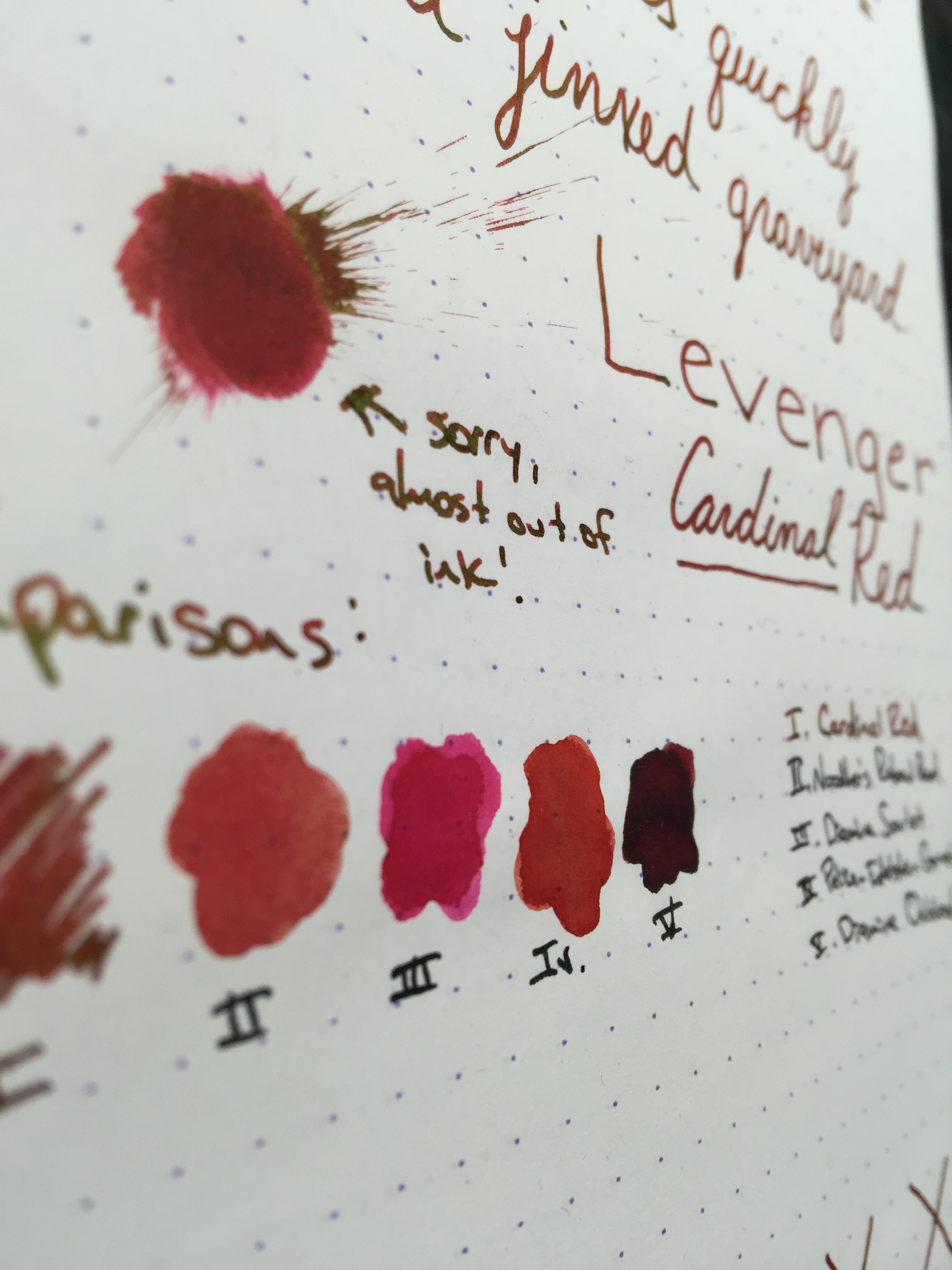
Levenger Cardinal Red
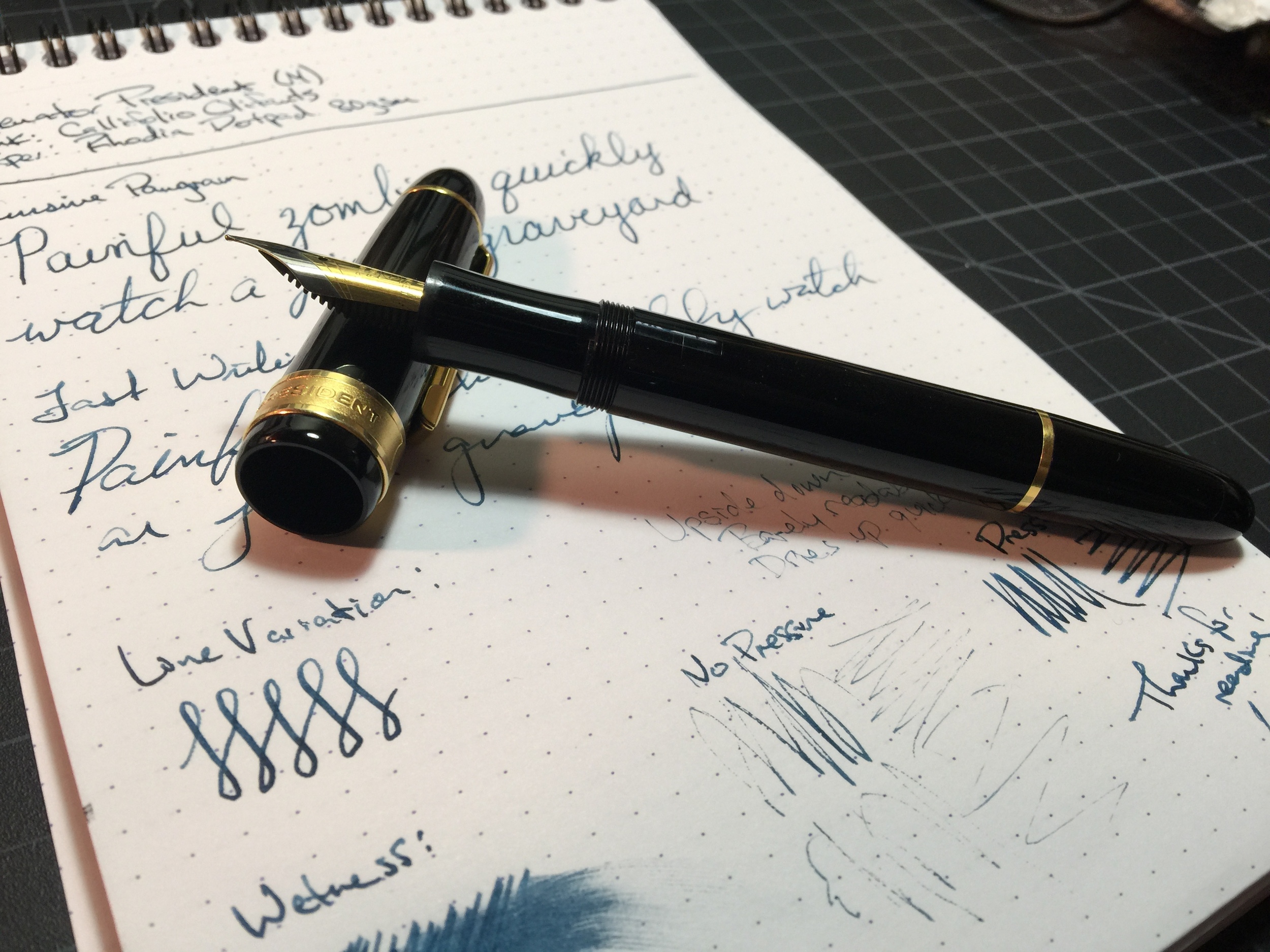
Pen: Levenger True Writer
Paper: Rhodia 80gsm
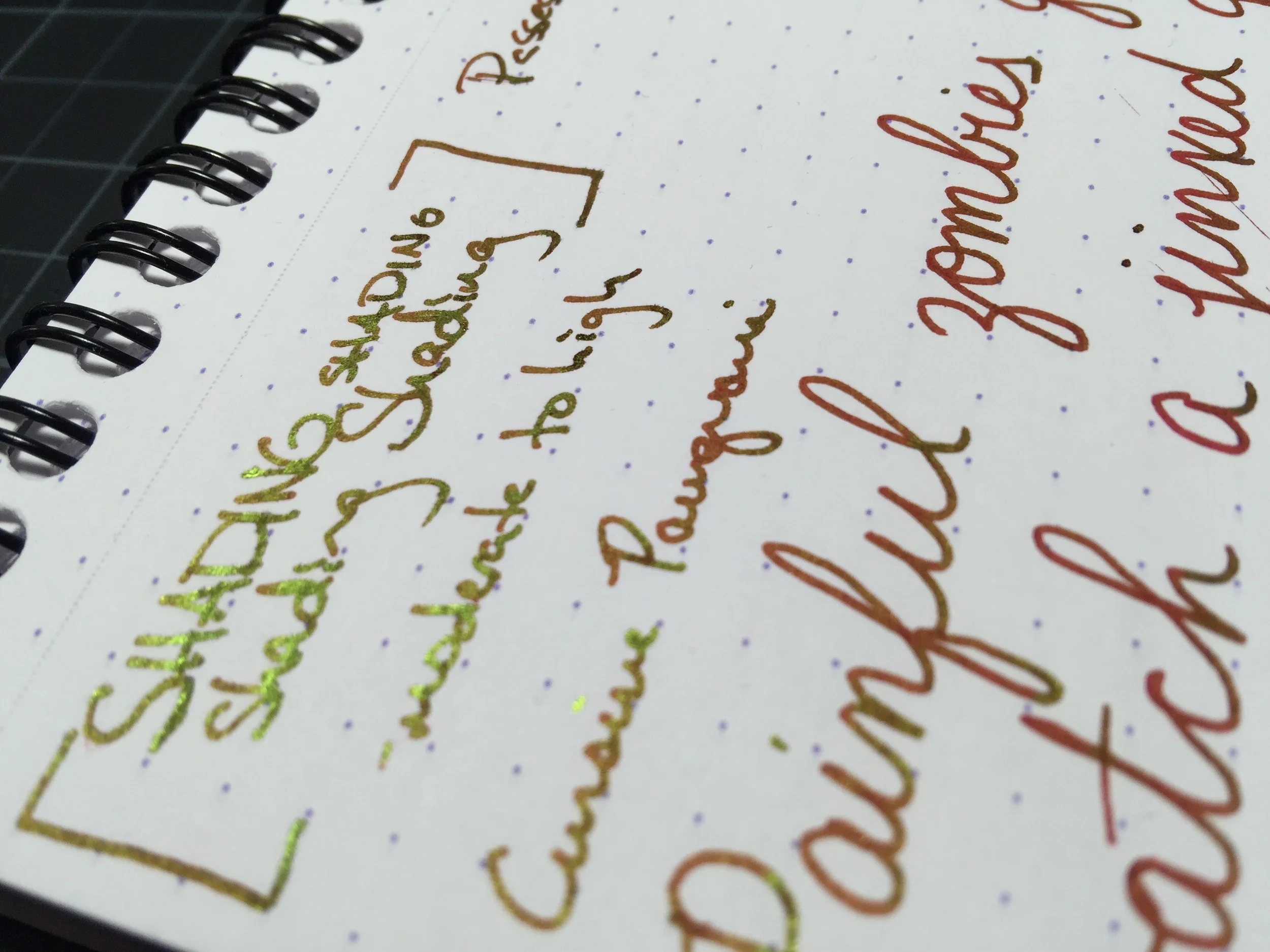
Shading: moderate to high
Saturation: moderate to high
Flow: wet
Dry Time: LONG - 45+ seconds depending on the nib
It's been a while since I've used a red ink, so when I was loaned the Levenger Truewriter with a converter full of Levenger Cardinal Red, I was anxious to give it a go. The ink behaved well on all of the usual ink-resistant papers I typically use, and has a nice balance of high shading and good saturation. My page was never starved for ink, as this one flows quite well, even in drier pens.
The one problem I experienced with Cardinal Red is that it takes forever to dry. I had to sit my page aside after finishing, as the ink took anywhere between 45 to 60 seconds to completely dry, making it bad choice for hook-handed lefties.
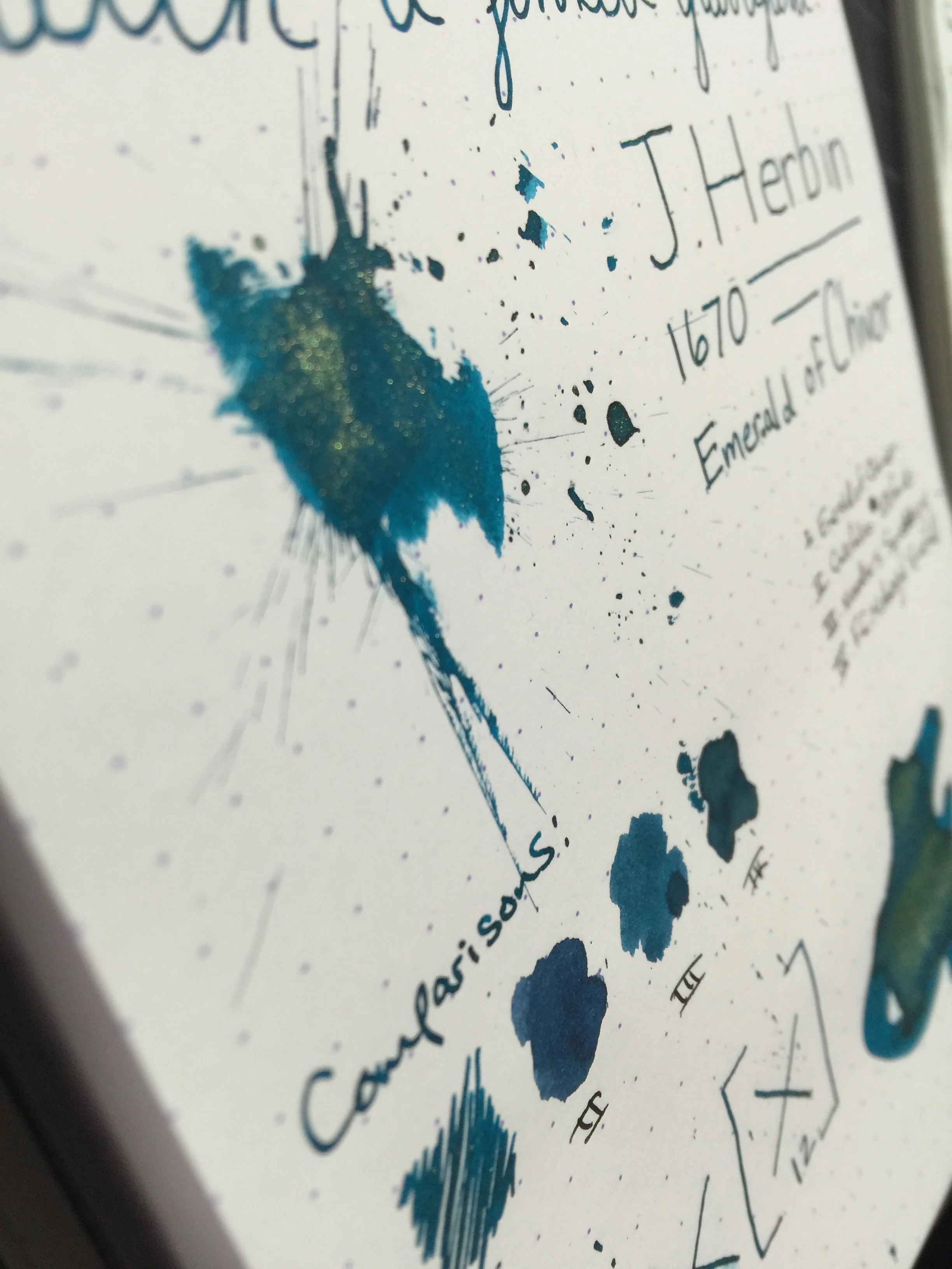
Despite the dry time issue, I wouldn't count this ink out just yet. It had one feature that I absolutely love: it sheens like crazy. In researching the ink, I didn't find any official statements about its sheen, so it would seem it's just a happy side effect. In even the faintest light, the ink has a bright greenish-gold sheen. It rivals that of J. Herbin's 1670 Rouge Hematite, without that actual gold fleck.

Of course if you're not a fan of sheen, this ink may not be for you as the sheen tends to drown out the actual red color; especially if you're in a setting with a light overhead.
Chromatography shows a bright red with a hint of magenta at the top. The ink compares well to Pelikan Edelstein Garnet and Diamine Scarlet.
All in all, I really enjoyed using this ink. I still tend to lean more towards darker reds, such as Diamine Oxblood; but for a mid-range red with an insane amount of sheen, Levenger Cardinal Red is just the ticket.
You can pick up a bottle for around $12 on Amazon. I had trouble finding it on some of the usual pen vendors, but it still seems to be easily obtainable.
Thanks for reading!
Lori