Pen Review: Karas Kustoms INK Fountain Pen in Raw Aluminum
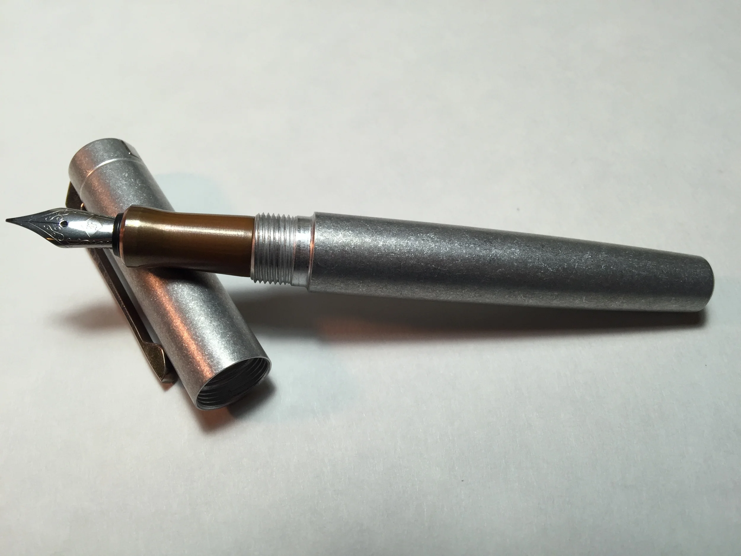
Karas Kustoms INK Fountain Pen - Tumbled Raw Aluminum w/copper section
Length Capped: 137mm
Length Posted: 183mm (not meant to be posted)
Length Uncapped: 127mm
Section at Thinnest Point: 9.5mm
Section at Widest Point: 10.25mm
Weight with Cartridge & Cap: 49.2g
Weight with Cartridge & No Cap: 33.4g
Fast Writing: Keeps up very well
Line Variation: None
Upside Down Writing: Not bad at all
Wetness: Perfectly balanced; not too wet or too dry
Pros: Machined metal, smooth threads, customization, color options, good nib/flow, converter included
Cons: Clip issue (likely just with my pen), may be heavy or large for some folks
You wouldn't imagine a machine shop full of guys from Mesa, Arizona who machine hot rod parts, would eventually venture into the world of pens - let alone fountain pens. This is exactly what happened, much to the benefit of pen addicts like myself. Dan Bishop, designer at Karas Kustoms (not Kara's Kustoms as some folks mistakenly assume), started their pen ventures by producing the Render K - an awesome rollerball refill holder to house your Parker or Pilot G2 compatible refills. They started off with a Kickstarter campaign that took off, and eventually this lead to 2 other wildly popular rollerball holders.
The pen community, namely the fountain pen community, wanted more. So Karas Kustoms caved to pressure and designed their first fountain pen - the INK. After another successful Kickstarter campaign, the INK came to be. Karas Kustoms offers the INK in several anodized aluminum finishes, along with a regular polished aluminum. More recently they've added a Raw Tumbled Aluminum finish, and that was enough to finally make me pick up one of these awesome pens. There's something about the raw metal pens that have come about lately that I just love, and this one is definitely no exception.
Along with being able to choose your barrel color, Karas allows you to choose the section material for your pen as well. Between aluminum, raw brass and raw copper, I knew I wanted copper for my own. The copper does add an additional $20 to the cost of the pen, but that is to be expected since it's a more expensive metal. Brass will cost you an extra $10, and the aluminum is nothing additional. I love how you can more or less build your own pen - the customization is definitely a plus. If you're really not a fountain pen person but love the body style of the INK, it also comes in a rollerball option.
Close up of the Raw Tumbled Aluminum finish
I've not used one of the anodized versions myself, but I've read some reviews where folks have found inconsistency in the color. Karas does address this on their FAQ page to their credit - since the anodizing can vary in color from batch to batch, there is inherently some risk that the colors will not match perfectly. It was also mentioned on the Pen Addict Podcast that they recently changed their anodizing company, so if you see an older pen from their line, you may not be able to get a new one of the exact same shade - something to keep in mind.
When Karas posted a picture on their Instagram page about their new Raw Bar Stock finish (or Tumbled Raw Aluminum as I believe it's listed on their product page), I knew that would be the finish I'd purchase my INK in. The photo they posted was of the Render K in the same finish, so I set out to find a picture of the INK - unfortunately I wasn't able to find one. I searched high and low online trying to find ANYONE who'd bought and reviewed this pen, so that I could see for myself what the pen looked like before I bought it. There were none. I had hoped Karas Kustoms would post a picture on their product page, and that was missing as well. There are only photos of the original anodized INK colors and the polished aluminum, which makes it very hard for a potential buyer to make a purchasing decision for this new finish. So Karas folks - if you're reading this - help the people out! :)
I bought my pen sight unseen anyway, because from what I'd seen of the Render K's finish I knew I would most likely love it - and I absolutely did. The pen came in a really neat retro-esque box that reminds me of something a vintage toy would have been packaged in. Printed on the back of the box are the words "Dozens of satisfied customers" - I had to chuckle at this, since their Kickstarter for the INK alone was backed by over 1000 people. The pen was disassembled and packaged neatly in the box - each piece wrapped in plastic. The copper section was polished up beautifully, and a small sheet of paper illustrated how to assemble the nib & section, and how to insert the converter and fill the pen.
The pen is on the large side, but isn't so large as to be uncomfortable. Being aluminum, it's not heavy, but is heavier than a plastic pen. The copper section that I got with my pen adds some weight, so if you prefer something lighter go for the aluminum section.
One thing that stands out about the pen is the threading for the cap. It has the most satisfying positive stop whenever you tighten the cap. The fit and finish is impeccable and is a true testament to the quality of Karas Kustom's products. Contrary to other pens I've used, the threads don't exhibit even the faintest squeak during use. It takes two full rotations to remove the cap, but the act of removing the cap is oh-so-satisfying that it doesn't bother me in the slightest.
Notice the "line" at the bend in the clip is slanted
Notice the flat side of the bottom of the clip is unevenly worn
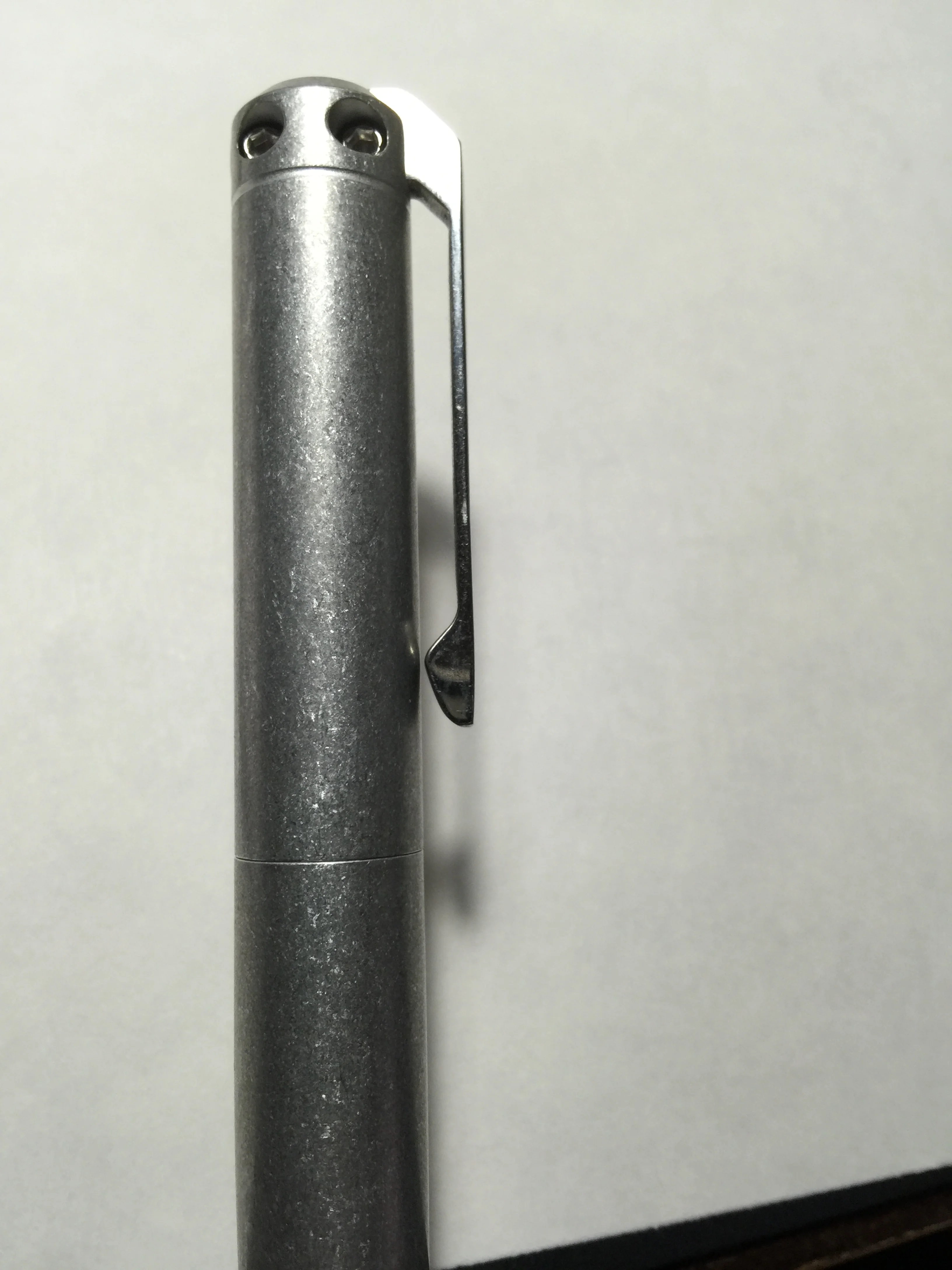
This side of the clip bottom is rounded
This side is pointed
A problem I've found with the pen is its clip. Not the design or its stiffness (I actually like both), but my clip in particular seems to not have been cut properly. You'll notice that the line at the top where the clip transitions from the long vertical portion to the bend at the top of the pen, is not horizontally level as it should be. In addition, the bottom of the clip isn't cut straight either; you'll notice one side is "pointy" while the other is rounded off. I can't decide whether it drives me crazy, or whether its imperfection complements the raw tumbled finish of the pen body. I go back and forth on it, but regardless it's definitely a manufacturing defect, albeit a minor one.
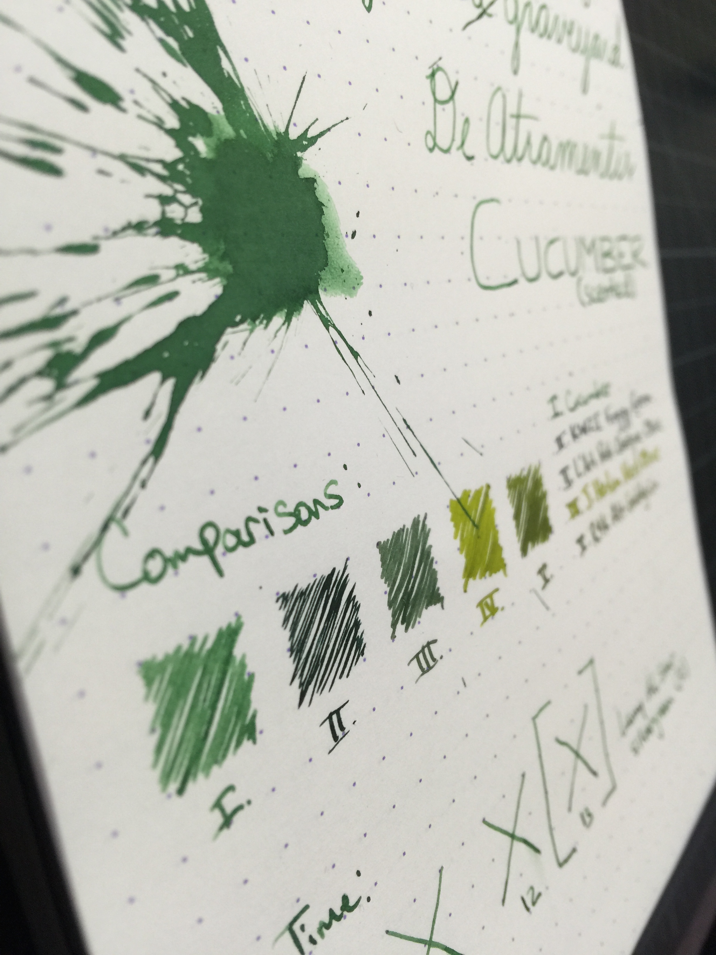
The nib is Schmidt and comes in either a Fine or Medium. I opted for the Fine and am very pleasantly surprised by how well it writes. It's not without a bit of tooth, but it's definitely not scratchy. It's a #5 size, and will exchange perfectly with Franklin Christoph's #5 nibs (not all #5s will be compatible). After seeing Matthew Morse's video where he swapped his out, I threw my Masuyama Medium Cursive Italic nib in my INK and it writes beautifully. I LOVE my cursive italic, but until I get an extra, it'll remain in my Model 40 Pocket and I'll use the Schmidt nib in this one.
The feed keeps up very well with fast writing. It doesn't give any line variation, but of course it's not meant to. Upside down writing proved useable as well. I was pleased with the pen's wetness as well - not dry at all and not a gusher.
All in all, I was VERY happy with my Karas Kustoms INK. The tumbled aluminum finish gives and awesome EDC feel and gives way to allowing scratches and dings over time. It would have been easy for Karas to put a junk nib on their pen but they didn't - I find this admirable. A lesser company may have opted to throw a *shudder* generic "Iridium Point Germany* nib on a beautiful pen. Based on the reviews I've seen my clip issue is not a common one. I'll probably reach out to them and see if I can get a replacement. I highly recommend you get an INK for yourself if you don't have one. They start at just $85, which is a steal for an American-made machined fountain pen with a converter included.
Thanks for reading!
Lori