Ink Review: Waterman Intense Black

Waterman Intense Black (Ink Drop - April 2015)
Pen: Lamy Safari EF
Paper: Rhodia Dotpad 80gsm
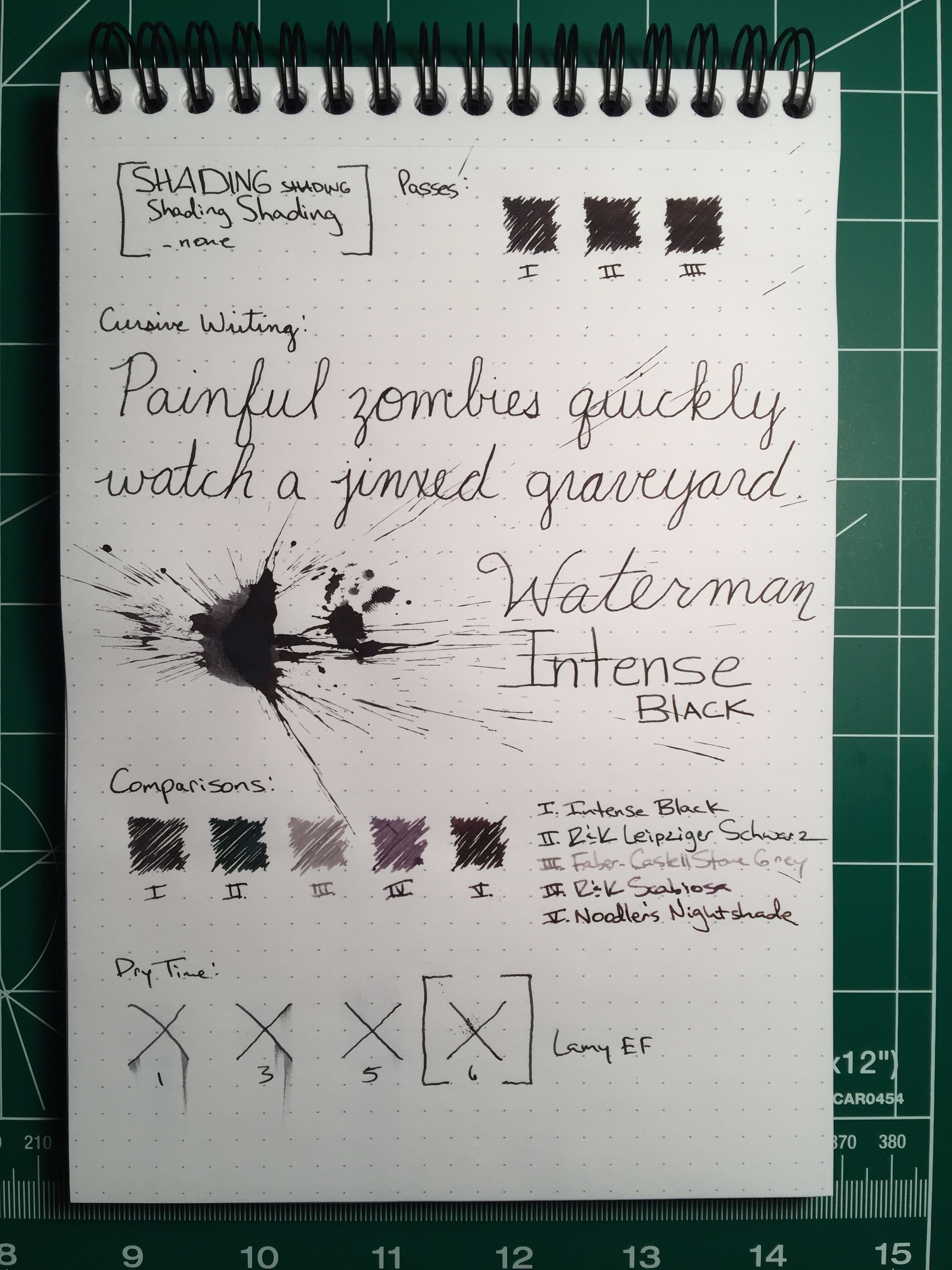
Shading: none
Saturation: high
Flow: wet
Dry Time: 6 seconds
The final ink in this month's Ink Drop is Waterman Intense Black. Waterman is one of the oldest brands in the fountain pen realm. Lewis Edson Waterman created the first Waterman Fountain pen in 1883 and by the early 1900s they added ink to their line. Waterman lays claim to creating the first ink cartridge in 1936 as well.
Waterman Intense Black is well-behaved black with a distinct brown undertone to it. It almost looks like a deep, dark brown rather than black. Being a black ink, it has no shading and is highly saturated. It's a fairly wet flowing ink as well, and despite its wetness it has a very quick dry time with my EF nib at 6 seconds.
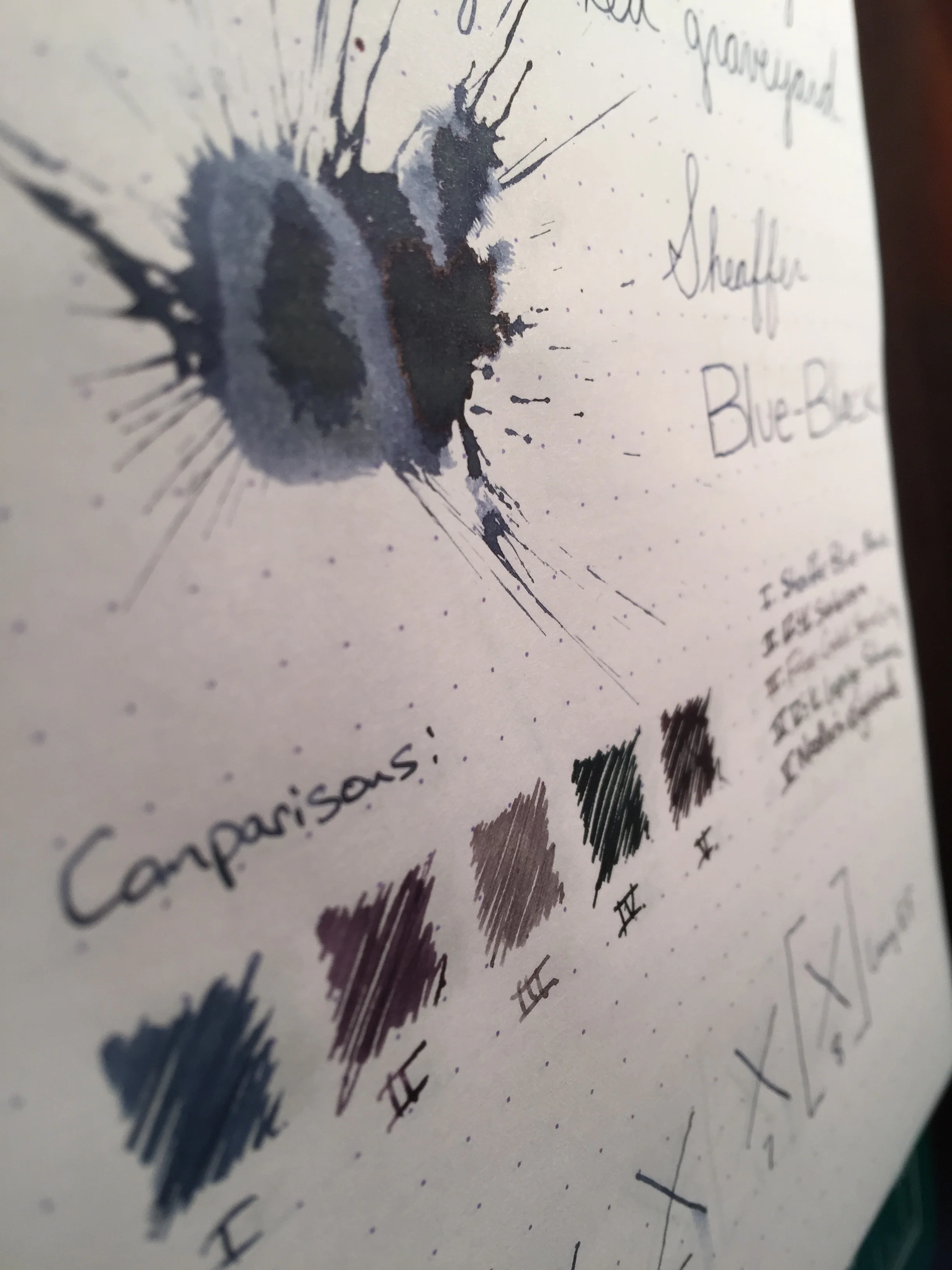
Back side of ink splatter, showing the evident brown undertone of the ink.
Overall, Waterman intense black is a nice ink. Not my favorite black ink by any stretch, though I think that's because of the brown tint. If you'd like a bottle, you can pick one up from Goulet or a similar retailer for $11.00 for a 50mL bottle.