Ink Review: J. Herbin 1670 Stormy Grey

stormy-grey-header

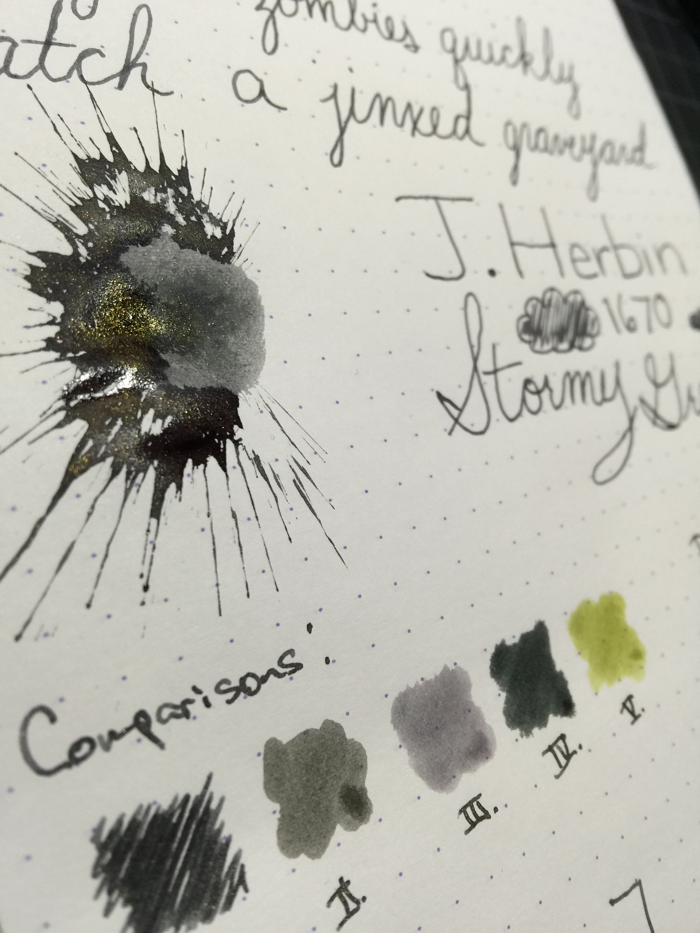
J. Herbin 1670 Storm Grey
Pen: Pilot Metropolitan (M)
Paper: Rhodia 80gsm Dotpad
Shading: Moderate
Saturation: low
Flow: medium wet
Dry Time: 9 seconds

I picked up a sample of this ink a month or so ago, and have been using it in my Metropolitan for a while.  I've gotten a few requests for a review on it, and I was very happy to oblige.  Grey being my favorite ink color, I have thoroughly enjoyed using it.

The shade of grey that this ink exhibits is a mid-range grey, leaning more dark than light.  If I were to imagine what "stormy grey" would be, this would be it.  It is reminiscent of the dark storm clouds, with just a tiny hint of blue underneath.

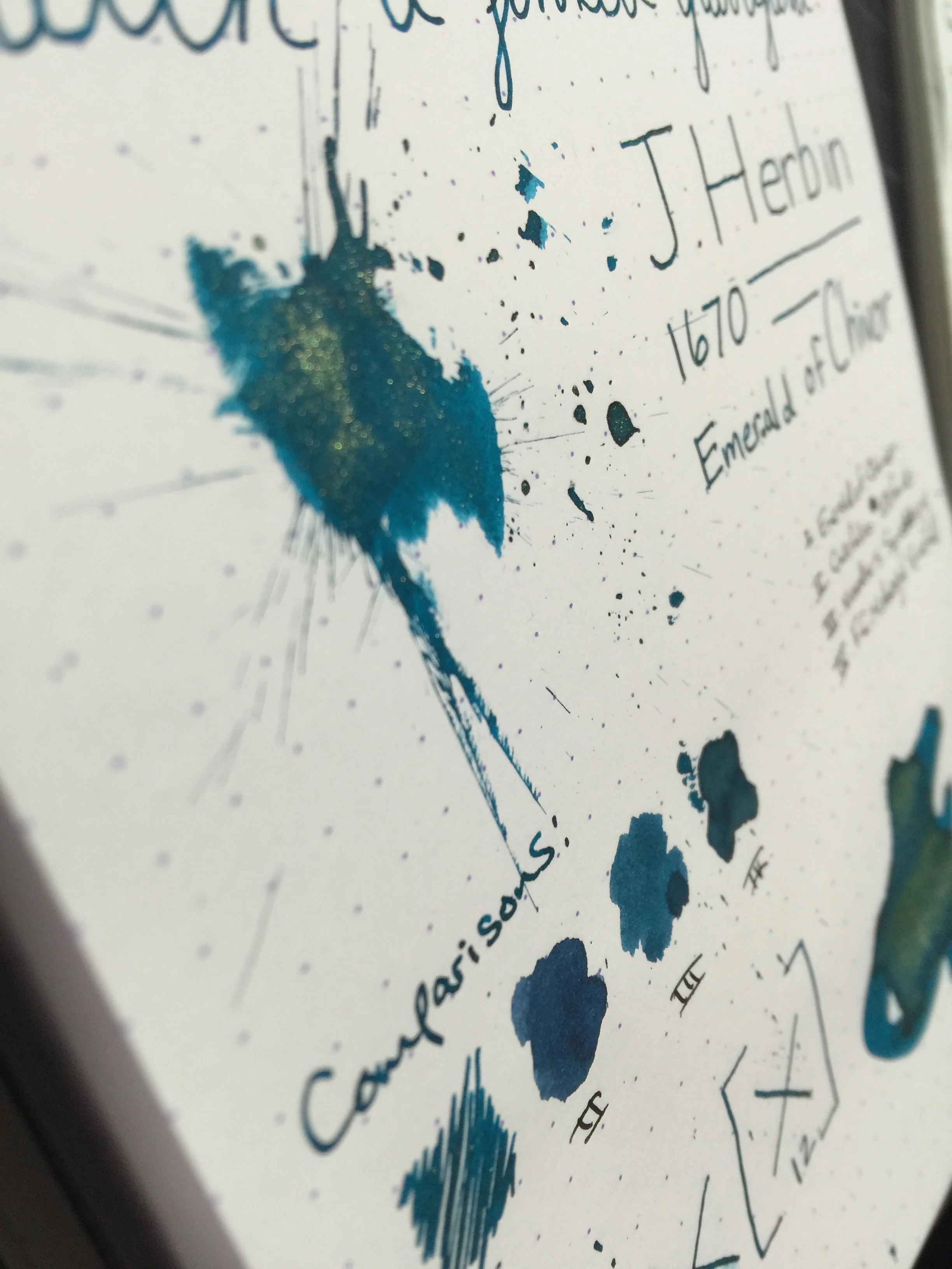
Of course one of the biggest draws to this ink is the gold fleck that gives your written word a brilliant glittery sheen.  On my Rhodia pad, the sheen stands out very well, but not so much as to drown out the color of the ink itself. Its sister ink, Emerald of Chivor, has a bit more gold sheen in my experience, though with the lighter color, it works very well.

Stormy Grey has a moderate amount of shading, and gives a good balance between shading and saturation.  Dry time is rather exceptional at 9 seconds for my Pilot medium nib.  I kept the ink in the pen for roughly a week, and did not have any trouble cleaning it out - much like Emerald of Chivor.

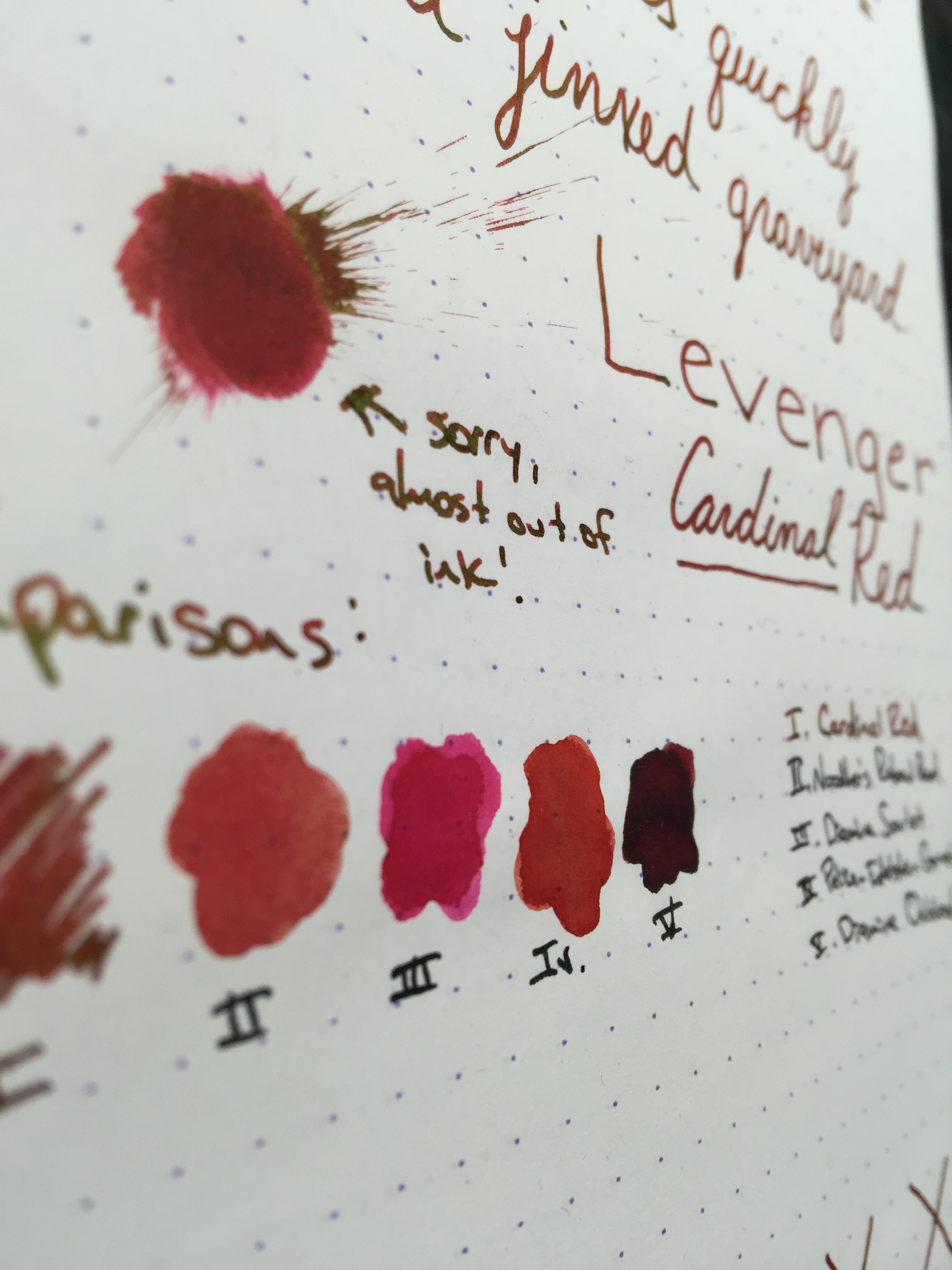
In comparison to other greys I've used, Stormy Grey is closest to Graf von Faber Castell Stone Grey, leaning just a bit cooler on the color scale.  Noodler's Lexington Grey is a close second, and matches better on paper than it does on the swab.

Overall, I really enjoyed using Stormy Grey.  I still am not really on the glitter/gold fleck ink bandwagon, but for those that are I think this is a great choice.  Being a huge grey ink fan, I loved the color more than anything else.  If you're interested in a bottle for yourself, you can pick up a 50mL bottle for $26.00.

Thanks for reading!

Ink Review: Levenger Cardinal Red

cardinalred-header

Levenger Cardinal Red
Pen: Levenger True Writer
Paper: Rhodia 80gsm
Shading: moderate to high
Saturation: moderate to high
Flow: wet
Dry Time: LONG - 45+ seconds depending on the nib

It's been a while since I've used a red ink, so when I was loaned the Levenger Truewriter with a converter full of Levenger Cardinal Red, I was anxious to give it a go.  The ink behaved well on all of the usual ink-resistant papers I typically use, and has a nice balance of high shading and good saturation.  My page was never starved for ink, as this one flows quite well, even in drier pens.

The one problem I experienced with Cardinal Red is that it takes forever to dry.  I had to sit my page aside after finishing, as the ink took anywhere between 45 to 60 seconds to completely dry, making it bad choice for hook-handed lefties.

Despite the dry time issue, I wouldn't count this ink out just yet.  It had one feature that I absolutely love: it sheens like crazy.  In researching the ink, I didn't find any official statements about its sheen, so it would seem it's just a happy side effect.  In even the faintest light, the ink has a bright greenish-gold sheen.  It rivals that of J. Herbin's 1670 Rouge Hematite, without that actual gold fleck.

cardinalred-sheen2

Of course if you're not a fan of sheen, this ink may not be for you as the sheen tends to drown out the actual red color; especially if you're in a setting with a light overhead.

Chromatography shows a bright red with a hint of magenta at the top.  The ink compares well to Pelikan Edelstein Garnet and Diamine Scarlet.

All in all, I really enjoyed using this ink.  I still tend to lean more towards darker reds, such as Diamine Oxblood; but for a mid-range red with an insane amount of sheen, Levenger Cardinal Red is just the ticket.

You can pick up a bottle for around $12 on Amazon.  I had trouble finding it on some of the usual pen vendors, but it still seems to be easily obtainable.

Thanks for reading!
Lori

Ink Review: J. Herbin 1670 Emerald of Chivor

chivor-header

J. Herbin 1670 Emerald of Chivor
Pen: Pilot Metropolitan (M)
Paper: Rhodia 80gsm & Tomoe River
Shading: moderate to high
Saturation: moderate to high
Flow: wet
Dry Time: 12 seconds or higher

The much anticipated and latest 1670 Anniversary ink from J. Herbin, Emerald of Chivor, has finally been released.  This ink had an incredible build up in the fountain pen media channels, and I was incredibly excited to see if it lived up to the hype.

Being that this ink has solid objects in it (the gold flecks), I didn't want to risk putting it in an expensive pen and potentially have clogging issues, or trouble cleaning the gold flecks out.  I chose my trusty $15 Pilot Metropolitan for the occasion because it's inexpensive, and it has a medium nib that puts down a heavy line.  In choosing a heavier-writing pen, I'd hoped to bring out both the gold flecks as well as the signature red sheen that this ink is known to have.

After inking up and writing on my Rhodia pad, I was immediately impressed with how prominent the gold flecks were in the ink.  They showed up beautifully, and the ink produced an incredibly gorgeous color with nice shading.  One thing that was missing was the red sheen - even on my Rhodia pad I could not reproduce that sheen that takes this ink from awesome to incredible.  After talking to some folks on Twitter, it hit me that I needed to try it on some Tomoe River paper - that was the ticket!

Of the "emerald" inks that I've used, Emerald of Chivor compares well to Noodler's Squeteague and Franklin Christoph Midnight Emerald.  Color-wise, I like Midnight Emerald a lot better than Emerald of Chivor, mainly because it's darker and tends to shade more.  Of course, a lot of people will buy this ink regardless of whether they absolutely love the color; it's the characteristics that is the main draw.

As far as dry time, the ink does fairly well on my Rhodia pad at about 12 seconds, but with Tomoe River it's quite a bit more.  That's to be expected of course, but something to be aware of.  A huge bit of disappointment for me was the fact that the red sheen does not present itself on anything less ink resistant than Tomoe River.  For me, that sheen is a huge factor in my enjoyment of this ink, and Tomoe River isn't always the most accessible or feasible paper choice.  Being as this ink is a bit of a novelty, you may really only use it for special correspondence, in which case Tomoe River would be a great choice.  So it really depends on how you plan to use the ink, and whether that is a deal breaker for you.

All in all, I really enjoyed my first experience with the 1670 ink series.  I have a sample of Stormy Grey that I'm very excited to try out - love grey inks!  If you wanna play around with a unique ink, pick up a bottle or sample of Emerald of Chivor - you won't be disappointed.  Just beware that you'll probably have gold flecks on your hands for a few days!

Thanks for reading!
​Lori

Ink Review: Private Reserve Avacado

avacado-header

Private Reserve Avacado - June 2015 Ink Drop
Pen: Lamy Al Star (F)
Paper: Rhodia Dotpad 80gsm
Shading: high
Saturation: high
Flow: wet
Dry Time: 14 seconds

The final ink in this month's Ink Drop is Private Reserve Avacado.  I've actually had a bottle of this ink for a while now, but just hadn't gotten around to writing up a review.  I forget where I first learned of this ink - I want to say it was SBREBrown's Inkcyclopedia, but I'm not certain.  What drew me to it was its very unique color.  It is a nice deep green, but rather than being a flat dark green, it has a distinct yellow undertone in lighter areas.  It gives some cool color patterns in the ink and sets it apart from all other dark greens I've used.

You may notice that the ink's name "Avacado" is spelled incorrectly.  I've not found a story on why this is the case, but I suspect it was an accidental misspelling.  Private Reserve's website now spells the word correctly (Avocado), but it seems they haven't gotten around to changing the labels (or I just happened to get one of the older ones).  I'm kinda glad I got a bottle of the old label, just so I have it.  

The ink is very well behaved on my Rhodia pad.  No feathering or bleedthrough.  Luckily the ink has no noticeable spread either, and despite it's high saturation level, it does have some great shading.  Very unique.

The chromatography was neat as well.  Yellow and orange is the main component, with a tiny touch of red and blue.

As unique as this ink is, it doesn't compare to anything I've seen.  The closest I've used so far is KWZI Foggy Green, which is darker with more blue undertones.

avacado-swabs

One thing I have noticed with this ink is that it tends to crust up under the cap of the bottle.  I'm assuming this is a result of the cap letting tiny bits of air inside, as I've had this ink loaded in a pen for a while and luckily haven't had any crusting issues.  Each time I open the bottle I have to take a paper towel and scrape the ink crust off the edges of the top of the glass - kind of a pain, but at least it's not ruining my pens.

I highly recommend you try this ink out if you're a fan of greens.  It's got a very unique color and the shading is awesome.  You can pick up a 66ml bottle for $11.

Thanks for reading!
Lori