Ink Review: Noodler's Socrates

socrates-header

Noodler's Socrates
Pen: Lamy AL-Star 1.1 stub
Paper: Rhodia Dotpad 80gsm
Shading: none
Saturation: high
Flow: wet
Dry Time: 17 seconds

Noodler's Socrates is part of the UK Series of inks from Nathan Tardif.  It's a dusty, pinkish-purple that claims the bulletproof, eternal, forge-resistant and water-resistant associations from the Noodler's ink property list.

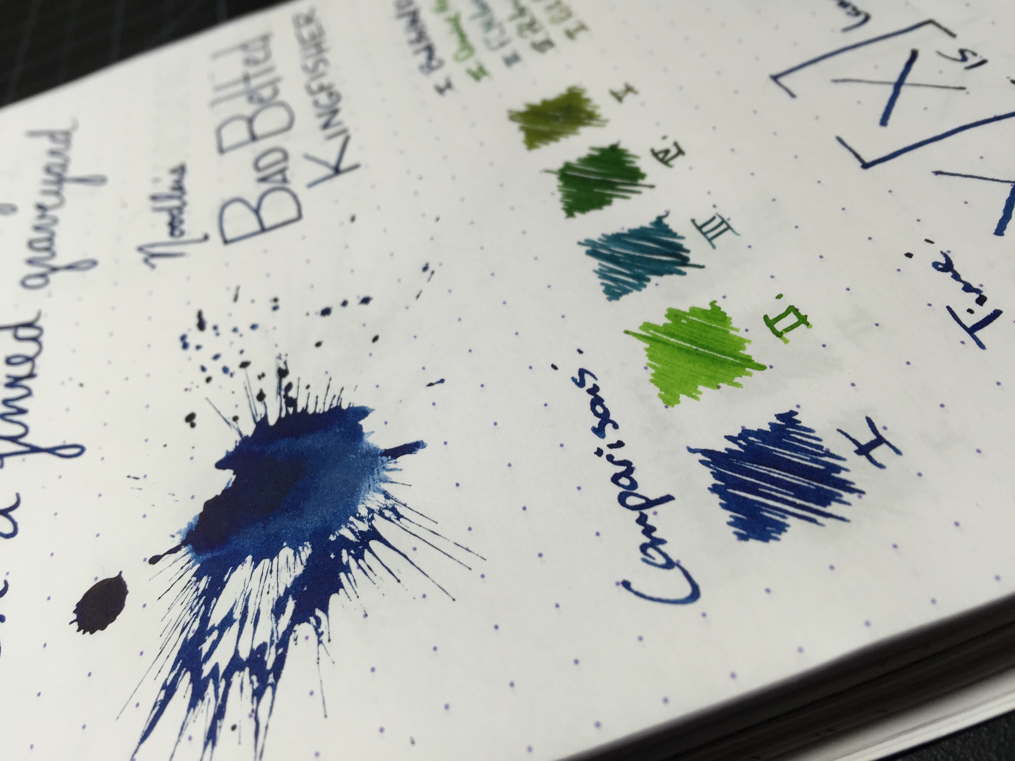
Named assumedly for the ancient Greek philosopher, Socrates didn't speak to me much as far as the color.  It was surprised by how the ink behaved on the paper when writing with it.  It seems to almost instantly seep into the paper and loose almost all of its vibrancy as it dries.  In looking at the ink itself in bottle form you'd think it would be a nice vibrant purple, but that's oddly not the case.  Despite that, it's still a very unique dusty purple.

Socrates behaves quite well on good paper.  It does have quite a bit of spread, which can be bothersome for some - I'm not a big fan of that myself.  It doesn't feather, though, and I didn't notice any bleedthrough or ghosting even with my 1.1 stub.

No ink that I've seen so far compares to the color of Socrates.  In swab form, it looks more vibrant than it does on paper.

I can't say I'd ever buy a full bottle of Socrates, but that doesn't mean it's a bad ink.  If you're interested in one yourself you'll get 3oz for $12.50.

Thanks for reading!
Lori

Ink Review: Noodler's Bad Belted Kingfisher

badbeltedkingfisher-header

Noodler's Bad Belted Kingfisher
Pen: Lamy AL-Star 1.1 stub
Paper: Rhodia Dotpad 80gsm
Shading: low to moderate
Saturation: high
Flow: wet
Dry Time: 15 seconds

I recently tried another one of Noodler's warden series of inks - Bad Belted Kingfisher - when a family member visited who had it inked up in his pen.  One of the more surprising things about this ink is how similar it looks to Bad Blue Heron, which is also part of the warden series.  In fact when I used it I asked him, "Is this Bad Blue Heron?"  That's one thing that's puzzled me about those two colors - why have a couple inks that are so similar to one another in the same line?  They have black, green and blue covered, so I would have liked to see a red in the mix instead of a second blue - just my opinion though.

Nathan Tardiff created the Warden Series of inks to combat both currently existing forgery techniques, as well as ones that haven't actually been observed by law enforcement as of yet.  The inks are what he calls "combination lock" inks, that have a set aging and component variable that are different on a per-bottle basis.  Essentially they each have a unique fingerprint; this makes it impossible for a forger to have an ink exactly identical to your bottle, making the forgery process nearly impossible.  In addition to the standard Bulletproof and washing-resistent properties that a lot of the Noodler's inks have, the Warden Series inks are also laser proof - pretty cool!

Bad Belted Kingfisher is a nice deep blue with a very high saturation level.  It does a great job of not feathering on good paper, though if you lay it on thick like I did with my 1.1 stub, you'll get some ghosting on the back side of the page; no bleedthrough though.  Compared to Bad Blue Heron, Kingfisher is a tad bit darker and more saturated, so there's less shading.  Heron maintains a very similar color, but has more shading and overall variation depending on how your writing.

Bad Belted Kingfisher is a great forgery-resistant ink.  If you already have Bad Blue Heron, I wouldn't bother picking up Kingfisher unless you're a completionist and want the whole warden set (trust me, I totally understand!).  You can pick up a bottle from Goulet or a similar retailer for $12.50/3oz.

Thanks for reading!
​Lori

Ink Review: Franklin-Christoph Midnight Emerald

midnightemerald-header

Franklin-Christoph Midnight Emerald
Pen: Franklin-Christoph Model 40 Pocket - Masuyama Medium Cursive Italic
Paper: Rhodia Dotpad 80gsm
Shading: high
Saturation: medium
Flow: medium
Dry Time: 13 seconds

After seeing all of the amazing photos online of Franklin-Christoph's pens, especially the "ice" models, I knew I had to have one.  Never has a company impressed me as much with their unique designs as Franklin-Christoph has.  Of course this review isn't about the pen itself, (that will come soon!) but about the ink that I bought along with the pen.

Midnight Emerald is a fairly new ink to the Franklin-Christoph line, and is one that I'm convinced will be one of their best sellers in due time.  I likely wouldn't have given an ink of this shade a second glance if it hadn't been for seeing Jeff Abbot's post on The Pen Addict.  He'd bought the same pen I was interested in, and when I saw the way this ink looked in the barrel of an eyedropper-converted Model 40 Pocket, I knew I had to have it.

Arguably the best thing about Midnight Emerald is its incredible shading properties.  With my medium cursive italic nib, it lays down enough ink to give quite a nice variation in color.  Depending on the speed at which you write, the ink will go from a deep blueish-green to a lighter medium teal.  It isn't overly saturated, and flows wet, but not so wet as to drown out the variations in color.  It doesn't feather at all on your standard fountain pen friendly papers, and there's no ghosting or bleed to speak of.

Shortly after picking up a bottle of Midnight Emerald, I grabbed a sample of Noodler's Squeteague to see how it compared.  It's actually very close in comparison, but leans more green than blue, unlike Midnight Emerald which exhibits more blue than green.  A lot of folks also compare Midnight Emerald to Sailor Yama-dori, though I've not had the opportunity to do the comparison myself yet.  From the pictures in Jeff's post, I'd say they're very close.

Chromatography shows the ink to be comprised of a royal blue, brown-ish red, and yellow tones.  I was surprised to see very little green in the mix!

If you've not tried Midnight Emerald yet, you definitely should! Unfortunately, Franklin-Christoph doesn't do ink sampling, but if you're a fan of Yama-dori or Squeteague and want an ink with incredible shading, then it's worth picking up a bottle.  You can pick it up at franklin-christoph.com for $12.50/2oz.

Thanks for reading!
Lori

Ink Review: Pilot Iroshizuku Chiku-rin

chiku-rin-header

Pilot Iroshizuku Chiku-rin
Pen: Kaweco Brass F
Paper: Rhodia Dotpad 80gsm
Shading: moderate
Saturation: medium
Flow: medium
Dry Time: 9 seconds

I've always been a big fan of green, and my boyfriend and I have really been enjoying the Iroshizuku line of inks; so I figured it was time to pick up a sample of Chiku-rin and see how I liked it.  It definitely didn't disappoint.

Chiku-rin translates to "bamboo forest," which is actually a very fitting description of the color of this ink.  The shade of green very much resembles a stick of fresh bamboo.  I love the mild shading properties this ink has, even with a fine nib.  With larger nib sizes, I'd imagine the ink is quite an exceptional shader.  It's nicely saturated, but not so much so that it kills the shading, and it flows quite well.  Dry time is right around average at 9 seconds in my fine nib.

As far as comparisons to other inks I've tried, the closest I've got is Diamine Meadow.  Chiku-rin is a tiny bit lighter in color and to me, has better shading characteristics.  Meadow is a nice slightly darker medium green with rich saturation.  I tried to decide which one I like best, and honestly I just can't make that decision - I love them both!

Once again, Pilot doesn't disappoint with another great Iroshizuku ink!  If you'd like a bottle for yourself, it'll run your about $28 for the full sized bottle.  However, if you're interested in a smaller 15mL bottle, you can check out Vanness Pens - they sell the 15mL bottles for $10.50, or you can get a 3 pack for $29 that comes with a really nice display box.  I definitely plan on getting a set once I decide what my favorite Iroshizuku inks are!

Thanks for reading!
Lori