Ink Review: Rohrer & Klingner Scabiosa

scabiosa-header

Rohrer & Klingner Scabiosa (Iron Gall)
Pen: Lamy Safari EF
Paper: Rhodia Dotpad 80gsm

Scabiosa is an amazing purple iron gall ink from the German company Rohrer & Klinger Leipzig Co.  It is part 1 of 2 in the Scabix mixture that I reviewed recently.  Rohrer & Klingner was established in 1892 when lithographer Johann Adolf Rohrer began creating "special graphic supplements" in the city of Leipzig.  His son, Adolf Jr., continued the manufacturing of these products with his partner Felix Arthur Klingner in 1907, under the company name that still remains today.  The Rohrer & Klingner inks continue to be some of my favorite inks out there.  Their brand continues to flourish in the fountain pen community, so they certainly are doing something right.

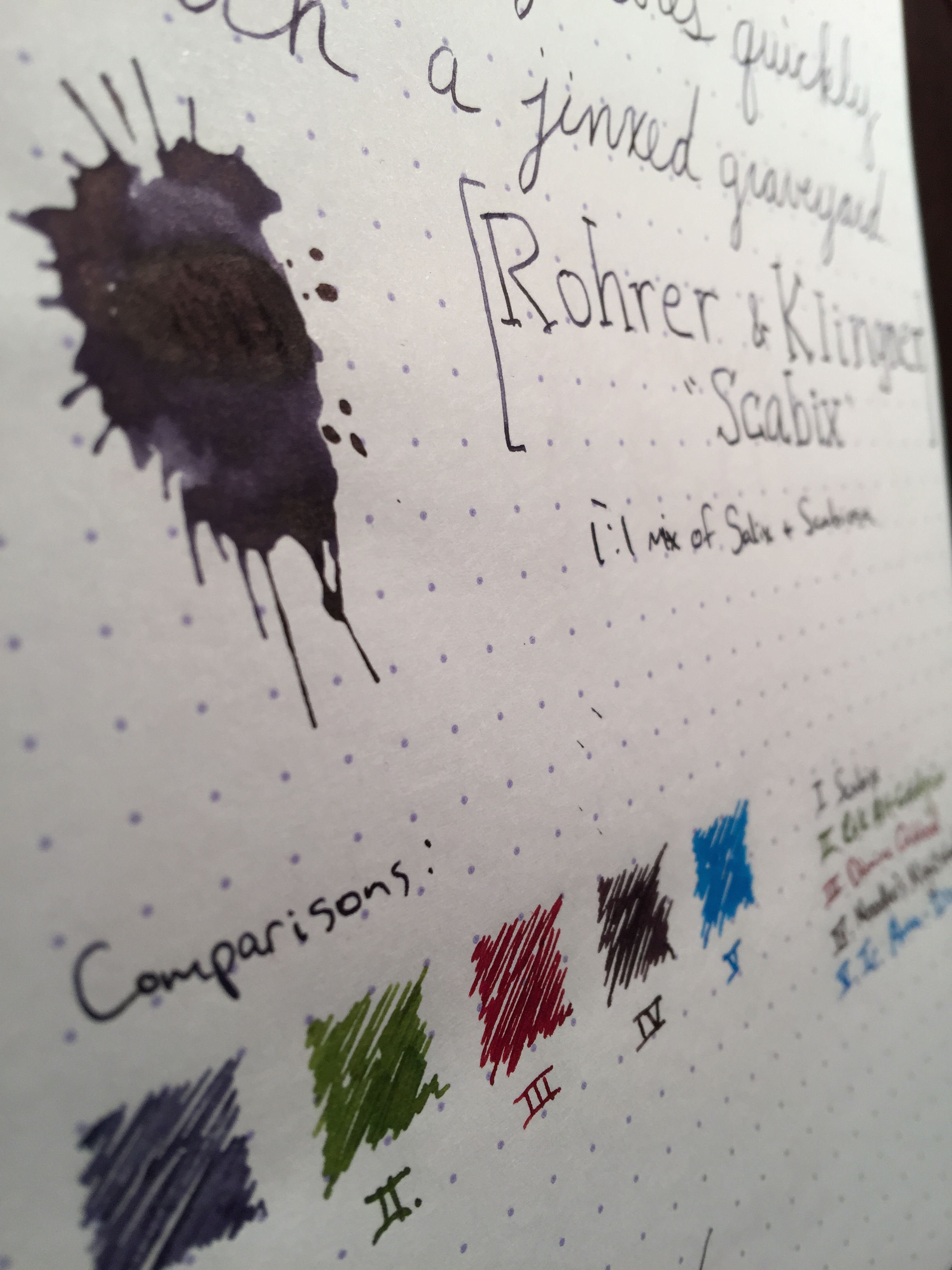
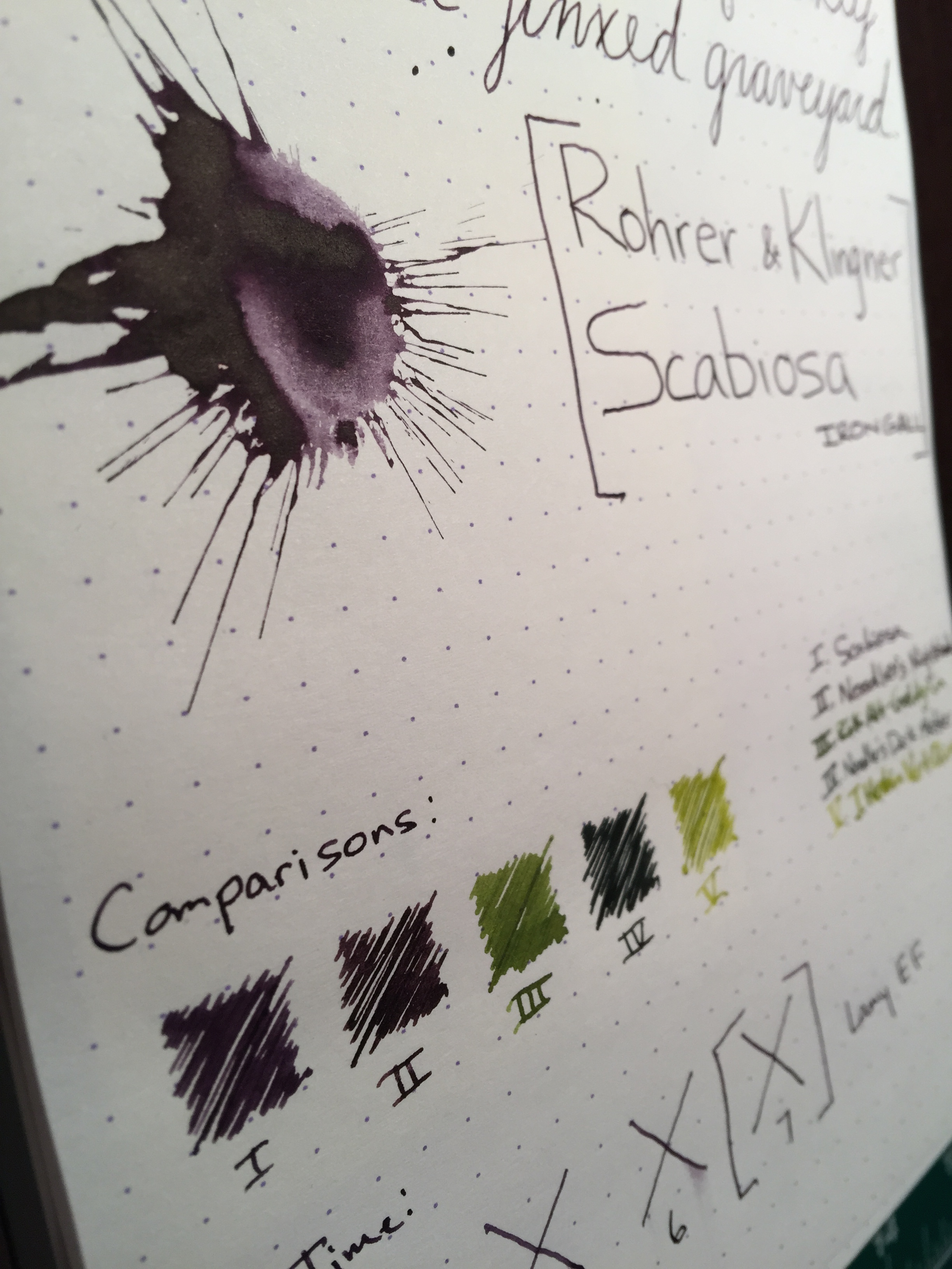
Scabiosa is my favorite of the two iron gall inks that Rohrer & Klingner carries.  It is a muted purple with a greyish undertone that I absolutely love.  As with all iron gall inks, the ink begins to oxidize once it hits the air, so after a few hours to a day, you'll see a subtle change in the inks coloring - mainly a slight darkening.  Aside from the permanence that iron gall is best known for, this characteristic makes it stand out from other inks.  One thing you'll notice about iron gall inks is they have a fairly unique smell to them.  I liken it to the smell of coins, or wet metal.  It's not evident in writing, but you can definitely smell it when you open up a bottle.

As with most of the Rohrer & Klingner inks, Scabiosa is extremely well behaved.  I see no feathering on most papers, and the dry time is around 8 seconds with a fairly wet Lamy EF nib.  It gives fairly moderate shading, though not a ton.  Scabiosa definitely stands out from the traditional purple fountain pen inks that you typically see with its unique color and the permanence of iron gall.  Don't be deterred by the fact that it is iron gall - all of the R&K inks are very easy to clean out of a pen.  So long as you practice regular pen maintenance, you should have no issue with any modern iron gall ink.

I highly recommend that you try this ink out - it is certainly in my top 2 favorites at the moment.  You can pick up a bottle from Goulet or a similar retailer for $12.00.

Ink Review: Rohrer & Klingner "Scabix" (1:1 Scabiosa & Salix Mix)

scabix-header

Rohrer & Klingner "Scabix" (1:1 Scabiosa & Salix Mix)
Pen: Pilot Custom 74 F
Paper: Rhodia Dotpad 80gsm

I was perusing Instagram one day, and came across a post by Brad Dowdy of an awesome greyish, blue-purple ink.  I didn't recognize the color, but I was in love with it nonetheless.  After I finally caught up on the Pen Addict podcast, I discovered this was Brad's "Scabix" mix - equal parts Rohrer & Klingner Scabiosa and Salix.

Both Scabiosa and Salix are Iron Gall inks.  Iron Gall ink is made from iron salts and tannic acids from vegetable sources.  They are typically blue, purple, black or brown in color and have a high level of permanence.  The ink is slightly acidic, making many folks worry about damage to their pens; however, modern Iron Gall is FAR less corrosive than vintage iron gall inks.  A true vintage Iron Gall would destroy a pen very quickly.  In modern pens, modern Iron Gall ink will not do damage so long as you practice normal pen maintenance.

One of the coolest things about Iron Gall ink is that once the air hits it, it begins to oxidize and changes color slightly, giving it a slight greyish tone.  Don't worry, it won't change dramatically; it just gives the ink some character.  Scabix (or, Saliosa if you prefer!) is a perfect mix of a blue-black ink and a grey purple.  It gives a vintage feel, which I really like - makes you think back to the inks that our constitution, or other significant documents were written with. Scabix has fairly quick dry time, and behaves amazingly well, even on cheaper paper.

Scabiosa and Salix by themselves are great inks as well - keep an eye out for reviews of them soon!  You can grab a bottle of both Salix or Scabiosa at Goulet or a similar vendor for $12.00.

Ink Review: Noodler's Operation Overlord Orange

operationoverlordorange-header

Noodler's Operation Overlord Orange (V-Mail Series)
Pen: Lamy Safari EF
Paper: Rhodia Dotpad 80gsm

Operation Overlord Orange is one of several vintage inspired inks from Noodler's V-Mail series.  The V-Mail series of inks have a very interesting story behind them.  In 2011, Noodler's obtained some sealed, viable bottles of ink with dates on them ranging from 1939 to 1945.  Most of the bottles had very patriotic labels on them, and referenced the term "V-Mail" which originates from around WWI.  Nathan Tardiff reverse engineered these inks to create his V-Mail series.

There's something really awesome about using a vintage inspired ink.  The fountain pen itself is a "vintage" tool that inspires nostalgia in its own right, but adding a vintage ink to the mix takes you back to times when no one thought of computers, phones, tablets and text messages.  There's something really great about that.  Op. Overlord Orange isn't the flashiest color out there; it's subdued and has minimal shading, but the story behind it certainly makes up for that.  I've read a lot of somewhat harsh reviews on this ink, but I found that I really enjoyed it.  The shade of orange is perfect for writing; not too dull and not melt-your-retinas bright.  It behaves well on Rhodia and other FP-friendly papers, though it does feather a bit on cheaper paper.

The bottles are just as interesting as the story behind the ink - they have a cream-colored label with Royal Airforce planes silhouetted on them.  Very minimalistic, but very appealing.

I'll be anxious to get ahold of some more of the V-Mail series inks to review.  If you are interested in trying them yourself, you can pick them up from Goulet or a similar retailer for $12.50.

Ink Review: Noodler's Air-Corps Blue Black

aircorpsblueblack-header

Noodler's Air-Corps Blue Black
Pen: Lamy Safari EF
Paper: Rhodia Dotpad 80gsm

Noodler's Air-Corps Blue Black caught my eye very early on as a very interesting green/blue ink.  I tend to avoid blue inks for whatever reason - I'm still not sure why - but I do love blue-black inks.  Air-Corps Blue-Black is a bit closer to a green-black than a blue-black, but if you squint at it on paper, it'll kinda jumps back and forth between the two.  That phenomenon is one reason that I really love this ink.

Being as dark as it is, ACBB has very little shading, though that doesn't take away from its character.  It's a great ink for the professional environment; it's subdued, but different enough than your typical blues and blacks.  It behaves well on my Rhodia pad, with no feathering, bleedthrough or ghosting.  Cleaning from my Z24 converter was a breeze, though I will say I didn't have the ink in there for too long.

I highly recommend this ink, especially if you are like me and like inks that stray from the "norm."  You can pick up a bottle from Goulet or a similar vendor for $12.50.

Greenish-blueish-blackish