Ink Review: Kaweco Sunrise Orange

sunrise-orange

Kaweco Sunrise Orange
Pen:
Kaweco Ice Sport - Black (M)
Paper: Rhodia #16 Blank - 80gsm
Shading: moderate
Saturation: low
Flow: medium wet
Dry Time: ~12 seconds w/Kaweco medium

Many fountain pen companies' line of inks are generally known to be very basic, underwhelming inks.  A lot of them are so under-saturated that they almost lean "watery."  I've often steered away from some pen manufacturers' inks for that reason, especially having tried some standard cartridges that come with pens that result in a very "meh" writing experience.  I wanted inks that represented me and my personality - after all, the fountain pen hobby is all about customizing to fit you style and needs.

Of course I knew that not all pen companies' inks were that way, but still the general mentality stuck.  Because of that, I'd really not ventured into the Kaweco inks, as I suspected them to fit this description.  When they released their two newest inks, one of them being Sunrise Orange - I was very intrigued.  Needless to say, they broke stigma around pen makers' inks with this one.

Sunrise Orange is a fun orange ink that has a very nice balance between saturation and shading.  It has the benefits of being a pen manufacturer's ink in that you don't have to worry about extreme properties, but it also provides a much richer color that doesn't suffer from the "watered down" syndrome that some others do.  I like the color variance that it provides when used in different nib sizes - in heavier writing pens, its color reminds me of pumpkin pie, while in fine and medium nibs, it's very similar to shades like Noodler's Apache Sunset and Habanero.  It doesn't give you quite as much shading and color variation as Apache Sunset, which is one of the best shading inks out there, but it's certainly not bad.

I found the dry time to be one of the best features of this ink - in my medium Kaweco nib, it dried right around 12 seconds on Rhodia, give or take depending on writing pressure.  With a finer nib, it should be even less, so I would suggest this ink as one to try out in the spirit of Left Hander's Day today!  I didn't find the ink to feather at all on Rhodia, Clairefontaine, Tomoe River, or my Field Notes Byline.  It's not weak on the saturation, but also gives a good amount of shading as I mentioned. Although it's not a super wet flowing ink, I didn't find it to write dry - even with a Kaweco nib which sometimes have a tendency to write on the dry side.

Kaweco's bottle design isn't super fancy, but it's not plain either.  I really enjoy the feel of the cap as it screws on - it has an inner liner that form fits to the lip of the bottle and prevents any air leak or evaporation, and it gives a nice positive "seal" when you tighten it.  The mouth of the bottle can be a bit small for larger pens, which could cause a problem when trying to tilt the pen and bottle with low ink levels.  The bottle's design does lend itself to getting the most out of the bottle before having to use an ink syringe to fill from lower ink levels, so with thinner pens you should fair well.

Chromatography was mostly orange, with a slight hint of greyish-blue.

The swab comparisons really show just how similar in shade this ink is to Apache Sunset and Habanero.  I think the color most closely matches Habanero, but doesn't give quite as much shading as either one.  If you love either of these inks, but don't want quite as much color variation, Sunrise Orange is a great choice.  The pumpkin pie coloring the ink exhibits when more ink is laid down is one thing that sets this apart from either of these two, and even some others in the same color range. 

I love where Kaweco is taking their ink line, and I'm glad they've helped me step outside my normal brand usage.  I plan on trying out a couple of their other standard colors as well, and expect a review in the coming days of their other new ink, Smokey Grey!  The new inks don't appear to have made it to most US retailers as of yet, but they're on their way.  The ink will be available in both bottled and cartridge form - cartridges for around $3 for for 6, and bottled for between $13 and $16 for 30mL depending on the site.  

(Kaweco has provided this product at no charge to The Desk for the purpose of review.  My opinions are honest and without bias - visit the About Me page for more details).

Ink Review: Faber-Castell Garnet Red

faber-castell-garnet-header

Graf von Faber-Castell Garnet Red
Pen: Lamy Safari (M)
Paper: Rhodia 80gsm Dotpad
Shading: high
Saturation: low-moderate
Flow: good flow
Dry Time: 15 seconds

Faber-Castell is a company that has been around since 1761, and is one of the oldest manufacturers of writing utensils and supplies in the world.  If you've been around your local hobby store recently, you've probably noticed their name on non-fountain pen tools such as colored pencils, erasers, india inks, etc.  Fountain pens and inks are just a small portion of their business, but if this ink is any indication, they're definitely doing something right.

Faber-Castell Garnet is the second ink in their line that I've used.  So far they've yet to disappoint me.  A nice mid-burgundy color, Garnet is an amazing shading ink.  Even with the folded nib, the ink displays an amazing variation in saturation and color, which really appealed to me.  On typical fountain-pen-friendly papers, it failed to feather or bleedthrough at all, and the dry time was respectable for a medium nib at 15 seconds.

One of the best things about this color, is how unique the shade is.  Though I haven't used a ton of burgundy inks, I really couldn't find anything close to this color.  De Atramentis William Shakespeare and Noodler's Black Swan in English Roses were closest in my collection. 

Chromatography was typical of most pinks & reds, with mostly a magenta color.  There is a yellow spot where the swab started, with a tiny bit of purplish color at the bottom.

Although I don't typically gravitate towards inks of this color, I really enjoyed using this one.  The shading really makes it pop on the page, especially when used with the folded nib.  I really think I'll have to try out some more Faber-Castell inks in the future.  If you're planning on giving them a try, you may want to pick up a sample first, as the bottles sell for $30 for 75mL.  For the size, it's not too bad at all, but it is a big investment and a lot of ink if you decide you aren't a fan of the color.  Let me know in the comments what your favorite Faber-Castell ink is!

Thanks for reading!
- Lori

Ink Review: KWZI Iron Gall Gold

KWZI-IG-Gold

KWZI Iron Gall Gold
Pen: Lamy Safari, Charcoal - F
Paper: Rhodia 80gsm dotpad
Shading: moderate
Saturation: medium
Flow: medium-dry
Dry Time: 17 seconds

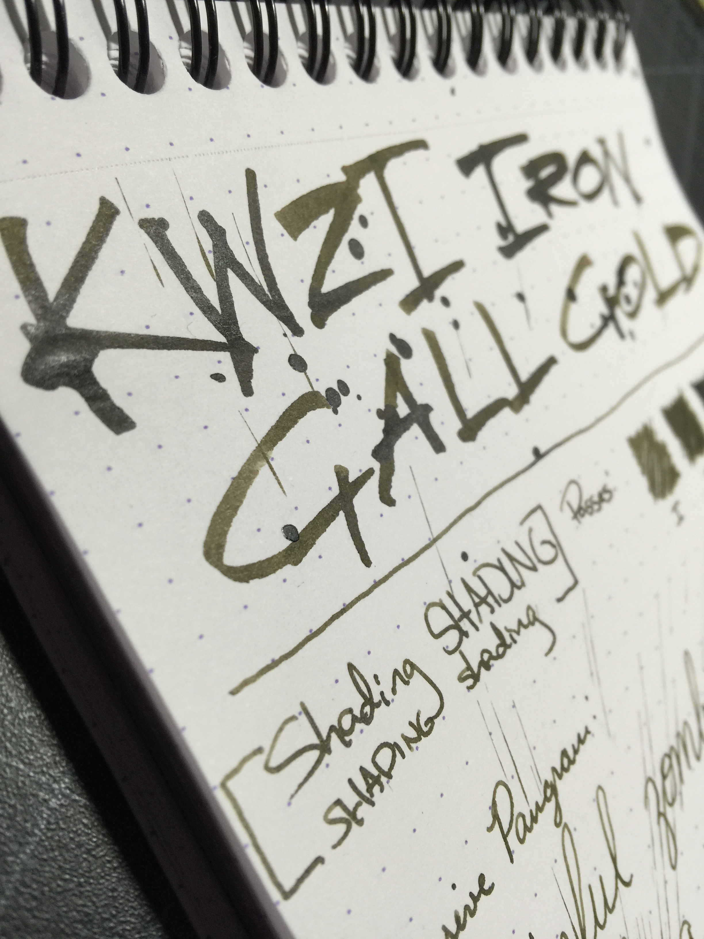
KWZI is developed in Poland by a fellow named Konrad.  He is a chemistry graduate and fountain pen user who'd been making inks for himself since 2012 - he wanted to increase the saturation of one of the inks, and his research eventually led to him developing his own line of inks for the public.  The KWZI line features colors that you just can't find elsewhere, some of which are iron gall inks that have a much wider range of colors than the few iron gall inks from the mainstream manufacturers such as Diamine or Rohrer & Klingner.

As I mentioned in a previous review of an iron gall ink from the KWZI line, I do have a fascination with iron gall inks.  Besides the benefit of their permanent qualities, they have some very cool properties that you just don't get with other inks.  KWZI's line seems to parallel much more closely with traditional old school iron gall inks, where the ink oxidizes rather quickly as you write on the page.  I did find this to be less pronounced with KWZI Iron Gall Gold than I did with their other ink Iron Gall Green Gold; but the effect is still there.  It goes on as a light golden brown and after several seconds begins darkening to a deep brown.  This effect can also mean that you may or may not have the same color that you expect once the ink is fully dried and oxidized (which can be a fun thing).  Iron gall inks do tend to have a funkier smell, so be warned.

30 seconds

4 hours

Iron Gall Gold is a well behaved ink, though I did find it to feel a tad dry coming out of the pen. The dry time was surprisingly longer than I expected given that the ink feels dry - right at about 17 seconds, with a fine nib on a Rhodia pad.  The ink wasn't at all unpleasant to use, but if you enjoy buttery smooth writing, you may want to use this ink with a bit broader nib to put more ink on the page.  It has some decent shading as you're writing, though it does become a bit less pronounced as the ink darkens from a medium golden brown to a muddy brown.  

I tried to let this swab sit for a bit before doing any color comparisons, to give the most accurate representation of final color.  It seems to sit somewhere in between Iroshizuku Yama-guri and Ina-ho.  I liken it to a more diluted version of Noodler's El Lawrence, because it has that motor oil look to it.

Chromatography of iron gall inks typically leaves a trail of dark grey/brown as it goes through the paper, and this one was no exception.  The two main colors that makeup this ink are black and yellow.

I'm often asked about whether it's harmful for pens to use iron gall inks in them.  For inks like Rohrer & Klingner Salix and Scabiosa - those seem to be more mild versions of the iron gall inks out there, so in my experience they behave close to traditional inks.  For the KWZI inks, they seem to sit somewhere between the R&Ks, and something like Diamine Registrar's (which I've heard folks have issues with from time to time).  I didn't have any cleaning issues with IG Gold, though I didn't leave the ink in my pen longer than a couple of weeks, and with regular use - which is about what I'd recommend with these iron gall inks before cleaning and refilling.  If you're using vintage pens, especially with any kind of sac filling mechanism, I wouldn't recommend using iron gall in them. Vintage pens are much harder to replace, so maybe stick to traditional inks for those pens.  I'm more of a modern pen user anyway, and in my experience as long as you practice regular pen maintenance, you shouldn't have any problems.  If you're curious, Vanness Pens has great information on their KWZI page talking about the properties and warnings about iron gall use.

I enjoyed the color of this ink more than anything.  It has a very retro feel to me, and is just different enough than a plain black ink to give your writing some character.  I could have stood for it to write a tad wetter, but I don't think I'd give up on it just for that reason.  Aside from buying straight from Konrad, you can also get the KWZI line from Vanness Pens here in the U.S. (60 ml for $14).  I can't recommend KWZI enough - they have such an amazing variety of colors to choose from and from the ones I've tried so far, they perform very well.

Thanks so much for reading!
- Lori

Ink Review: Diamine Shimmertastic Magical Forest

magical-forest

Diamine Shimmertastic Magical Forest
Pen: Pilot Metropolitan (M)
Paper: Rhodia 80gsm
Shading: moderate
Saturation: low to moderate
Flow: medium wet
Dry Time: short; 13-15 seconds with a Pilot medium

The sheening and shimmering inks craze has been in full force since J. Herbin debuted their 1670 line of inks with gold flecks in them.  Since that time, Diamine took shimmering inks to a whole different level and released their "Shimmertastic" line.  The Shimmertastic line currently consists of 10 different colors, most of which were new colors that haven't seen a simmering version before from other brands.  Magical Forest was my first test of these new inks, and I have to say I am very impressed with its balance of subtlety and uniqueness.

One of my favorite things about this ink that is different than some of the J. Herbin inks, is that is has a silver sheen, or flecks, whereas the J. Herbins had a gold sheen.  I feel like silver goes well with almost any color, and pairing it with this green was a great choice.  As far as the ink properties themselves, the ink writes moderately wet, but not too wet.  I got no feathering or bleeding on my Rhodia pad or any other typical fountain pen papers.  The dry time was good at around 14 to 15 seconds with a medium Pilot nib.  The sheen itself shows up pretty well in good lighting, but it also doesn't overwhelm the color of the ink.  This might be good and bad depending on the person - myself, I like the balance a lot.

Chromatography of the ink reminds me a lot of the tie dye t-shirts we wore in middle school - very bright blue and yellow.  The ink compares closely with Diamine Woodland Green or Noodlers Gruene Cactus (it sits right in the middle).  

I really enjoyed my time with this ink.  If you're a fan of a heavy sheen or fleck in your ink, this one may not be heavy enough for you, but I feel it has a very nice balance.  Its a mid-range green, so you could easily use it in your day to day without a lot of distraction from the work you're doing.  It behaves wonderfully on most papers, and had a quick to moderate dry time.  One downside is the price - it runs $20 for a 50mL bottle at most ink vendors, whereas other Diamine inks are around $15 for 80mL.  It is a couple bucks cheaper than the J. Herbin 1670 inks, though, and you get a much bigger variety of colors that sheen.

Thanks for reading! Drop a comment and let me know what other inks you'd like to see a review of!
Lori