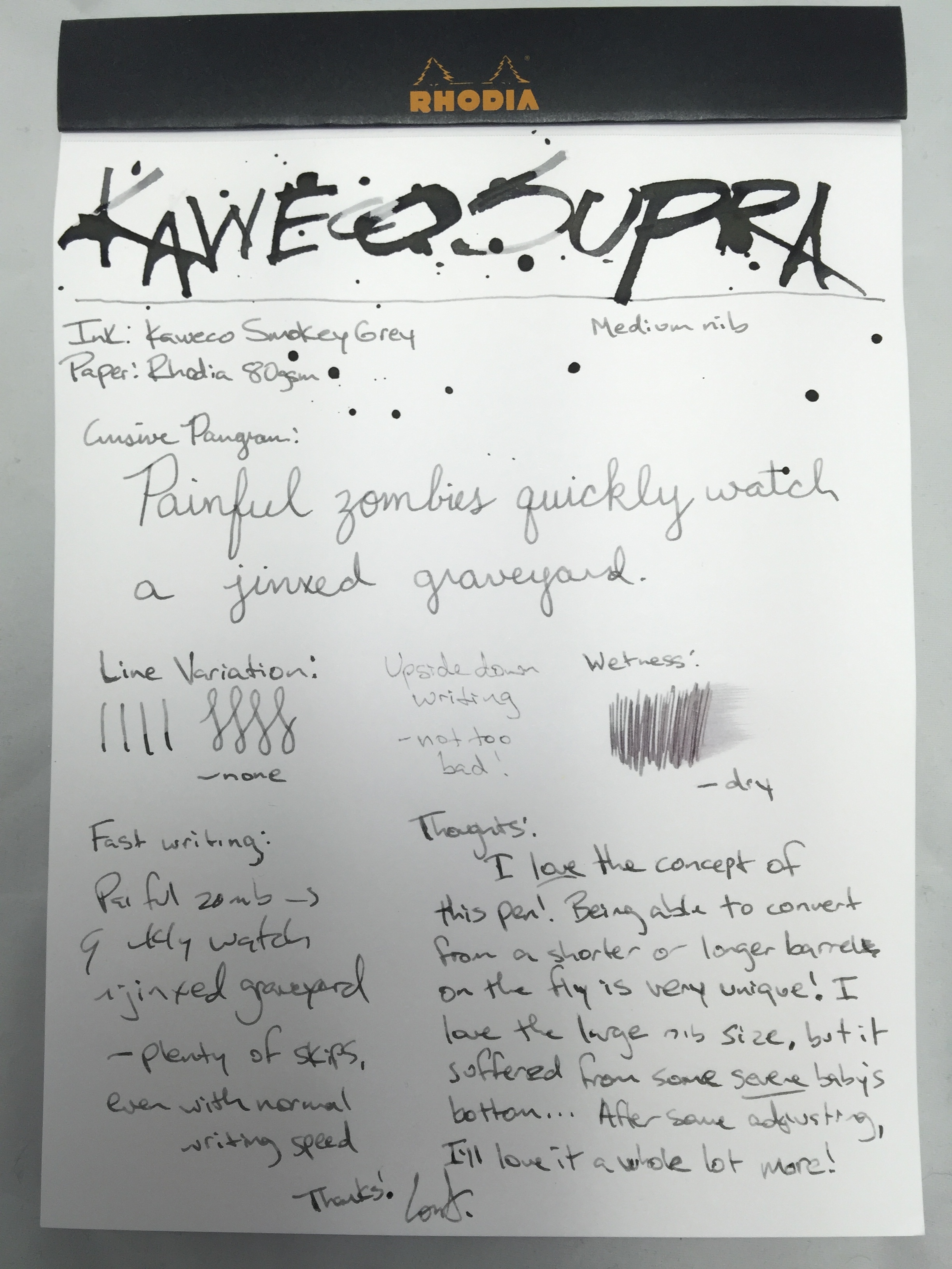
Pen Review: Kaweco Special Dip Pen

kaweco-special-dip-pen-header

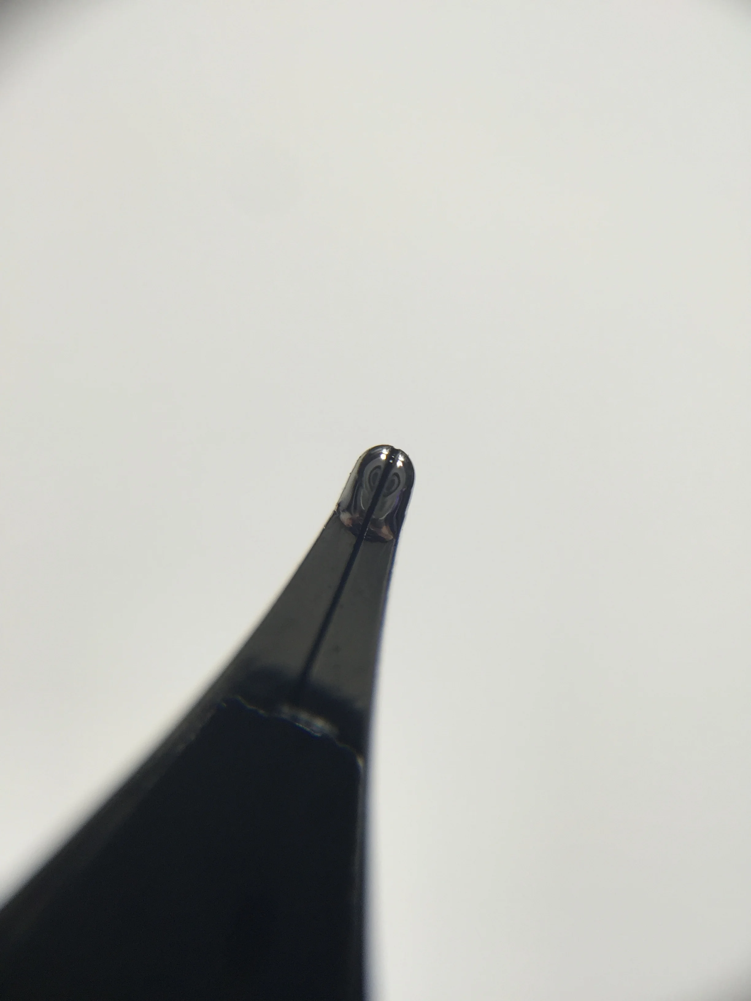
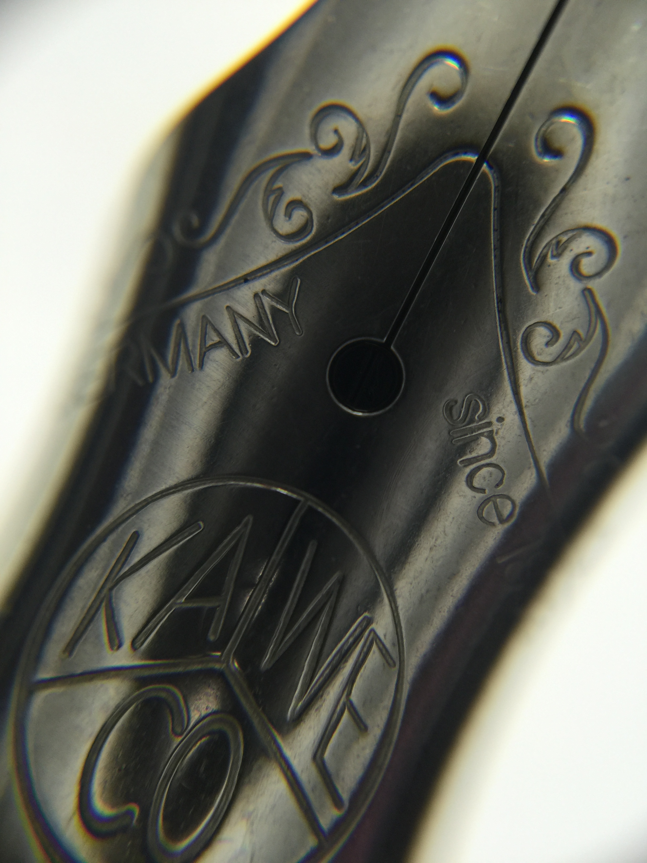
Kaweco Special Dip Pen - Steel Leonardt 30 Pointed Nib
Length: 199mm
Section Width: 10mm
Weight: 17.2g
Pros: Nice sturdy nib holder, good flex, anodized aluminum body
Cons: Rusting issue (not specific to Kaweco's nib holder), frequent dipping depending on the ink you use, nibs wear out easily.

I am very new to dip pens in general, but I've been wanting to get my feet wet a little bit with them.  A while back I'd gotten an inexpensive dip pen set from John Neal Books because it included the Mitchel Witch Pen, which I wanted to try using for ink "passes" on my ink reviews - my ink reviews are ever-evolving as I figure out what best represents the ink and what I want my reviews to look like.  I really only bought the set for the Witch Pen, but I did mess around a bit with the dip nibs that it came with and my experience wasn't so great.  Noob Lori was using fountain pen inks with the pens, and without a reservoir, they dried up VERY quickly, railroaded a lot and required constant dipping.

Kaweco launched their Dip Pen from their Special line, and I thought it was a perfect opportunity to give a review from the perspective of both a dip pen novice, as well as a pen addict who knows a thing or two about a good pen in general.  I had a really good time reviewing the pen, and I do think that I'll continue to use it for specialty things such as lettering cards or art in the future.

The pen comes in come minimalistic packaging, which I can always get on board with.  When I received the tube from Kaweco, my first thought was, "How did that nib not get bent in shipping?!" Of course Kaweco certainly thought of this because the base/cap of the tube actually grips the end of the pen as you slide it into the tube and it's tight enough to prevent the pen from slamming its nib into the back end of the tube.  Pretty cool!

The nib holder itself is one of the best one's I've seen - it's black anodized aluminum with a faceted barrel.  Most nib holder's I've come across are either wood or cheap plastic.  This one is heavy and feels like it will last a lifetime.  I don't find it slick or uncomfortable to use, though not having your traditional tapered and flared section design was something I had to get used to.

Of course I mentioned earlier that I'd tried out some dip pens before with fountain pen ink and that was a fairly unimpressive experience.  I did my research online, and even checked out some dip pen pros like Azizah at Gourmet Pens (if you're not following her Instagram, you should be!).  I found that most folks use one of these few inks for their dip pens, Speedball or India ink, calligraphy inks, or fountain pen inks with gum arabic in them.  I went to my local hobby stores and I could not for the life of me find any gum arabic at either of them (probably would have had better luck at a food store), so I headed to the calligraphy aisle.  I'd read online that inks labeled "calligraphy ink" are runnier than some of the speedball or higgins brand inks.  My store carried both Higgins and Speedball brand and I read that acrylic inks are more viscous and don't railroad as much in flex pens (if you know more about these ink types, please enlighten me!), so I ended up choosing Speedball's Super Pigmented Acrylic ink.

I dipped the pen and played around with some flex writing and testing how long the ink would last with a single dip.  My experience with the acrylic ink was much more pleasant than with fountain pen inks, and the single dip lasted for quite a while.  The acrylic ink, especially when laid down thick from flexing, dries in almost a textured 3D form on the page.   I can't imagine you'd have an issue doing washes over this ink.

So as I mentioned, I am a complete dip pen noob.  I figured this out the hard way after I finished using the pen for the first time, took it into the bathroom and gave it a quick rinse under the sink.  I dried it with a paper towel, sat the pen down and didn't touch it for a few days.  The next time I pulled the pen out, I attempted to remove the nib, so that I could try out some other dip nibs in it, and I had a terrible time getting the nib out.  I soon discovered that my very brief rinse under the sink water was enough to start a very rapid rusting process of the nib.  I was a little shocked by this - I didn't realize how easily dip nibs rusted.  I did a little more research online and found others who'd had a similar problem, and many folks said to just wipe your nib clean after use instead of using any sort of water - or at least make sure that you're drying it absolutely completely.  Dip nibs are apparently not meant to last a lifetime and some people even mentioned that after a while, because there is no tipping, the tips would begin to wear out - which makes sense.  I checked the inside of the Kaweco nib holder and saw a bit of rust in there too - I can't really tell if it was contact rust that was transferred from the rusted nib, or if the inside of the nib holder also rusted from the water contact.  To further test the rusting issue, I did the same rinsing with the cheap plastic nib holder that I got from the John Neal Books dip nib set, and it rusted as well; so I feel comfortable stating that this is not specific to Kaweco's product.  I would definitely advise you not to rinse yours unless you absolutely have to, and if you do make certain it's completely dry.  Total noob move on my part!

Finally I wanted to try out various fountain pen inks with the dip pen, just to see how well the fared compared to the acrylic ink.  I tested some of my current favorites, as well as the two newest Kaweco inks and surprisingly there was quite a variation in the amount of dips needed to complete my writing with each one.  It certainly wasn't scientific, but I did try to keep the writing as consistent as possible and the amount of time & depth of the dips.  On average, I was dipping multiple times for the very small writing sample, and found that some inks were so runny that they would blob ink down after a fresh dip.  I was very pleased with how Rohrer & Klingner Scabiosa and Noodler's El Lawrence fared - Scabiosa held up for my entire sentence and I even did some extra flexes before the ink ran out.  El Lawrence was on the higher viscosity side as well with just two dips.  Most others were at least 4 or 5 dips.  With the acrylic ink, I was able to write the entire upper half of the review (not the title - that was done with a folded nib), with some extreme flex, with only 6 dips.  Pretty impressive!

In all, I really enjoyed venturing outside my normal fountain pen regimen and trying out Kaweco's Dip Pen.  I have tried the Noodler's Ahab for flex, and this one was a lot more pleasant to use because railroading wasn't a factor with the right ink.  I could see myself using this for holiday cards, design work, or just for fun.  I do still want to try out some gum arabic mixed into fountain pen inks, so that I can have a wider color variety than most dip inks offer.  Kaweco's nib holder is sturdy, well balanced and very enjoyable to use.  It retails for around $36 at places like JetPens.com - I feel like that's a very fair price for an anodized aluminum nib holder.  You can also swap out different dip nibs for a whole different writing experience.  Have you tried any dip pens before? Let me know your experience!

Thanks for reading!
- Lori

Ink Review: Kaweco Sunrise Orange

sunrise-orange

Kaweco Sunrise Orange
Pen:
Kaweco Ice Sport - Black (M)
Paper: Rhodia #16 Blank - 80gsm
Shading: moderate
Saturation: low
Flow: medium wet
Dry Time: ~12 seconds w/Kaweco medium

Many fountain pen companies' line of inks are generally known to be very basic, underwhelming inks.  A lot of them are so under-saturated that they almost lean "watery."  I've often steered away from some pen manufacturers' inks for that reason, especially having tried some standard cartridges that come with pens that result in a very "meh" writing experience.  I wanted inks that represented me and my personality - after all, the fountain pen hobby is all about customizing to fit you style and needs.

Of course I knew that not all pen companies' inks were that way, but still the general mentality stuck.  Because of that, I'd really not ventured into the Kaweco inks, as I suspected them to fit this description.  When they released their two newest inks, one of them being Sunrise Orange - I was very intrigued.  Needless to say, they broke stigma around pen makers' inks with this one.

Sunrise Orange is a fun orange ink that has a very nice balance between saturation and shading.  It has the benefits of being a pen manufacturer's ink in that you don't have to worry about extreme properties, but it also provides a much richer color that doesn't suffer from the "watered down" syndrome that some others do.  I like the color variance that it provides when used in different nib sizes - in heavier writing pens, its color reminds me of pumpkin pie, while in fine and medium nibs, it's very similar to shades like Noodler's Apache Sunset and Habanero.  It doesn't give you quite as much shading and color variation as Apache Sunset, which is one of the best shading inks out there, but it's certainly not bad.

I found the dry time to be one of the best features of this ink - in my medium Kaweco nib, it dried right around 12 seconds on Rhodia, give or take depending on writing pressure.  With a finer nib, it should be even less, so I would suggest this ink as one to try out in the spirit of Left Hander's Day today!  I didn't find the ink to feather at all on Rhodia, Clairefontaine, Tomoe River, or my Field Notes Byline.  It's not weak on the saturation, but also gives a good amount of shading as I mentioned. Although it's not a super wet flowing ink, I didn't find it to write dry - even with a Kaweco nib which sometimes have a tendency to write on the dry side.

Kaweco's bottle design isn't super fancy, but it's not plain either.  I really enjoy the feel of the cap as it screws on - it has an inner liner that form fits to the lip of the bottle and prevents any air leak or evaporation, and it gives a nice positive "seal" when you tighten it.  The mouth of the bottle can be a bit small for larger pens, which could cause a problem when trying to tilt the pen and bottle with low ink levels.  The bottle's design does lend itself to getting the most out of the bottle before having to use an ink syringe to fill from lower ink levels, so with thinner pens you should fair well.

Chromatography was mostly orange, with a slight hint of greyish-blue.

The swab comparisons really show just how similar in shade this ink is to Apache Sunset and Habanero.  I think the color most closely matches Habanero, but doesn't give quite as much shading as either one.  If you love either of these inks, but don't want quite as much color variation, Sunrise Orange is a great choice.  The pumpkin pie coloring the ink exhibits when more ink is laid down is one thing that sets this apart from either of these two, and even some others in the same color range. 

I love where Kaweco is taking their ink line, and I'm glad they've helped me step outside my normal brand usage.  I plan on trying out a couple of their other standard colors as well, and expect a review in the coming days of their other new ink, Smokey Grey!  The new inks don't appear to have made it to most US retailers as of yet, but they're on their way.  The ink will be available in both bottled and cartridge form - cartridges for around $3 for for 6, and bottled for between $13 and $16 for 30mL depending on the site.  

(Kaweco has provided this product at no charge to The Desk for the purpose of review.  My opinions are honest and without bias - visit the About Me page for more details).

Pen Review: Kaweco Supra

supra-header

Kaweco Supra - Steel nib (Bock M)
Length Capped: 129.5mm (with extension); 99mm (without extension)
Length Posted: 163.5mm (with extension); 133.5mm (without extension)
Length Uncapped: 124mm (with extension); 94mm (without extension)
Section at Thinnest Point: 9.5mm
Section at Widest Point: 10.5mm
Weight w/Ink & Cap: 49g (with extension); 37g (without extension)
Weight w/Ink & No Cap: 39g (with extension); 27g (without extension)
Fast Writing: Lots of skips.
Upside Down Writing: Not bad at all.
Wetness: Dry.
Pros: Unique! Changes sizes, pocket pen option, very smooth nib, patina potential, balance in the hand
Cons: Baby's bottom, weight could cause fatigue, no converter, only available in brass (which also makes your hands smell like metal)

I feel like every time I write about Kaweco lately, I'm talking about the newest awesome and unique innovation that they've brought to the writing table.  Today is another one of those days.  The Supra is one of Kaweco's newest fountain pen designs, and what makes it unique is it includes a removable 3cm midsection which allows you to change the length of the pen on the fly - taking it from a full-size pen to a pocket pen in just a few seconds.  This is such a neat feature, and something I've not seen with other pens.
The pen is the big brother of the Kaweco Liliput; and if you weren't a fan of that pen because it was just too small, this might be your answer to that.  It's made of brass, so it has some decent weight to it (around 49g with the extension and 37g without).  There is a step down on the barrel from the extension to the back end piece of the pen, but I don't think it takes away from the sleek design, and your hands shouldn't ever come into contact with that during writing.  The section is a tapered and flared design, and it's size is very similar to that of the Kaweco brass sport (and other Sport pens).  Being that it's a metal pen, the threads are a tad sharper than you'd experience on a plastic or resin pen, but I didn't find them to be uncomfortable.  Like the Liliput, the cap has the 3-syllable Kaweco logo on the top, with the Kaweco name in script and pen name on the upper half of the side of the cap.

Another thing that differentiates this pen from most of Kaweco's others is it's nib.  The Supra comes with a large #6 nib, and it's a beauty.  The nib really sets it apart, and I didn't have an issue with the pen at all until I started writing.  I typically use F nibs but wanted to give a Kaweco Medium a try, and this one unfortunately suffered from a pretty severe case of baby's bottom.  I would get a skip at the beginning of each stroke, and at faster writing speeds that carried on throughout the sentence.  It's an incredibly smooth nib (as is the case with a lot of baby's bottom nibs), and I enjoyed the pen so much that I wasn't ready to give up on it.  I spent some time doing some minor smoothing on some micro mesh, and it writes like a dream.  It is unfortunate how frequently this does happen with Kaweco's nibs - not sure if it's a Bock issue, or if they're tuned at Kaweco before they're sent out.
 

Nib out of the box - just a tad misaligned

A bit out of focus, but, the nib after alignment.  You can see the gap that is likely causing the flow issues.

Underside of the nib

Top side of t he nib

Compared to other pocket pens, Supra stacks up nicely against pens like the TWSBI Mini.  At its full size, the Supra is a tad longer than the Mini, but in it's pocket form it's shorter.  Of course it's heavier being that it's brass, but the size is nice.  I also compared it to the Pocket 40 from Franklin Christoph, and without its extension, it's shorter than that pen capped, and a tad longer posted.  The pen has a great balance in the hand, both at its full size (unposted for my preferences), and in it's pocket size, posted.  I don't care too much for posting it at full size because at that point it becomes almost an oversized pen, but at the same time I don't post any of my full size pens.  If you post regularly, then the length is probably something you're used to

Capped, with extension

Capped, without extension

Posted, without extension

Writing issues aside (which I was fortunately able to remedy), I am a huge fan of this pen.  The removable extension is absolutely brilliant, and Kaweco continues to come up with awesome ideas for their customers.  I would love to see them come out with other finishes/materials for this pen, as I think it will only increase the appeal (fireblue, anyone?).  I do also think it should come with a converter, especially at this price.  Speaking of, the price seems to vary pretty drastically between the US and Europe - I've seen listings at most US sellers for $140, and some European sites for around €95 (little over $100).  So if you're interested, a non-US seller may be your best option.  I can't recommend this pen enough!

(Kaweco has provided this product at no charge to The Desk for the purpose of review.  My opinions are honest and without bias - visit the About Me page for more details).

Pen Review: Kaweco AC Sport Carbon

AC-Sport-header

Kaweco AC Sport Carbon - Steel Nib (F)
Length Capped: 107mm
Length Posted: 131mm
Length Uncapped: 100mm
Section at Thinnest Point: 9mm
Section at Widest Point: 10mm
Weight w/Ink & Cap: 22.2g
Weight w/Ink & No Cap: 13.4g
Fast Writing: Keeps up fine.
Line Variation: Very little line variation, but you can squeeze out a tiny bit.
Upside Down Writing: Very scratchy, but it can be done if needed.
Wetness: Fairly wet writer.  This ink did contribute to that some.
Pros: Lightweight, portable, Kaweco style & dependability
Cons: May be too light for some; cannot be used long without posting; nib can be a tad scratchy.

Parts of the Pen:

Like all Kaweco Sport models, the pen features a fairly long cap with an octagonal facets.  The body is cylindrical with a step down at the end leading to an end cap with a rounded top and a dimple in the middle.  The section is tapered and flared, and has a small grouping of threads at the top where the cap screws on.  Finally, the finial is very slightly conical and features the 3-syllable Kaweco logo.  The carbon parts on the cap appear to be applied as stickers, so you do have a bit of a gap between the carbon and the aluminum edge.

Review:

Kaweco is always coming up with new creative spins on their classic style fountain pen, and the AC Sport Carbon is a good example of that.  This pen features a nice matte aluminum finish and is embellished with a nice genuine carbon wrap around the barrel, and on every other panel of the unique octagonal cap.  The pen comes in 4 different colors - Red, Champagne, Silver and Black.  

As far as how the pen writes, if you've used any other Kaweco sport pen, it functions pretty much the exact same in my experience.  This pen uses the same steel nib that comes standard on all of the other Kaweco Sports/Skylines, so the added price doesn't add anything to the writing experience itself.  I admittedly have had my hits and misses with Kaweco nibs, but this one performed fairly well.  I had a bit of an issue with scratchiness, but discovered the nib tines were misaligned out of the box.  Once that was corrected, it performed well with no hard starts and only a slight "toothiness."

One issue that kind of bugged me about this pen was that lint and dust seems to settle in the small gap between where the carbon ends and the aluminum edge begins on the cap.  It's not noticeable at a distance, but up close it's pretty easy to see.  That is one small improvement Kaweco could make to this pen to bring it up a notch.

Final Thoughts:

Overall I really enjoyed using this pen, much like all my Kaweco pens.  The style is something that very few other companies have mimicked successfully, and it is another great spin on a classic design.  Whether the extra cost is worth it is really up to what added style is worth to you.  The Kaweco AL Sport, which is just the standard aluminum body Sport, retails for $80, and the AC Sport Carbon retails for around $128 - so close to an extra $50.  I think if you really like the carbon look, it's worth it to go ahead and pick it up.  If the cost isn't worth it to you, try the AL Sport, or even the classic Sport which has a plastic body.  All are great pens for on-the-go. 

Thank you so much for reading, and thank you to Kaweco for sending this pen for review!
- Lori

(Kaweco has provided this product at no charge to The Desk for the purpose of review - I have since chosen to purchase the pen from them.  My opinions are honest and without bias - visit the About Me page for more details).